Line Graph 29
The pie graphs below The line graph below compares the Gross Domestic Product (GDP) in four countries in billions of US dollar. Write a report for a university lecturer and report the main features, and make comparisons where relevant.

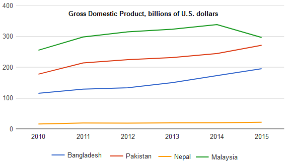
The line graph shows changes in GDP in four countries and compares the GDP of those countries between 2010 and 2015. As can be seen, Malaysia had a better GDP than other countries listed in the diagram and GDP is Nepal remained constant throughout the time.
As is outlined in the graph, GDP in Malaysia was approximately 270 billion US dollar in 2010 which was the highest among the given countries. Pakistan’s GDP at that moment was roughly 180 billion which was around 70 billion higher than that of Bangladesh. Nepal with its meagre 10 billion Gross Domestic Product stood at the bottom of the list.
Looking further, Malaysian GDP gradually increased till 2014 and then witnessed a decline. GDP in this country was 300 billion dollar in 2015, which was the highest. GDP in Pakistan progressed moderately and this progress accelerated between 2014 and 2015 at which point it nearly touched Malaysian’s GDP. Bangladesh’s GDP gradually improved and almost doubled in 5 years. Interestingly, Nepal is the only country whose GDP remained static at only 10 billion dollars.