IELTS Graph #15
Write a report describing the information in the graph below.
- You should write at least 150 words.

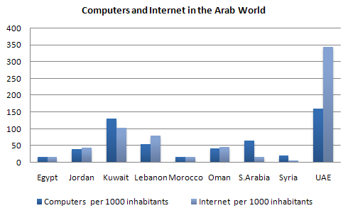
The chart shows striking differences in the level of computer and Internet penetration in the Arab world.
The UAE and Kuwait are by far the most computerized countries, with Lebanon a distant third. The UAE has over 150 computers for every 1000 inhabitants, compared to Kuwait’s 130 and Lebanon’s 60. In contrast, countries such as Egypt, Morocco and Syria have less than 20 computers per 1000 inhabitants.
There are also great differences in Internet use and availability. The UAE has by far the highest proportion of users, with more than one-third of its population using the Internet. Kuwait and Lebanon are second and third again, with 100 users per thousand in Kuwait and 80 in Lebanon. In some countries the number using the Internet is negligible: Saudi Arabia has less than 20 users per thousand, and there are fewer than 5 users per thousand in Syria.
One unusual feature of the graph is that Internet use does not seem to be directly related to the number of computers. In several countries (the UAE, Lebanon, Jordan and Oman), there are more Internet users per thousand people than computers. However, in other countries, such as Kuwait, Saudi Arabia and Syria, the number of Internet users is lower than the number of computers.
In summary, there are major differences between computer use and Internet use in the Arab world, but the UAE clearly leads the area in both number of computers and number of internet users per capita.
IELTS Graph #16
The graph below shows the different modes of transport used to travel to and from work in one European city in 1960, 1980 and 2000.
Write a report for a university lecturer describing the information below.
- You should write at least 150 words.
model answer:
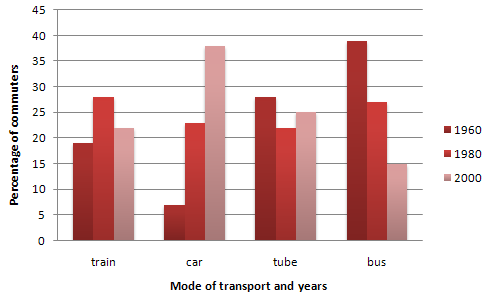
The graph shows the changing patterns in commuting by train, car, tube or bus for commuters in London in the years 1960, 1980 and 2000.
The number of people using trains at first rose from just under 20% in 1960 to about 26% in 1980, but then fell back to about 23% in 2000.
Use of the tube has been relatively stable, falling from around 27% of commuters in 1960 to 22% in 1980, but climbing back to reach 25% by 2000.
On the other hand, the use of cars increased steadily from just over 5% in 1960 to 23% in 1980, reaching almost 40% by 2000, whereas the popularity of buses has declined since 1960, falling from just under 35% in 1960 to 27% in 1980 and only 15% in 2000.
The graph indicates the growing use of cars for commuting to work between 1960 – 2000, and the corresponding decline in the popularity of buses from being the most popular mode of transport in 1960 to the least popular in 2000.
IELTS Graph #17
Write a report for a university lecturer describing the information below.
- You should write at least 150 words.
- You should spend about 20 minutes on this task.
model answer:
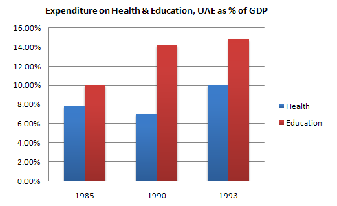
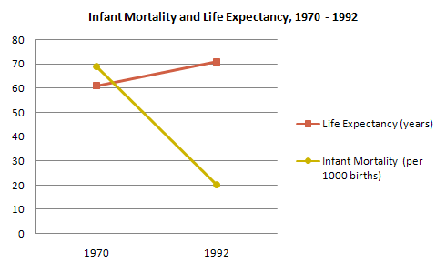
The graphs show health and education spending and changes in life expectancy and infant mortality in the UAE. Overall, as the percentage spent on health and education increases, infant mortality and life expectancy improve.
Graph 1 shows the percentage of GDP spent on health and education between 1985 and 1993. There were big increases in both areas. Health spending stood at about 8% in 1985 but rose to 9% in 1990 and 10% in 1993. Spending on education was even higher. It was 10% in 1985, and shot up to 14% in 1990 and 15% in 1993, a 50% increase in just 8 years.
Graph 2 shows improvements in life expectancy and infant mortality between 1970 and 1992. Life expectancy was just 60 in 1970 but rose to almost 72 in 1992. In contrast, the number of babies dying dropped dramatically, from 60 per 1000 in 1970 to only 22 in 1992.
In conclusion, people in the UAE are living longer and healthier lives because of the government’s spending on education and medical facilities.
IELTS Graph #18
Write a report for a university lecturer describing the information below.
- You should write at least 150 words.
- You should spend about 20 minutes on this task.
model answer:
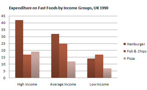
The graph shows weekly expenditure on fast food in Britain by food and income group. There are two main trends. First, the expenditure is directly related to income. Secondly, there are differences in the types of fast food eaten by each group.
The amount of money spent on fast food is related to income. People in the high-income group spent the most – over 85 pence per person per week. People in the low-income group spent the least – less than half of what the high-income earners spent.
The type of fast food eaten also depends on the group. High-income earners spent 3 times more on hamburgers than people in the low-income group. Pizza was generally the least favorite food. Fish and chips was the most popular food with the low-income group but consumption was fairly similar among all groups.
IELTS Graph #19
Write a report for a university lecturer describing the information below.
- You should write at least 150 words.
- You should spend about 20 minutes on this task.
model answer:
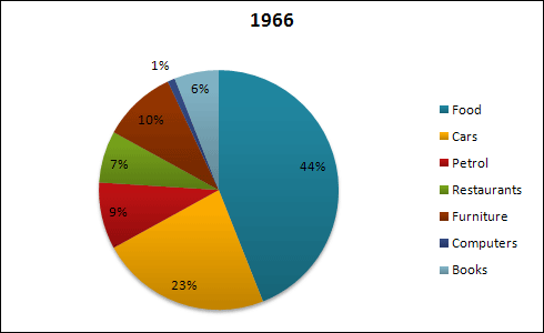
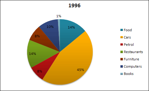
The pie charts show changes in American spending patterns between 1966 and 1996.
Food and cars made up the two biggest items of expenditure in both years. Together they comprised over half of household spending. Food accounted for 44% of spending in 1966, but this dropped by two thirds to 14% in 1996. However, the outlay on cars doubled, rising from 23% in 1966 to 45% in 1996.
Other areas changed significantly. Spending on eating out doubled, climbing from 7% to 14%. The proportion of salary spent on computers increased dramatically, up from 1% in 1996 to 10% in 1996. However, as computer expenditure rose, the percentage of outlay on books plunged from 6% to 1%.
Some areas remained relatively unchanged. Americans spent approximately the same amount of salary on petrol and furniture in both years.
In conclusion, increased amounts spent on cars, computers, and eating out were made up for by drops in expenditure on food and books.
IELTS Graph #20
Write a report for a university lecturer describing the information below.
- You should write at least 150 words.
- You should spend about 20 minutes on this task.
model answer:
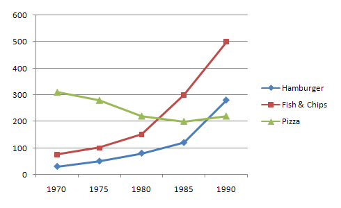
The graph shows changes in the amount of fast food consumed in the UK between 1970 and 1990. Several trends are apparent. First, Britons are eating more and more fast food. Secondly, the type of fast food has changed.
In 1970, the most popular fast food was fish and chips. Over 300g were consumed each week. By 1990, however, this had fallen to just over 200g – a 50% drop. Consumption of other fast foods such as pizza and hamburgers increased, however. The amount of pizza eaten shot up from about 20g a week to more than 270g, overtaking fish and chips in the late 1980s. Hamburger consumption also increased, rising from about 80g in 1970 to almost 300g in 1990.
Accompanying this change in the choice of foods was an increase in the amount of fast food consumed. In 1970, British consumers ate about 450g a week of fast food. In 1990, on the other hand, this had more than doubled, to 1000g.
alternative answer:
The graph shows the amount of fast food eaten between 1970 and 1990 in grams per person per week. Overall, the amount of fast food eaten more than doubled.
The amount of fish and chips eaten declined slightly. In 1970, the consumption was about 300g/week. This fell to 220g/week in 1990.
In contrast, sales of hamburger and pizza rocketed. In 1970, very little pizza was eaten – less than 50g/week. This rose to 280g/week by 1990. In the same period, hamburger sales shot up by more than 500%, from 100g/week in 1970 to 500 grams in 1990.
In conclusion, although there was a big increase in the consumption of pizza and hamburger, sales of fish and chips decreased.