Index
1.
The chart below shows the percentage of adults of different age groups in the UK who used the Internet everyday from 2003-2006. Summarize the information by selecting and reporting the main features and make comparisons where relevant.
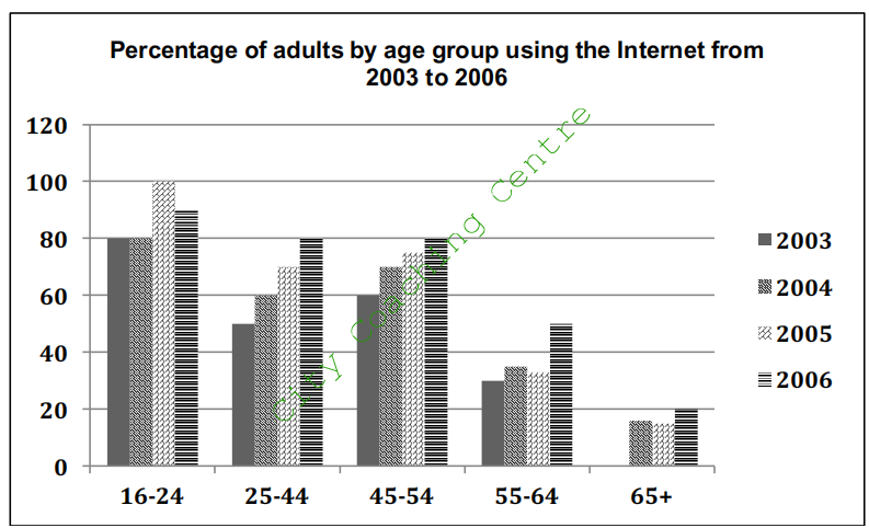
The given column graph illustrates the percentage of adults of different age groups using the Internet between 2003 and 2006, in the Great Britain. The over 65s had the least percentage of Internet users.
The main users of the Internet were young adults aged between 16 and 24 years. In 2003 and 2004, they shared the same percentage, which was 80%. In 2005, this figure increased significantly to 100%, but decreased slightly to 90% in the next year.
We can see from the chart that all the age groups experienced an upward trend as far as their daily use of the Internet is concerned. In the 25-44 group, there was a gradual growth in the percentage, from 50% to 80%, between 2003 and 2006. There were similar increases for the 45 to 54 year olds, rising from 60% in 2003 to 80% in 2006. As for the other two groups, although the percentages had minor fluctuation, the overall trend was upwards.
Overall, adults between 16 and 44 showed the greatest usage of the Internet and the users grew with time regardless of their age.
2.
The chart below shows the percentage of whole world population in four countries from 1950 to 2000, with projections till 2050. Summarise the information by selecting and reporting the main features and make comparisons where relevant.
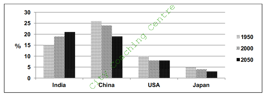
The column graph compares the changes in the proportion of population in India, China, the USA and Japan in 1950 and 2000, and also indicates the projections for 2050. It is clear from the graph that China had the highest percentage of world population in 1950 and 2000, but estimates show that India will take the lead by 2050.
In 1950, China accounted for a little over a quarter of the world’s population. Although it decreased to a little under a quarter, it was still the highest in 2000, compared to the other three countries. It is estimated that the population of China will continue to drop and would reach approximately19% by 2050.
India showed an opposing trend to China. The population in India in 1950 was 15%, which was considerably lower than that of China. However, the population increased moderately to 19% by 2000 and is further expected to grow and reach nearly 20%, which would be the highest among the given countries by 2050.
When it comes to the population of the USA and Japan, both showed a decrease from 1950 to 2000. It is predicted that the percentage will remain the same in the USA, whereas in Japan, the population is likely to keep falling till 2050.
Overall, Japan had the least population in the given period, and the population is expected to decrease to approximately 3% by 2050.
3.
The chart below shows the expenditure on three categories among different age groups of residents in the UK in 2004. Summarize the information by selecting and reporting the main features and make comparisons where relevant.
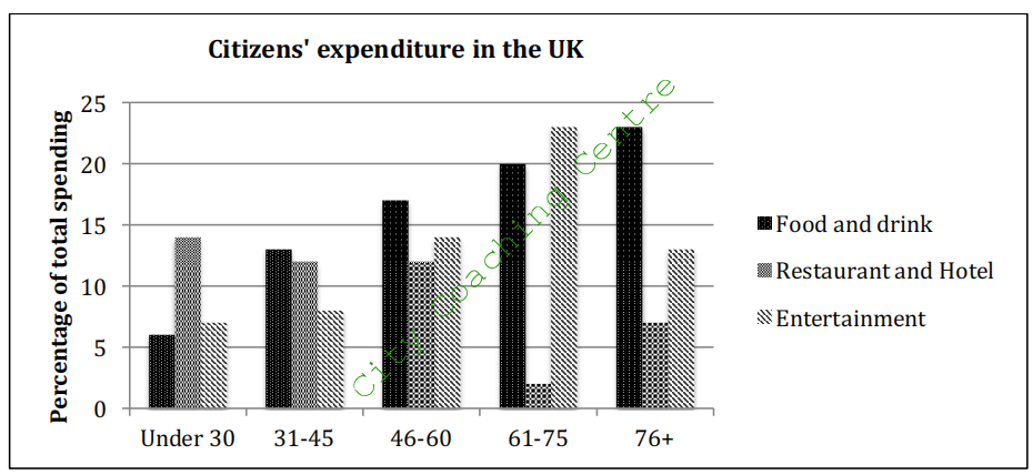
The given column graph compares the amount of money spent by five age groups of the British citizens on three different items, in the year 2004. It is interesting to note that the spending on food and drinks was the least by the under 30s, and the highest by the above 76 age group.
It is noticeable that the largest proportion of spending went on food and drinks in most age groups, except for the under 30s and those between 61 and 75 years of age. Expenditure on restaurant and hotel was almost similar among all age groups below 60 years. They spent 12- 14% on this sector. The 61-75 and the 76+ age groups spent 2% and 7% respectively on restaurant and hotel. The under 45s spent lesser on entertainment than on restaurant and hotel, but the vice versa was true for all the other given age groups. The 61-75 year olds, showed the highest discrepancy in their spending on these two areas. They spent 2% and 23% on restaurant and hotel, and entertainment respectively.
Overall, it is observed that as age advanced, the spending priorities of people changed. Older age groups spent more on food and drink and entertainment. However, the 76+ age group did not give much importance to entertainment.
4.
The charts below show the number of working hours per week, in industrial sector, in four European countries in 2002. Summarize the information by selecting and reporting the main features and make comparisons with relevant.
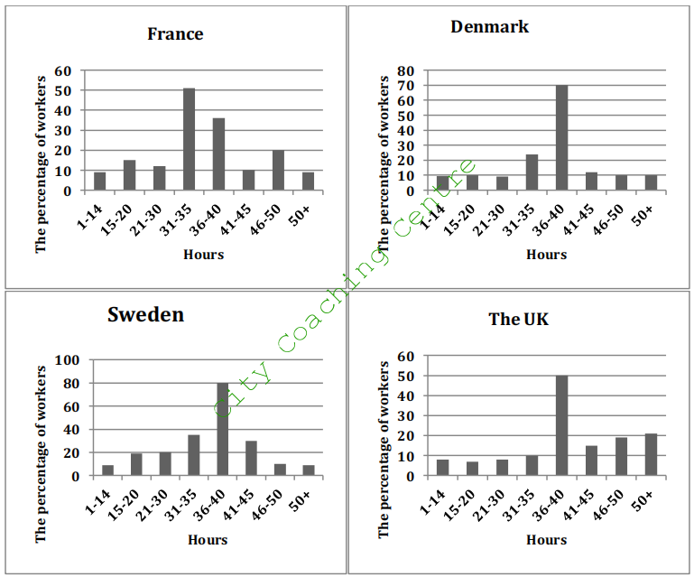
The given column graphs compare the number of hours spent on work per week by industrial workers in France, Denmark, Sweden and the UK in 2002. In three countries, it can be seen that the maximum workers worked 36-40 hours, but in France the maximum workers worked 31-35 hours per week.
In France, approximately half the workers worked for 31-35 hours per week. The percentage of people who worked for 36-40 hours and 46-50 hours was 35% and 20% respectively. The figures for the rest of the working hours accounted for around 10% workers each.
Denmark and Sweden witnessed the highest proportion of people working for 36-40 hours, which was quite different from that of France. The second and the third place came from 31- 35 hours and 41-45 hours workers (25% and 10% in Denmark; 35% and 30% in Sweden). The proportion of people working for the remaining hours was higher in Denmark than in Sweden.
It is interesting to note that in the UK, the percentage of people working 50+ hours was the maximum. Almost 50% worked 36-40 hours per week.
Overall, France was a country where the people worked for the least hours, where as the Swedish people spent the most time on work among the people from four different countries.
5.
The chart below shows the aid from six developed countries to developing countries from 2008-2010. Summarize the information by selecting and reporting the main features, and make comparisons where relevant.
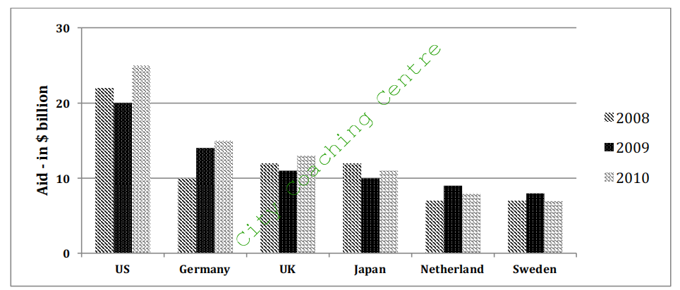
The given column graph illustrates the amount of aid given by six developed countries from 2008 to 2010, measured in billions of dollars.
The US provided the most aid in all three years and despite a slight drop in 2009 from 22 to 20 billion dollars in 2009, the figure rose to $25 billion in 2010. Germany, UK and Japan, were other three major donors, with figures ranging between 10 and 15 billion dollars. It is interesting to note that Germany increased its aid continuously over the years, but the aid from the other two showed fluctuations. The aid from Netherlands and Sweden was always under $10 billion, yet the three years saw similar changes in the figures.
Overall, the US contributed the most in supporting the developing world. whilst the aids of most countries fluctuated in three years, Germany was the only country with consistent increases.
6.
The graph below shows the information on waste disposal in a European country from 2005 to 2008. Summarise the information making comparisons where relevant.
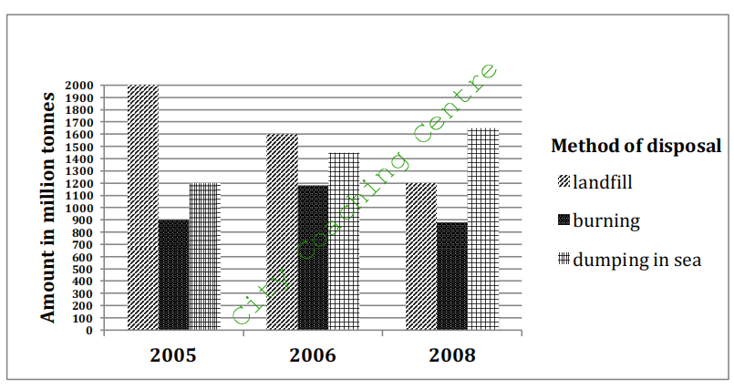
The given column graph illustrates three methods of disposal of waste materials in 2005, 2006 and 2008. It is clear that the landfill method was the most used for waste disposal in 2005 and dumping in sea was used the maximum in 2008.
It is clear that about 2000 million tonnes of waste was disposed by landfill method in 2005. Disposal of waste by this method lost popularity gradually and by 2008, only 1200 million tonnes was disposed off by this method. About 900 million tonnes of waste was burnt and about 1200 million tonnes was dumped in sea.
In 2006, again the most popular method of waste disposal was landfill, but the amount disposed was lesser than that in 2005. Just under 1200 million tonnes was disposed off by burning and a little over 1400 million tonnes was dumped in sea.
In 2008, the most popular method was dumping in sea and over 1600 million tonnes was disposed off like this. A little under 900 million tonnes was burnt.
Overall it can be seen that dumping in landfill sites lost popularity and dumping in sea gained popularity in the given time. The burning method of waste disposal fluctuated over the period.
7.
The chart below gives information about the growth of urban population in certain parts of the world including the prediction of the future. Summarise the information by selecting and reporting the main features and make comparisons where relevant.
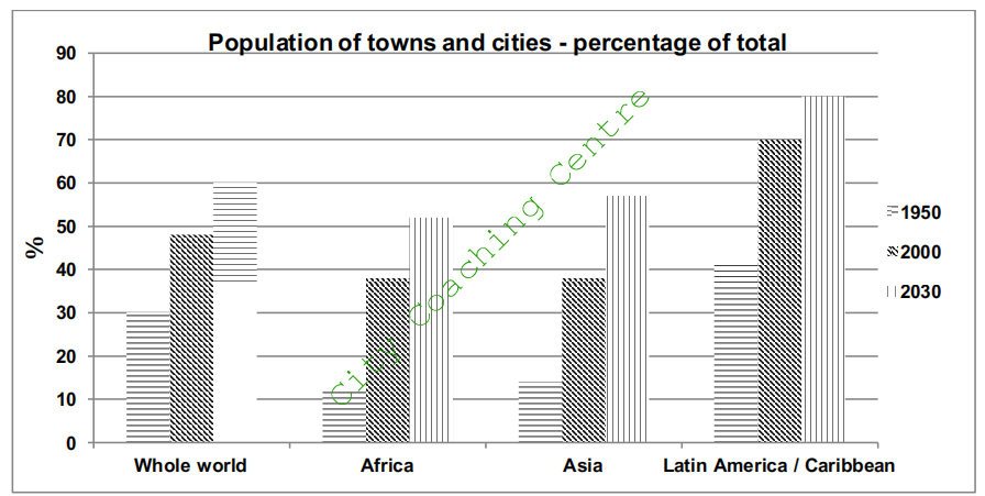
The given column graph depicts the increase in the percentage of urban population in Africa, Asia, Latin America / Caribbean and the whole world from 1950 to 2000 and also gives predictions for 2030. It can be seen that population escalated in all given areas of the world and is expected to grow further.
In 1950, Latin America and the Caribbean had the maximum urban population, which constituted 42% of the total population. In contrast, Asia and Africa had much lesser people living in cities at 14% and 12% of the total population respectively. Just under a third of the population was of urbanites in the whole world in 1950.
In 2000, Africa and Asia saw an almost threefold increase in urban population. In both these areas city population became approximately 38% of the total. Latin America and the Caribbean had over two thirds of the population in cities. However, the whole world had almost equal number of rural and urban people in 2000.
It is predicted that by 2030 the urban population will continue to grow in all areas by 10- 15%. Almost 80% of people in Latin America and Caribbean are expected to live in cities, whereas in the whole world the percentage of urbanites is estimated to be 60%.
Overall, it is clear that urban population has grown in all the given areas and is expected to grow in the future.
8.
The graph below shows the changes in the places where people used to surf the Internet in the years 1998, 2000, 2002 and 2004. Summarize the information by selecting and reporting the main features and make comparisons where relevant.
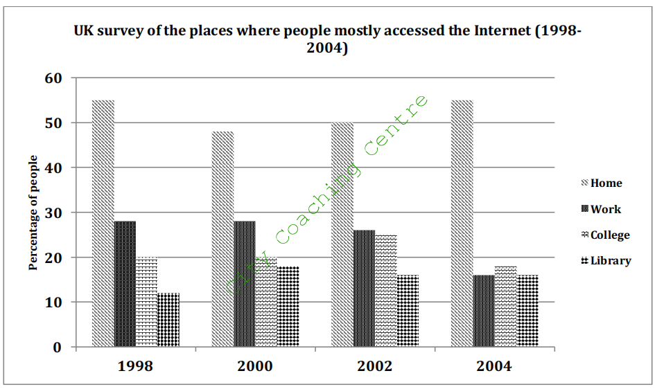
The given column graph compares the changes in the places where people accessed the Internet between 1998 and 2004. It is clear that the maximum people surfed the Internet from home in all the given years.
It can be seen from the graph that more people surfed the Internet at home and in their working places than in the colleges and libraries. The percentage of people who accessed the Internet from home fell from approximately 55 in 1998 to 48 in 2000. After that this percentage began to rise steadily and reached 55 in 2004. The second most common place where people accessed the net was office. The proportion of people who spent their online time at work was between 25% and 30% from 1998 to 2002, but fell to 15% in 2004. Approximately 18%-25% people used the Internet at college in all the given years. The least percentage surfed the net in libraries. This percentage fluctuated between 12% and 18% over the given years.
Overall, the discrepancy between people surfing the net from home and all other places was high in all the four given years.
9.
The charts below show the percentages of male and female students getting top grades in 1960 and 2000. Summarise the information by selecting and reporting the main features and make comparisons where relevant.
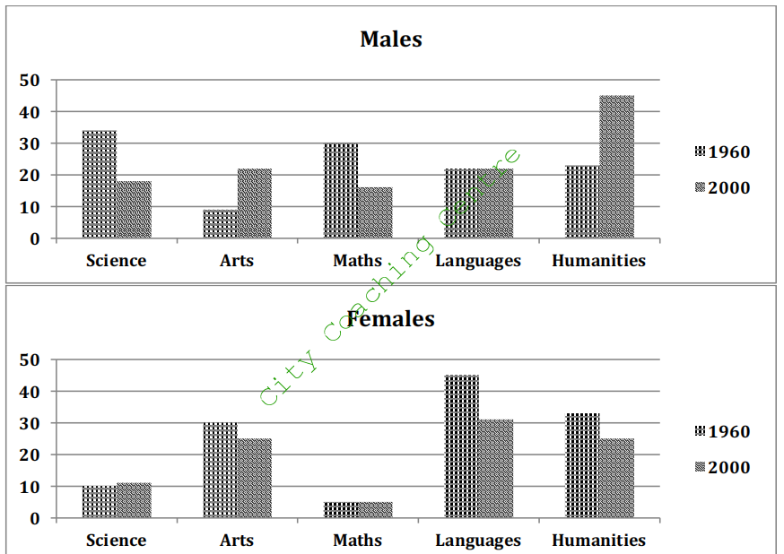
The given column graphs compare the proportion of boys and girls getting top grades in five subjects, which are science, arts, maths, languages and humanities, in 1960 and 2000. It is clear from the graph that girls scored higher in Arts and languages, whereas boys scored higher in science and math in the given years.
In 1960, slightly over 30% boys scored good grades in science and maths, whereas in languages and humanities the high scorers were 20% each. Only one in ten scored high in Arts. In contrast, girls did much better in languages, Arts and humanities, with 45%, 32% and 30% scoring high in these subjects respectively. Only 10% girls scored high in science and the least (5 %) scored high in maths.
In 2000, among boys, the percentage of top scorers in arts and humanities almost doubled where as that in science and math became approximately half as compared to the figures of 1960. The percentage of top scorers in languages remained the same. Among girls, however, the percentage of top scorers in arts, languages and humanities decreased moderately, whereas that in science and maths remained the same.
Overall, it is surprising to see that boys scored better than girls in humanities in the year 2000.
10.
The graph below shows the average class size in six countries and compares it with the world average class size in 2006. Summarise the information by selecting and reporting the main points and give comparisons where relevant.
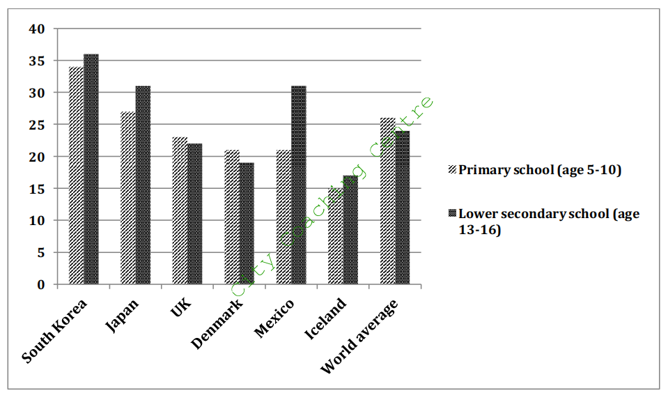
The given column graph illustrates the average class size in primary school and lower secondary school in six nations in 2006, and compares it with the world average. On the whole, the class size of primary school in the UK and Denmark was larger than the class size of lower secondary school, whereas in the other given countries it was smaller.
It is clear that the UK and Denmark had higher number of students in primary school (23 and 21 respectively) than those in secondary school (22 and 19 respectively). A similar trend was seen in the world average, with 26 and 24 students in primary and secondary classes respectively. South Korea had the highest number of students in both primary and secondary classes (nearly 35 in each class). Japan had an average primary class of 26 students, whereas the secondary class size was slightly bigger with 31 average students. The biggest discrepancy in primary and secondary class size was seen in Mexico, where the primary class strength was only about 20 students, but secondary class had a little over 30 students. Iceland had the smallest primary and secondary classroom size of 15 and 17 students on an average respectively.
Overall, the teacher-taught ratio was the best in Iceland with the smallest classroom size.
11.The chart below shows information about the favourite subjects of 60 students from two schools, school A and school B. Summarize the information by selecting and reporting the main features, and make comparisons where relevant.
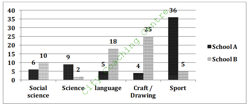
The given column graph illustrates the best-loved subjects of 60 students of two schools, School A and School B. It is clear from the graph that the choice of subjects varies greatly between the two schools.
In school A, more than half the students (36) like sports. By contrast, the rest of the subjects are not very popular among students in school A.
In school B, 25 students like craft and drawing which is more than six times the students number of school A. Language is the second most preferred subject in school B, chosen by 18 students. Social science is the third most liked subject, with 10 students of school B liking it, which is almost double the number of students of school A, who like it. Only two students of school B like science, where as 9 of school A like science. The biggest discrepancy can be seen in those choosing sports as their favourite subject, with 36 students of school A going for sports, in contrast to only 5 of school B.
Overall, craft and drawing is the least preferred subject of school A students, whereas science is the least liked subject of students of school B.
12.
The graphs below show four categories of citrus fruits and the top three countries to which these were exported (in thousand tonnes) in 2012. Summarise the information by selecting and reporting the main features and make comparisons where relevant.
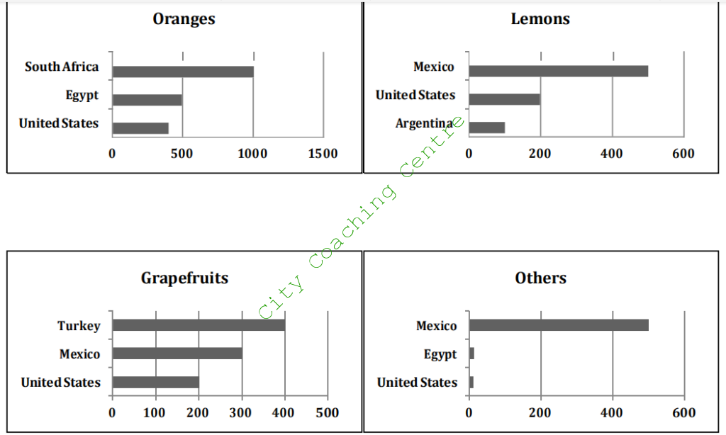
The given bar charts compare the top three countries importing different types of citrus fruits in 2012. The fruits given are oranges, lemons, grape fruits and all other citrus fruits.
As can be seen from the chart, oranges were the most popular fruit. More specifically, South Africa was the country where the largest number of oranges were exported amounting to 1020 thousand tonnes approximately. This was followed by Egypt (500 thousand tonnes) and the United States, which imported the smallest amount (400 million tonnes) of oranges among the three countries.
Lemon was the second popular fruit in the four categories, with 500,000 tonnes imported by Mexico and 200 imported by the USA. The minimum amount was imported by Argentina (100,000 tonnes).
Grapefruits did not constitute a large proportion of the imported fruit. Turkey was the main country that imported grapefruits, while Mexico and United States imported 400,000 and 300,000 tonnes respectively.
The largest import of all other citrus fruits was done by Mexico. The other two countries only accounted for a tiny proportion of the whole volume.
Overall, the export quantities of different fruit varied among different countries in 2012.
13.
The graphs below show the average retirement age for men and women in 2004 and 2008 in six different countries. Summarise the information by selecting and reporting the main features and make comparisons where relevant.
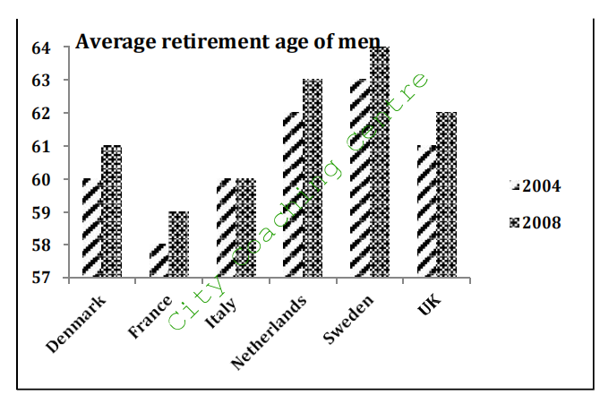
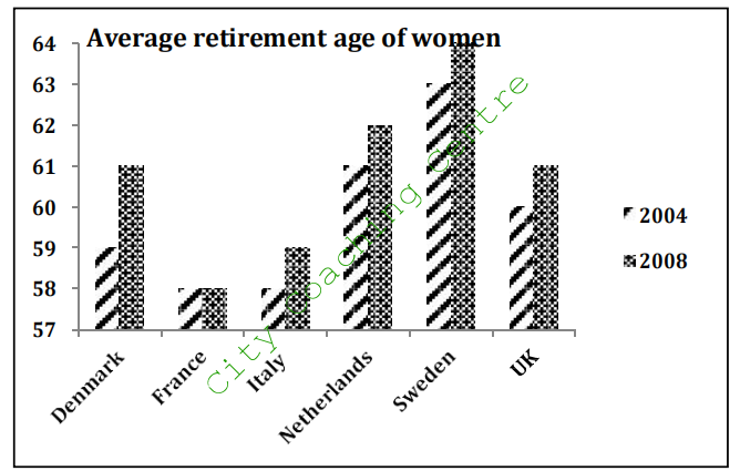
The given column graphs compare the retirement age of males and females in six countries in 2004 and 2008. Overall, the retirement age increased in all countries with the exception of Italy, among men, and France, among women, where it remained the same in the given years.
The Danish men and women retired at the ages of 60 and 59 respectively in 2004, but in 2008 they both retired at the age of 61. The average age of retirement for both genders was the lowest in France, with the men retiring at the age of 58 in 2004 and at 59 in 2008. Women retired at the age of 58 in both the given years. The Italian men retired at 60 years in 2004 as well as 2008, whereas women retired at a younger age in both the years as compared to men. The age of retirement for women was 58 in 2004 and 59 in 2008. A similar trend in retirement ages was seen among the Dutch, Swede and British males and females with the increase of one year in each case in 2008 as compared to 2004.
To conclude, a striking feature of the graph is that the retirement age for both sexes was the highest in Sweden in comparison with all other given countries.
14.
The graph below shows the percentage of dependents in 2000 and the predicted figures in 2050 in five countries, and also gives the world average. Summarise the information by selecting and reporting the main figures and make comparisons where relevant.
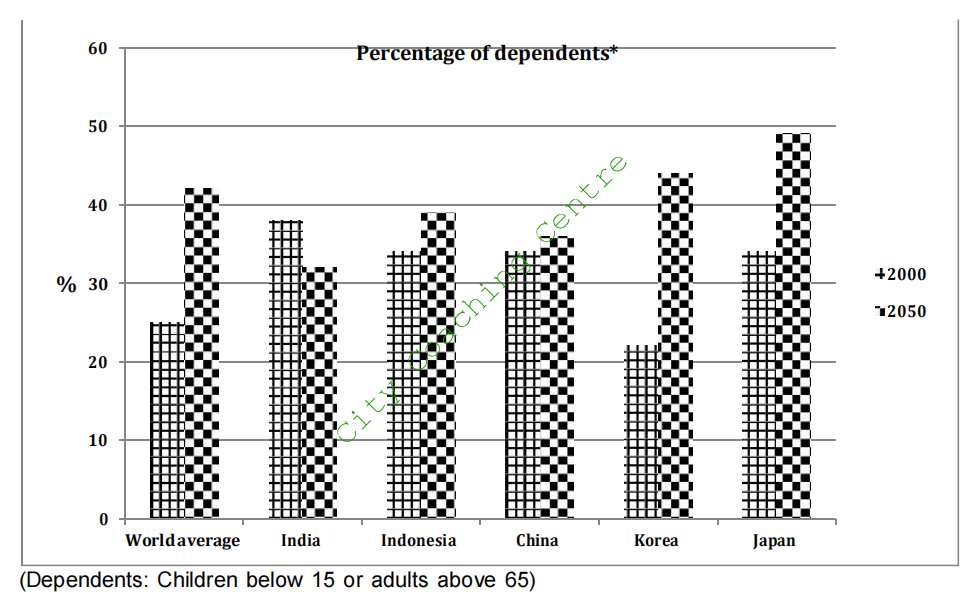
The given column graph illustrates the percentage of dependents (children below 15 or adults above 65) in five countries in 2000 and also gives projections for 2050. It also depicts the world average in the given two years.
In 2000, India had the maximum percentage of dependents (38%), with Japan, Indonesia and China following closely behind with around 34% of dependents. Korea had the least percentage of reliant people (22%). The overall world population of children below 15 and adults over 65 was 25%.
Looking into the future, an increase in the population of dependents is predicted for Indonesia, Korea, China and Japan. In contrast, in India the needy population is thought to fall from 38% to 32%. In Korea the population is expected to double by 2050, from 22% to 44%. Approximately 15% rise in such population is predicted for Japan, whereas China is thought to show the least increase (2%). The world average of the dependents is expected to go up from about 25% to nearly 42%.
Overall, the percentage of dependents is expected to decrease in India whereas in other four countries it is projected to increase.
(Note the language for the future and the synonyms for dependents)
15.
The chart shows the information relating to people within 15-minute drive service in a particular region in UK. It also compares the people living in urban areas and people living in rural areas. Write a report for a university lecturer describing the information given below.
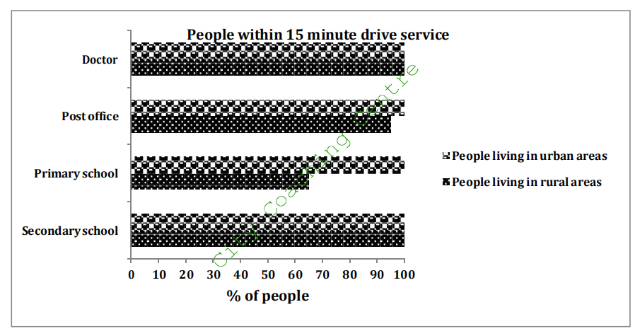
The given bar graph compares the access to medical, educational and postal services by the city and countryside people in a specific region in the United Kingdom. Overall, it can be seen that almost all urban people are within fifteen-minute drive to all these mentioned services.
Cent-percent urban and rural people have access to medical facilities. They are all within fifteen minutes drive to a doctor. Similarly, secondary school can be reached within 15 minutes by all residents of villages and cities. All city people have a post office in their propinquity. However, five per cent of villagers have to drive more than fifteen minutes to avail postal services. The biggest discrepancy lies in primary school facilities. Only sixty five percent of villagers have a primary school within a quarter of an hour drive, where as the remaining, approximately, one third inhabitants of countryside have to drive their children to far-off schools.
Overall, the rural and urban communities have similar access to medical, postal and secondary school facilities but only about a third of villagers do not live close to a primary school.
16.
The graph below shows the percentage of adults according to age and gender who do not do any physical activity in Australia. Summarise the information by selecting and reporting the main features and make comparisons where relevant.
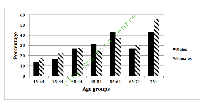
The given column graph compares the percentage of men and women of seven different age groups who lead a sedentary life in Australia. It can be clearly seen that except for the 45 to 64 year olds, all other age groups have more females than males who do not do much physical activity.
The 15-24 year age group is the most active with only about 14 and 17 % men and women respectively who don’t do much physical activity. The 25-34 age group has a little more percentage of people following a leisurely way of life. As age advances the percentage of easy-going men and women also is seen to be on the rise, with the exception of the 65-74 age group. Surprisingly, in this age group the number of males and females doing no physical activity is lesser than that of the 55-64 age group. However, the 75+ age group has the maximum number of both genders doing no physical work.
Overall it is clear that as age goes up more and more people start leading physically inactive lives except for the 65-74 year olds, and in most age groups more females than males lead sedentary lives.
17.
The graph below shows the result of a survey of young people in four European countries on the most effective solution of global warming. Summarise the information making comparisons where relevant.
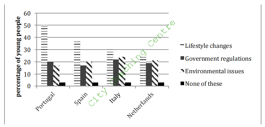
The given column graph elucidates the outcome of a survey as to the best solution of global warming among the people of four European countries, which are Portugal, Spain, Italy and the Netherlands. It is clear from the graph that lifestyle changes were rated as the best solution by the maximum youth of all the countries.
50% of the Portuguese young people rated lifestyle changes as the best solution for global warming. Government regulations and environmental issues were considered the best ways to solve global warming by 20% and 17% respectively. The maximum Spanish young generation also was of the view that lifestyle changes were the most effective solution but their percentage was lesser than that of the Portuguese in this respect. 17% and 20% young people of Spain rated government issues and environmental factors as the best solution. The overall trend of the Spanish, the Italian and the Dutch youth was the same for all the factors with minor differences in percentage.
Overall, only a small minority of the youth of all the countries opined that none of these factors could help reduce global warming.
18
The graph below shows the way in which men and women used the Internet in Canada in 2000. Summarise the information making comparisons where relevant.
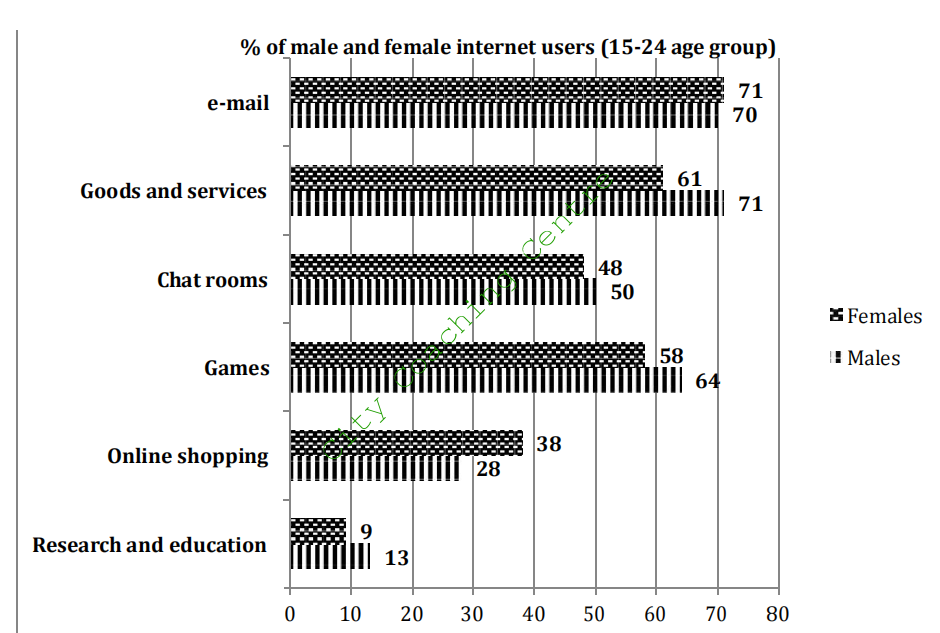
The given bar graph compares the percentage of males and females, of 15-24 age group, who used the Internet for various purposes in Canada in 2000. It is manifest from the graph that the least percentage of both genders used the Internet for research and education.
It is clear from the graph that the maximum number of men used the Internet for goods and services (71%). The second most popular use among the males was for sending e-mails (70%). A slightly higher percentage of women (71%) used the Internet for e-mails. However, a significantly lesser percentage (61%) of women used the Internet for goods and services.
Chat rooms were almost equally popular among both genders with 50% males and 48% females using the internet for this purpose respectively. Online shopping was more popular among women. 38% women used the net for this purpose and only 28% men used the Internet for online shopping.
Games were slightly more popular among males (64%) than females (58%). Research and education was the least popular activity among both men and women. 9% women and 13 % men used the Internet for this purpose.
Overall, it can be seen that women were ahead of men in using the internet for e-mailing and online shopping. In all other given activities, males superseded women.
19.
The graph below shows the number of trips made by children in one country to travel to and from school in 1990 and 2010 using various modes of transport. Summarise the information by selecting and reporting the main features and make comparisons where relevant.
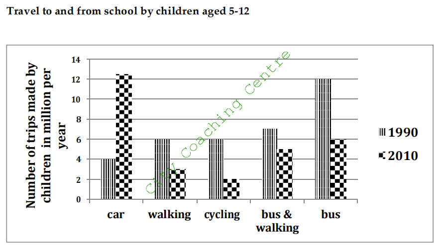
The given column graph illustrates the number of trips made by children in two separate years, which are 1990 and 2010 in a particular country. The vertical axis represents the number of trips in million per year and the horizontal stands for the different modes of transport like bus, car, walking, bicycle and, bus and walking together.
In 1990, the trips made by bus were dramatically higher than by other modes. About 12 million trips were made by bus, which was two times more than those made by walking and cycling each, and three times more than those made by car. About 7 million trips were made by bus and walking together.
Two decades later, in 2010, the car trips superseded all other modes and became approximately 12.5 million, an increase of 8.5 million from the figures of 1990. The bus trips decreased to half and became 6 million. Trips made by bus and walking together also decreased by 1 million from the figures of 1990. Trips made on foot also decreased from 6 to 3 million and those made by cycling reduced to 2 million.
On the whole, the column graph shows that bus was the most popular form of transport to go to and from school for children in 1990. However, in 2010, the car became the most popular mode.
20.
The bar chart below shows the average hours of housework done by women (unemployed, part time employed and full time employed) and full-time working men. Summarise the information by selecting and reporting the main features and
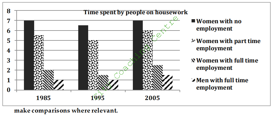
The given column graph illustrates the average time spent by men and women at different levels of employment on household chores over a period of two decades. It can be clearly seen that full time employed men spent the least amount of time on housework.
Women with no employment spent the maximum time on housework in the three given years. They spent 7 hours per day in 1985 and 2005 and 6.5 hours a day in 1995. A little less time was spent by part time employed women. They spent 5.5, 5 and 6 hours per day on household chores in 1985, 1995 and 2005 respectively. Women with full time employment spent lesser time on domestic work than the other two categories of women. They spent 2 hours per day in 1985; 1.5 hours per day in 1995 and 2.5 hours/day in 2005. Full time employed men spent one hour per day in 1985 and 1995 and 1.5 hours per day in 2005. No data is given for the unemployed men and men with part time employment.
Overall, it can be seen that full time employed women spent lesser time in household chores than unemployed and part-time employed women, but still they worked more than their male counterparts.
21.
The graph below shows the cinema attendance of people on different days of the week in 2003, 2005 and 2007. Summarise the information by selecting and reporting the main features and make comparison where relevant.
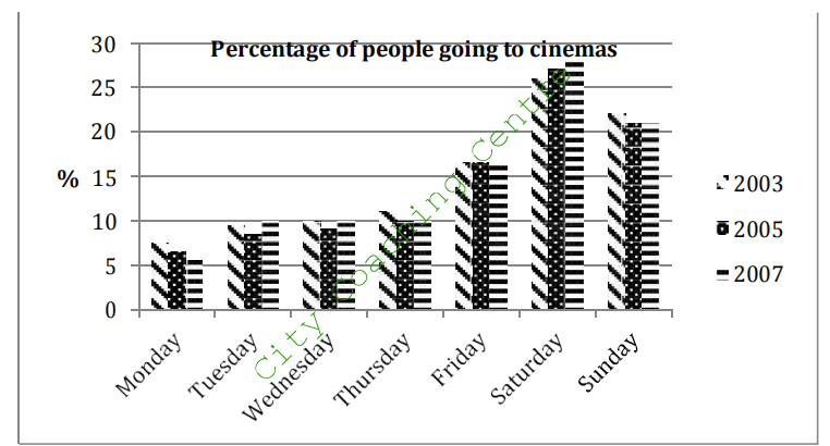
The given column graph depicts the percentage of people going to the cinemas on different days of the week, in 2003, 2005 and 2007. It is manifest from the graph that more people attended cinemas on weekends than on weekdays.
There was not much variation in the given three years in cinema attendance. In all the three years, which are 2003, 2005 and 2007, nearly 10% of people frequented the cinemas from Tuesdays to Thursdays. The least number of people viewed cinema on Mondays. This percentage was 7.5%, 6.5% and 5% in all the years respectively. A little over 15% watched the cinemas on Fridays, in all the three given years. On Saturdays and Sundays the cinema halls were flooded with people as over 25% and 20% went for viewing films on these two days respectively.
Overall, the number of people going to the cinemas grew slightly on Saturdays and the number frequenting cinemas on Mondays fell slowly over the given years.
22.
The following graphs depict the reliability of print and non-print academic materials as voiced by undergraduates and postgraduates at 3 different British universities. Summarise the information by selecting and reporting the main features and make comparisons where relevant.
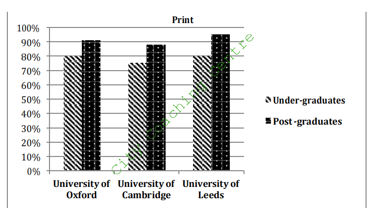
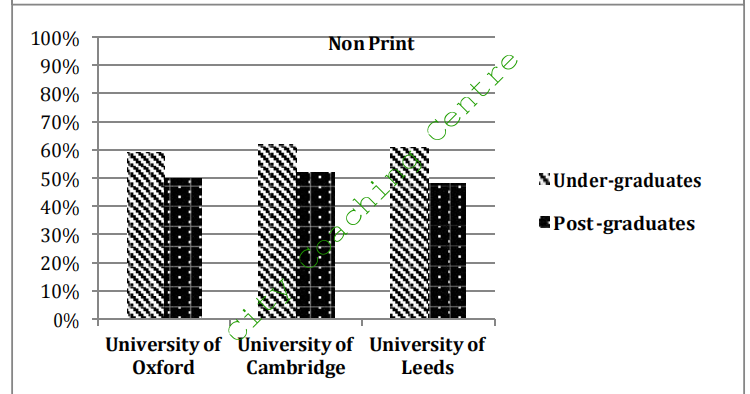
The two charts compare the views of undergraduate and postgraduate students from 3 different British schools on the reliability of print and non-print academic resources. In all the three given universities, students feel printed materials to be more reliable than the non- print materials.
75% of undergraduate students at Cambridge and 80% of undergraduate students at both Oxford and Leeds rate printed material ‘reliable’. However, postgraduates support printed materials in strengths of 92% at Oxford, 87% at Cambridge and 96% at Leeds. Thus, more postgraduates than undergraduates rate printed material reliable at these 3 schools.
However, this trend is reversed for non-print academic sources. Only 59% at Oxford, 63% at Cambridge and 61% at Leeds support non-printed materials among the under graduates. The proportion of postgraduates who feel positive about non-printed academic items are 50%, 54% and 47% respectively, for the same 3 schools.
The charts depict that postgraduates find printed material more dependable and under- graduates find non-printed material more reliable.
23.
The graph below shows the average calorie intake per person in eight countries in 2003. Summarise the information by selecting and reporting the main features and make comparisons where relevant.
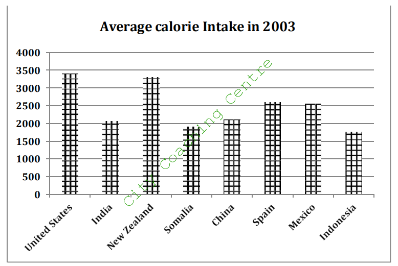
The given column graph compares the average calorie intake of eight different countries in 2003. It is manifest from the graph that the highest calorie intake per person was in the USA, whereas the least was in Indonesia in the given year.
The country with the highest caloric intake was the United States, with a staggering 3350 calories consumed per day on average. Not far behind was New Zealand, where people consumed about 3200 calories per day during the year in question. Intakes for Spain and Mexico were slightly higher than 2500 calories per day. On the lower side of the spectrum were countries like China, at 2200 daily calories, India, at 2100 daily calories, and Somalia and Indonesia, both at roughly 1800 calories per day. When comparing the highest and the lowest values, Americans had the highest calorie intake and Indonesians had the least calorie intake.
Overall, it can be seen that consumption for all countries varied between 1800 and 3350 calories per day.
24.
The chart below illustrates the result of a British survey on the types of houses people liked, taken in 2005. Summarise the information given below and make comparisons where relevant.
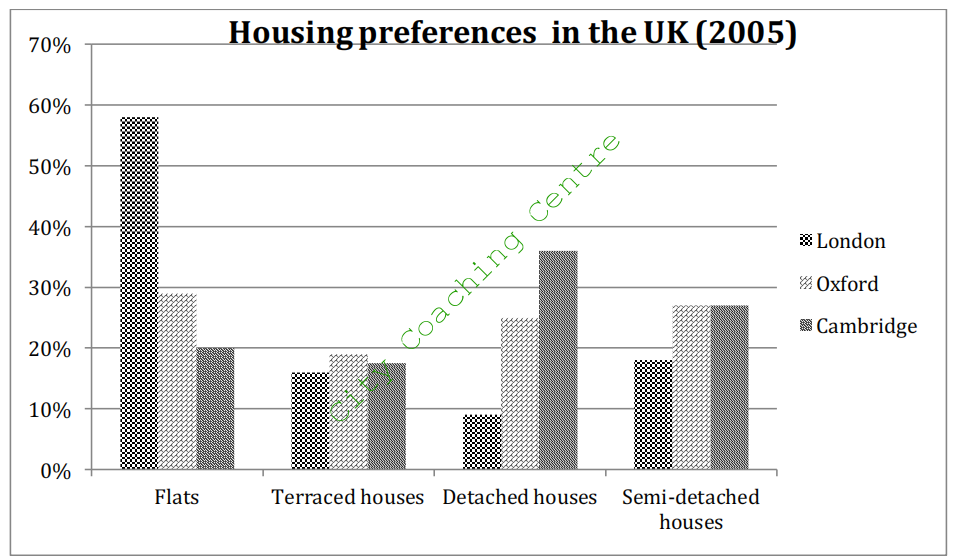
The given column graph illustrates housing preferences among people who lived in the British cities of London, Oxford and Cambridge in the year 2005. Four types of houses are mentioned, such as flats, terraced houses, detached houses and semi-detached houses.
58% of Londoners listed ‘flats’ as their preferred living arrangement, a number much higher than its Oxford and Cambridge counterparts, at 29% and 20% respectively. Fondness of terraced housing was roughly equal between the three cities, all of which showed figures within the 16% to 19% range. However, a stark difference was seen among the figures representing people who preferred detached houses, with London at 9%, Oxford at 25% and Cambridge at 36%. 17% of people living in London in 2005 preferred semi-detached style of housing. Oxford and Cambridge, however, both had figures of 27%.
Overall, people of London preferred flats and the people of Cambridge preferred detached houses.
25.
The following graphs illustrate electronic gaming trends in South Korea in 2006. The first outlines gamer age groups and gender demographics. The second indicates game type preference. Summarise the information by selecting and reporting the main features and make comparisons where relevant.
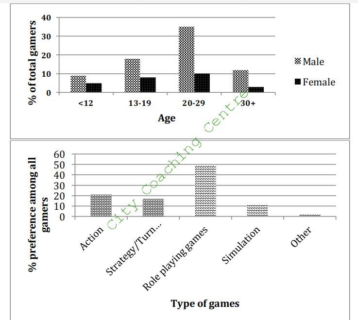
The given bar charts illustrate the trends of electronic gaming in South Korea in 2006. The first graph gives information about gamers’ age and gender, and the second compares gamers’ preferences for different types of games.
The first graph shows that there were more male gamers than female gamers in every single age group. Nearly half of all gamers (45%) were aged between 20 and 29 years, of which 35% were males and 10% were females. The second largest age group was of the 13 to 19 year olds, which made up 26% of all gamers. 14% gamers were younger than 12 years and15% gamers were older than 30 years.
According to the second diagram around 50% of gamers rated role-playing games the most popular in marked contrast to simulation, which was liked by only 10%. Other games, which did not fit into the given four categories, had the least popularity. The preferences for strategy/turn based and action games, on the other hand, were almost similar. Just a little more than 20% of gamers preferred the former, where approximately 17% favoured the latter.
From the bar graphs, one can conclude that far more males than females played electronic games, and role-playing was the top choice for game type in Korea, in 2006.
26.
The bar graph below outlines literacy rates for a number of nations in 2004. Write a report for a university lecturer describing the information shown here.
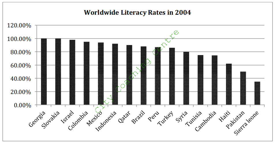
The given column graph illustrates the various literacy levels of a handful of countries around the world in 2004. The countries are plotted on the x-axis, whereas the literacy rate on the y-axis.
According to the graph, Georgians and Slovakians, with literacy rates of 100% were the most literate in the list for this time period. Israel ranked the third most literate, with roughly 97% literacy rate. Colombia, Mexico, Indonesia, Qatar, Brazil, Peru and Turkey appeared to share an almost identical literacy rate of 88%. Literacy in Syria in 2004 was slightly lower, at 80%, while Tunisia and Cambodia had a literacy rate of slightly below 70%. Haiti, at 62%, Pakistan, at less than 50% had fairly lesser literacy rates than the countries mentioned earlier. Sierra Leone, at 35%, made up the least literate country among the given countrie.
Overall, eleven of the countries given in the graph had a literacy rate of 80% or above literacy rate in 2004.
27.
The graph below outlines paper and plastic cup production at a factory over the period of one year. Summarise the information by selecting and reporting the main features and make comparisons where relevant.
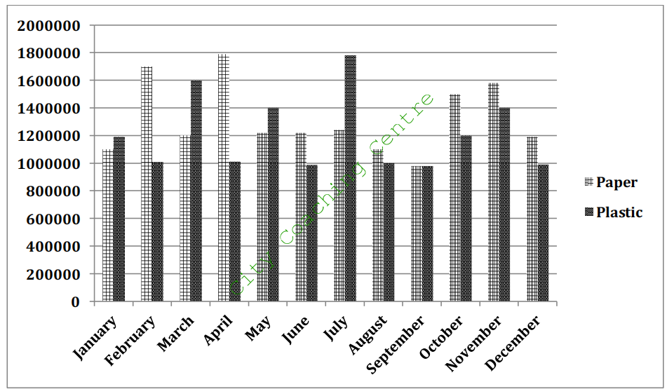
The given column graph shows the production of paper and plastic cups over the course of one year. No obvious correlation between the manufacturing levels of each cup type can be seen in the graph.
In January and March, about 1.1 million paper cups are manufactured. In between these two months the figure peaks at roughly 1.7 million in February and 1.8 million in April. 1.2 million paper cups are manufactured in May, June and July. After that there is a gradual decrease and by September, the production reaches 1 million cups. This number jumps to approximately 1.5 million units in October. Paper cup levels finish the year at slightly less than 1.2 million.
Plastic cups commence the year at 1.2 million units. Throughout the year there are fluctuations. The months of February, April, June, August, September and December all hover at roughly a million finished products each. Between these months, however, production values rise to varying levels, the highest of these being in July at 1.75 million
Overall, fluctuations are seen in the production of paper and plastic cups all over the year. The least production of both is seen in September.
28.
The two bar charts show the proportion of 14-16 year-old students studying a modern foreign language in an English speaking country, and the top three popular foreign languages. Summarize the information by selecting and reporting the main features, and make comparisons where relevant.
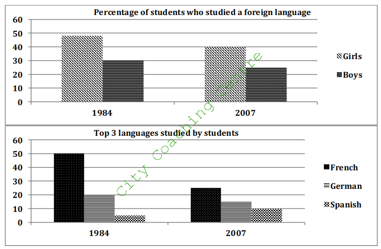
The given column graphs illustrate the percentage of boys and girls of 14-16 year age group studying foreign languages, and the top three foreign languages opted by those children of an English speaking country. It is clear that more girls than boys studied foreign languages, and French was the most popular out of the three given languages.
Just-under 50% girls and 30% boys studied foreign languages in 1984. This number fell among both genders and in 2007 40% girls and approximately 25% boys were studying foreign languages.
In 1994, French was the most popular language and was studied by 50% students. The percentage of students studying French nearly halved and became about 25% by 2007. German also lost popularity as the proportion of students studying German fell from 20% to 15% over the given period. Spanish was the least popular language in the given two years, but surprisingly it is the only language whose popularity grew over time. In 1984, 5% students studied Spanish but 10% opted for Spanish in 2007.
Overall, there were maximum French learners and the minimum Spanish learners in the given years.
29.The graph below shows the number of magazines sold in 5 different countries in 2005 and 2015. A prediction for 2025 is also given. Summarise the information by selecting and reporting the main points and make comparisons where relevant.
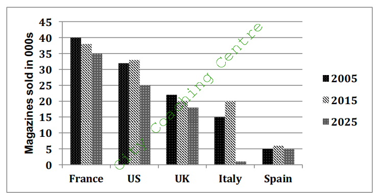
The given column graph depicts the number of magazines sold in five countries from 2005 to 2015, with a prediction till 2025. It is clear from the graph that in France and the UK, the number of magazines sold decreased from 2005 to 2015 and are predicted to decrease in the future also. However, in the US, Italy and Spain the number of magazines sold increased from 2005 to 2015, but a decrease in sales is predicted for 2025.
The French were the most ardent magazine readers and are projected to remain so till 2025. 40,000 magazines were sold in France in 2005 but this number fell to approximately 37,500 by 2015 and is predicted to fall further by 2025 and reach 35,000. The number of magazines sold in the UK was far less than those sold in France, but the trend was identical. 22,000 magazines were sold in the UK in 2005 but by 2025 the number is forecast to fall to 18,000.
The least number of magazines (5,000) were sold in Spain in 2005, and after a slight rise in 2015 the number is again predicted to reach 5,000 by 2025. In the US, the second highest number of magazines was sold in 2005 but here again the number is expected to fall to 25,000 by 2025. The most striking prediction is for Italy. The number of magazines sold were 15,000 in 2005, 20,000 in 2015 but are predicted to fall to 1,000 by 2025.
Overall, the French magazines were sold the most, whereas the Spanish magazines were sold the least, and this trend is expected to remain so by 2025.
30.
The graph below shows the amount of tea and coffee imported by four different countries. Summarise the information by selecting and reporting the main points and make comparisons where relevant.
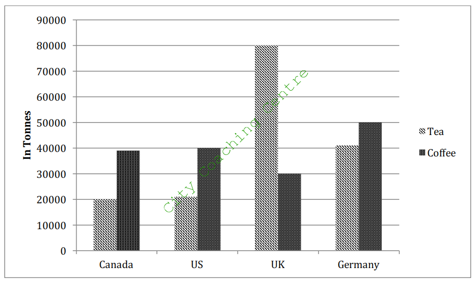
The given column graph illustrates the amount of tea and coffee imported in Canada, the USA, the UK and Germany. It is clear from the graph that only in the UK more tea is imported than coffee and the maximum tea (80,000 tonnes) is imported by the UK.
Canada and the USA import almost equal amount of tea and coffee each, which is 20,000 tonnes and 40,000 tonnes respectively. The Germans import double the amount of tea (40,000 tonnes) than Canada or the USA but the amount of coffee imported is only 10,000 tonnes more at 50,000 tonnes. The highest discrepancy is seen in the amount of tea and coffee imports in the UK where 80,000 tonnes of tea is imported and about 30,000 tonnes of coffee is imported.
Overall, it is interesting to note that the UK takes the lead in importing both these beverages with a total of 110,000 tonnes. Germany follows closely by importing a total of 90,000 tonnes whereas US and Canada import 60,000 tonnes each.
31.
The bar chart below shows about the average children born per woman in 5 countries in 1970 and 2000. Summarise the information by selecting and reporting the main features and make comparisons where relevant
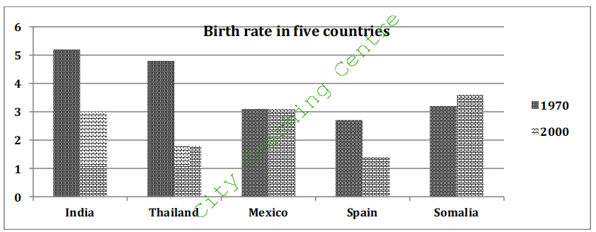
The given column graph illustrates the birth rate in 5 countries namely India, Thailand, Mexico, Spain and Somalia. It is clear from the graph that in Somalia the number of births per woman increased over time, whereas in all other given countries, either the birth rate remained the same or decreased over a period of three decades.
In 1970, India superseded all the given countries by having 5.2 births per woman. It was closely followed by Thailand at 4.8 births per woman. Mexico, Spain and Somalia had between 2.8 and 3.1 births per woman.
In 2000, Somalia took the lead and had the highest number of childbirths per woman (3.6 approximately). India and Mexico both had around 3 births per woman. Spain and Thailand had between 1 and 2 childbirths per woman.
Overall, in Mexico the birth rate did not change over time. India, Thailand and Spain showed a significant downward trend in the birth rate. Somalia showed an upward trend in the number of children born per woman.
32.
The diagram below shows the percentage of share of total world production of wheat by Asia, Europe and other part of the world from the years 1840 to 2000. Summarise the information by selecting and reporting the main features and make comparisons where relevant.
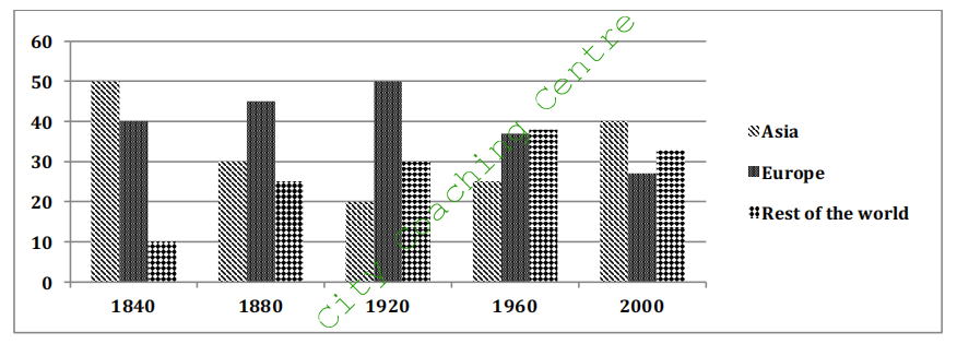
The given column graph gives information about the share of total world production of wheat in Asia, Europe and the rest of the world, from 1840 to 2000. In general, no specific trend can be seen in all the three regions.
In 1840, Asia had the highest share of wheat production (50%), whereas Europe produced 40% and the rest of the world only produced 10%. The production of wheat in Asia fell significantly and reached an all time low of 20% by 1920, after which it picked up again and became 40% by 2000. Europe’s share of wheat production increased steadily till 1920 and reached 50%, after which it dropped and bottomed at approximately 27% by 2000. Wheat produce from the rest of the world escalated moderately till 1960 and reached 38% but after that showed a slight fall and became 33%.
Overall, it can be seen that by 2000, the difference in all the three regions in terms of wheat production was not much pronounced, but Asia was the undisputed leader.
33.
The column graph shows the percentage of males in a particular country who prefer watching sports to males who prefer participating in sports. Summarise the information by selecting and reporting the main features and make comparisons where relevant.
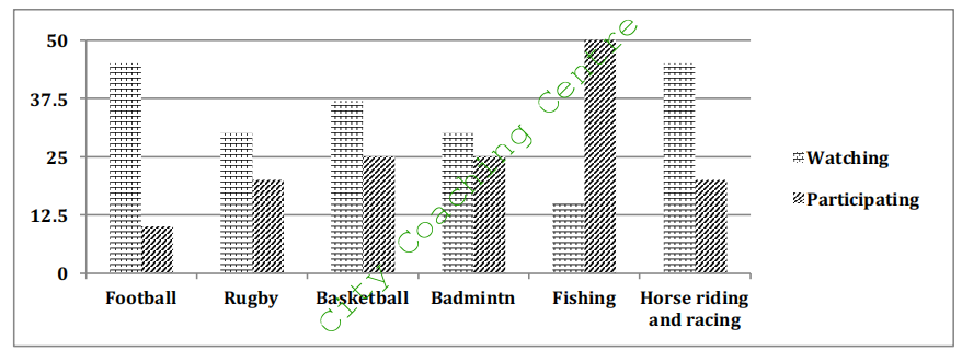
The given column graph compares the ratio of males who prefer watching sports events and that of those who would rather take part in sports activities. It can be seen that fishing is the only sport, which has more participants than spectators.
As shown in the graph, a large percentage of males (40%) in that particular country enjoy watching football and horse riding and racing. Approximately 36% like to watch basketball. Surprisingly, an equal proportion of males treat rugby and badminton as their favourite sports for watching, accounting for roughly 27%.
In terms of the people who choose to participate in sports instead of watching, 50% of them take fishing as their first choice. However, 25% of males choose to take part in basketball and badminton, while football is the last sports they would like to try.
To sum up, fishing is the most popular sports event in which males in this specific nation would like to take part, while it is the last event they would choose to watch.
34.
The bar graph shows the global sales (in billions of dollars) of different types of digital games between 2000 and 2006. Summarise the information by selecting and reporting the main features, and make comparisons where relevant.
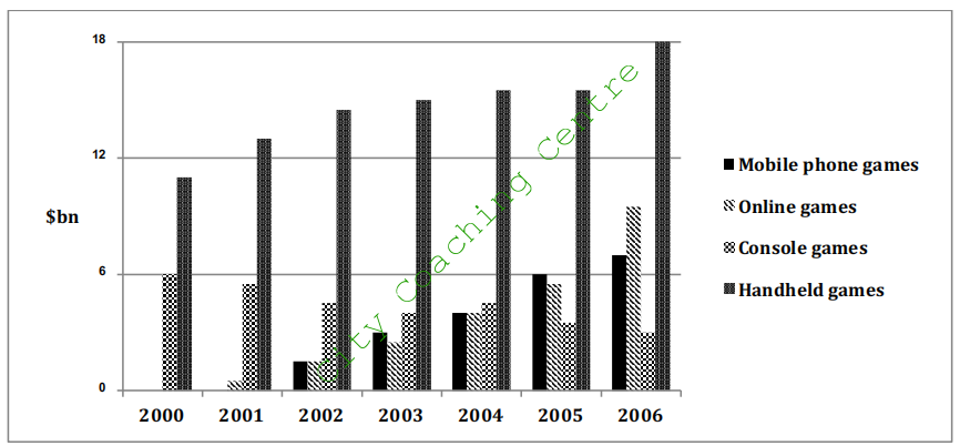
The given column graph compares the turnover in billion dollars from sales of video games of four different types, namely mobile phones, online games, console games and handheld games, from 2000 to 2006. It is manifest from the graph that hand-held games ruled the market in the entire given period.
It is clear that sales of games for three out of the four types rose each year, leading to a significant rise in total sales over the 7-year period. Sales figures for handheld games were the highest in almost every year.
In 2000, worldwide sales of handheld games stood at around $11 billion, while console games earned just under $6 billion. No figures are given for mobile or online games in that year. Over the next 3 years, sales of handheld video games rose by about $4 billion, but the figure for consoles decreased by $2 billion. Mobile phone and online games started to become popular, with sales reaching around $3 billion in 2003.
In 2006, sales of handheld, online and mobile games reached peaks of 17, 9 and 7 billion dollars respectively. In contrast, sales of console games dropped to its lowest point, at around $2.5 billion.
35.
The graph below shows the three different kinds of emission sources (oil / coal / gas) of greenhouse gas in the UK. Summarise the information by selecting and reporting the main features and make comparisons where relevant.
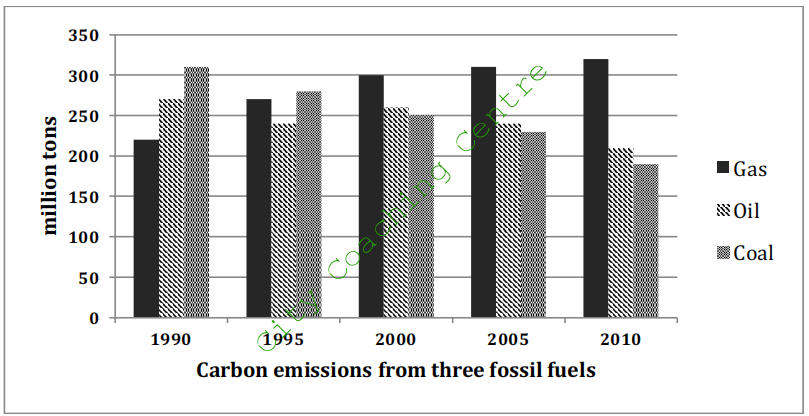
The given column graph depicts the quantities of emissions of greenhouse gases in million tons from three fossil fuels which are gas, oil and coal over a period of two decades. It can be clearly seen that the emissions from gas showed a downward trend, from coal showed an upward trend, whereas the emissions from oil fluctuated over the period.
In 1990, the greenhouse gas emissions from gas stood at 220 million tons. These emissions increased gradually and reached 320 million tons by 2010. The emissions from coal fell markedly from 310 million tons to 190 million tons over the given period of twenty years. The carbon emissions from oil showed fluctuations till 2000 but after that there was a slow decline in carbon emissions till 2010. In 2010 the emissions became 210 million tons from 270 million tons.
Overall, it is interesting to see that from 1990 to 2010, the emissions from gas went from being the least to the most dominant.
36.
The graph below shows the participation of Australian children in sports outside school hours in 2014. Summarise the information by selecting and reporting the main features and make comparisons where relevant.
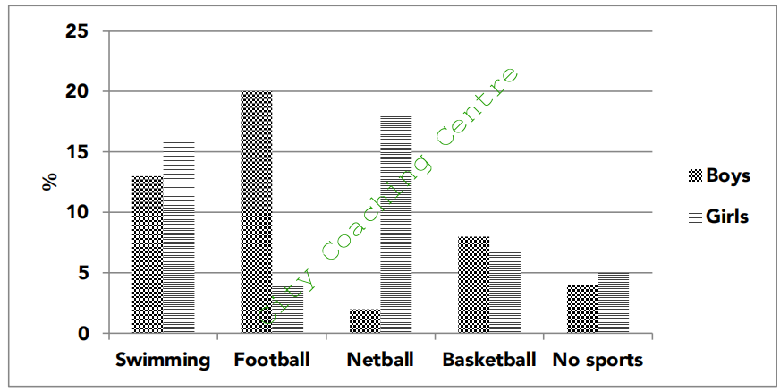
The given column graph compares the percentage of Australian boys and girls who participated in sports as extra-curricular activity in 2014. It is interesting to note that only 4% boys and 5% girls did not participate in any sports after school hours.
Swimming was slightly more popular among girls than boys, with about 13% boys and 16% girls participating in it. By contrast, basketball was minimally more popular among boys with 8% boys and 7% girls participating in it. Football was most popular among boys with 20% playing football after school hours. Only a small minority (4%) girls played football. Netball, on the other hand, was more popular among girls with 18% playing it and only 2% boys liked netball. Therefore netball and football show opposing trends between both genders.
Overall, netball could be labeled as a game for girls and football for boys, according to this graph. Boys and girls in Australia clearly had different preferences for after school sports activities.
37.
The graph below shows the sales of children’s books, adult fiction and educational books between 2002 and 2006 in one country. Summarise the information by selecting and reporting the main features and make comparisons where relevant.
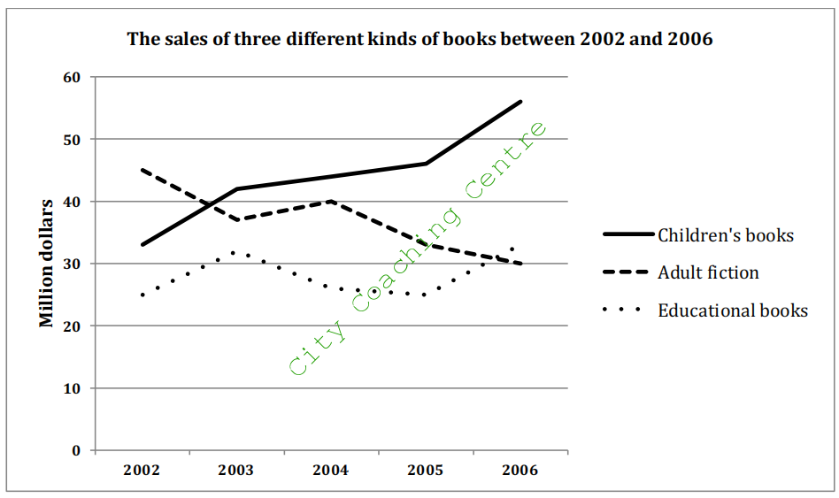
The given line graph compares the sales of three different types of books from 2002 to 2006. It is evident that the sale of educational books and children’s books showed an upward trend, but adult fiction lost popularity over the given time period.
In 2002, adult fiction was on top with a sale of 45 million dollars, followed by children’s books at 33 million dollars and educational books at 25 million dollars. After a few fluctuations, the sale of adult fiction declined to 30 million dollars by 2006. In contrast, educational books were the least sold in 2002. After that their sale showed an opposing trend to that of adult fiction and reached $32 million by 2006.
Sales of Children’s books’ started at $32 million in 2002, but rose rapidly to 42 million dollars in 2003. From 2003 to 2005 there was a very slight increase in sales, but after 2005, sales grew considerably and reached an all time high of $56 million.
Overall, children’s books ruled the market after 2003, among the given three categories of books.
38.
The line graph below shows the population size, birth rate and the death rate of England and Wales from 1700 to 2000. Summarise the information by selecting and reporting the main features and make comparisons where relevant.
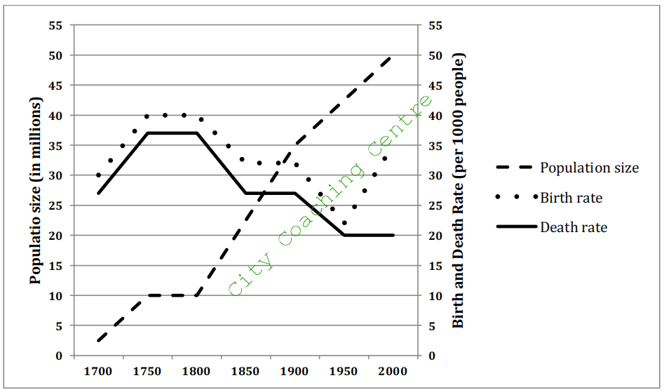
The given line graph illustrates the information about the population size, and also compares the birth and mortality rate of England and Wales for a period of 300 years starting 1700. It is evident that the population showed an upward trend, whereas death and birth rate showed a fluctuating trend.
The death and the birth rates followed a similar trend from 1700-1950. From 1700-1750, an increase was seen in both these, with the birth rate rising from 30 to 40 births per 1000 people and the death rate increasing from 27 to 37 per 1000 people. There was stability in both for the next 50 years, after which there was a sharp fall with both rates reaching an all time low of around 20 per thousand people by 1950. In between, from 1850 to 1900, birth and death rate again showed a leveling off. From 1950 to 2000, the death rate remained stable. In contrast, the birth rate increased dramatically, from 22 to 35 births per 1000 people.
The three centuries saw a dramatic escalation in population from 2.5 million in 1700 to 50 million in 2000, with a short period of stability from 1750-1800.
39.
The graph below shows the number of overseas visitors who came to the UK for different purposes between 1989 and 2009. Summarize the information by selecting and reporting the main features, and make comparisons where relevant.
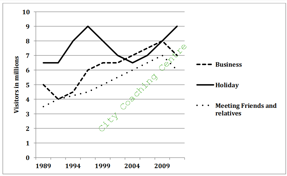
The given line graph illustrates the number of foreign visitors who came to the United Kingdom for business, holiday and for meeting kith and kin, from 1989 to 2009. It can be seen that tourists who came for holiday were more than those for the other given purposes for a major part of the given two decades.
About 6.5 million people travelled to the UK for holidays in 1989. This number rose rapidly and peaked at 9 million by 1997, but after that fell dramatically and reached 6.5 million in 2004. After that the number of visitors picked up again and again reached a high of 9 million in 2009.
Meanwhile, business and socializing trips to the UK showed almost similar trends, starting from 3.5 million and 5 million respectively in 1989 and then rising moderately to reach 6 – 7 million in 2009. After that a fall in the number of visitors can be seen in both these cases. Throughout the given period, more people did business than those who visited their family and friends.
Overall, an upward trend can be seen in all the three reasons for visiting abroad.
40.
The graph below shows the spending on research into renewable sources of energy in four countries between 1975 and 2000. Summarise the information by selecting and reporting the main features and make comparisons where relevant.
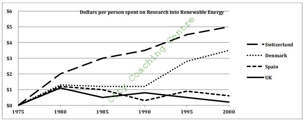
The given line graph illustrates the spending patterns of four countries in conducting research about renewable sources of energy from 1975 to 2000. It is clear that Switzerland spent the most among the given four countries, on research into renewable sources of energy throughout the entire period.
From 1975 to 1980, the Swiss spending on research increased from nothing to $2 per person. From then on, the figure climbed steadily and reached $5 per person by 2000. On the other hand, the UK spent the least throughout the period except for a brief time in 1990 when Spain spent the least. By 2000, the Britisher’s spending on research reached an all time low of
0.2 dollars per person.
As for the remaining two countries, Spain’s research budget fluctuated at around $1 for the entire period, spending just a little bit more than UK. Denmark’s spending was around $1.2 per person in 1980 and remained steady for ten years. From 1990, the amount climbed steeply until reaching its all time high of $3.5 per person in 2000.
Overall, the four countries spent varying amounts on research into renewable sources of energy, but The Swiss and the Danes showed the maximum interest in these alternative sources.
41.
The chart below shows three different types of crime in England and Wales from 1970 to 2005. Summarize the information by selecting and reporting the main features, and make comparisons where relevant.
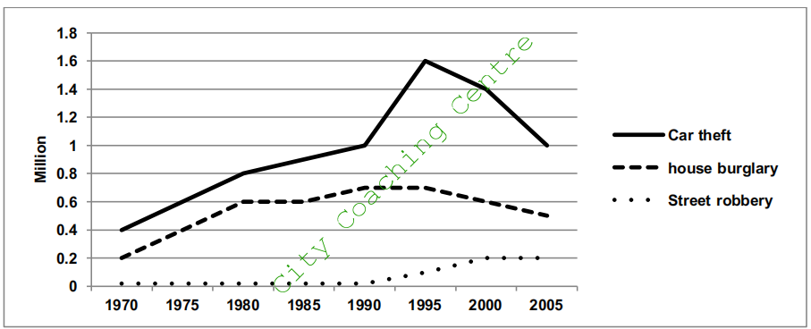
The given line graph compares three types of law breaking offenses in England and Wales between 1975 and 2005. We can see immediately that there was an upward trend in all three types of crime.
The number of car thefts was the highest throughout the given period. In 1970, the number of car thefts stood at 0.4 million, which were two times more than the reported cases of house burglaries. The next two decades saw a moderate rise in the reported cases of car robberies, and the number reached 1 million by 1990. There was a dramatic escalation in car robberies from 1990 to 1995 and the number peaked at 1.6 million, after which there was a rapid decrease and by 2005, the number of car robberies fell to 1 million.
The number of house burglaries showed a similar trend as car thefts for the first 10 years, after which the number fluctuated and reached 0.5 million by 2005
Street robberies were very few (0.01 million approximately) from 1970 to 1990. Then there was a moderate growth in the number of street robberies and the number grew to 0.2 million by 2000, but after that there was stability in street robberies.
Overall, reported cases of car thefts were the maximum and street robberies the minimum throughout the given period of 35 years.
42.The graph below shows the total births and the deaths in a European country from 1950 to 2050. Summarise the information by selecting and reporting the main features and give comparisons where relevant.
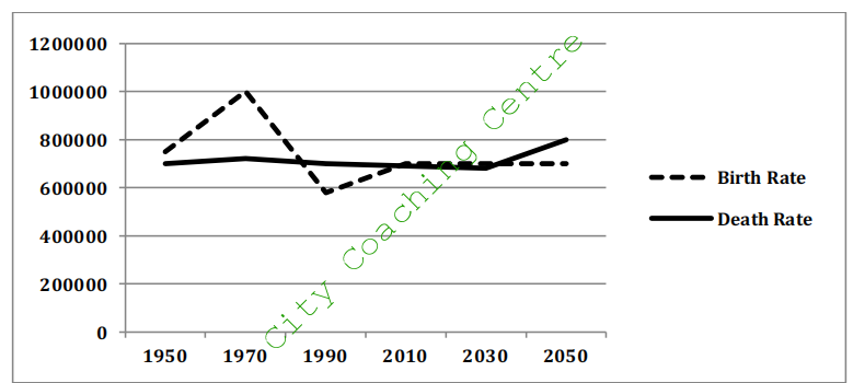
The given line graph compares the Birth Rate and the Death Rate from 1950 onwards and also gives projections upto 2050. It is clear from a cursory glance at the graph that the Birth and Death Rates have been almost similar except for the 1970s when the birth rate was much more than the Death Rate.
In 1950, the number of births in this country was roughly 750,000. After that the population of the newly born rose sharply and peaked at 1000000 in the 1970s. Then it dropped sharply to reach an all time low of a little under 600000 in the 1990s. From then on the birth rate picked up again and has reached approximately 700,000 and is predicted to remain stable till 2050.
The Death Rate has been fairly stable at around 0.7 million. It is expected to remain constant till 2030, after which it is forecast to rise and reach the 0.8 million mark by 2050.
Overall, the Birth Rate experienced fluctuations in the past, while the Death Rate remained stable. The Birth Rate is expected to remain stable after 2030, but the Death Rate is predicted to rise moderately till 2050.
43.
The given graph shows the past and projected figures of the government spending as a percentage of GDP for the years 2000 to 2025 in three areas. Summarise the information by selecting and reporting the main features and make comparisons where relevant.
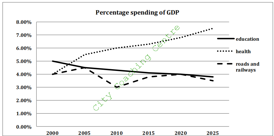
The given line graph elucidates the percentage of GDP spent by government on education, health and roads and railways from 2000 to the present time and also gives projections upto 2025. It can be clearly seen that the amount spent on education and health show opposing trends upto the present time and are expected to continue that trend in future also.
In 2000, the percentage of GDP spent on education was 5%, which was the maximum. The amount spent in this field decreased steadily over time and presently is approximately 4.1% and in future also it is expected to decline and reach about 3.9% by 2025. In contrast, the percentage of gross domestic product spent on health stood at 4% in 2000. This figure grew moderately to 5.6 % by 2005 and after that there has been a slight increase till today. This spending is expected to grow in future also and by 2025 it is forecast to be about 7.5%.
From 2000 to 2005, the percentage of GDP spent on roadways and railways increased minimally from 4 to 4.5% abut after that showed a dramatic fall till 2010 and reached 3% of the GDP. The spending on these public transports has picked up and is near about 3.6 %. This growth in expenditure is expected to continue till 2020 but after that is predicted to show a slight decrease.
Overall, health is one area in which the government spending was the least in 2000 and is expected to be the most by 2025.
44.
The graph below shows the number of students from the US, the UK and Australia who studied in universities in other countries from 2002 to 2007. Summarise the information by selecting and reporting the main features and make comparisons where relevant.
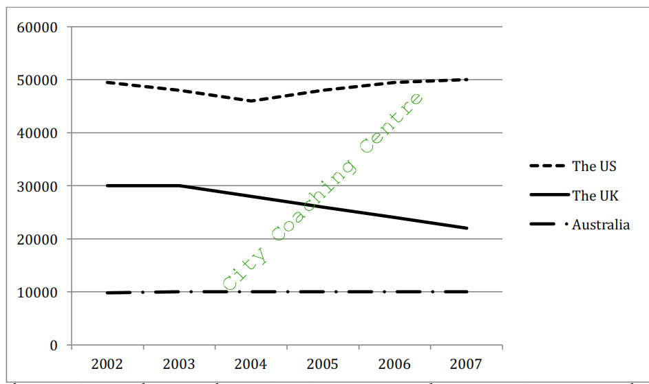
The given line graph depicts the number of American, British and Australian students who studied in universities of other nations over a period of five years starting in 2002. It can be clearly seen that the maximum number of American students and the least number of Australian students studied away from their home country.
From 2002 to 2007, the number of Australian students who studied abroad was stable at around 10,000. The students from the United Kingdom who studied in foreign universities were 30,000 in 2002. Their number was the same till 2003, but after that it showed a steady decline and reached approximately 22,000 by 2007.
The number of American students who studied in other parts of the world was 50,000 in 2002. Their number decreased moderately and reached nearly 46,000 by 2004. After that the number of American students picked up again and became 50,000 by 2007.
Overall, it is clear that the number of American students was five times more than the number of Australian students studying abroad. The number of American and Australian students showed a fairly stable trend whereas the number of students from UK showed a downward trend.
45.
The graph below shows cinema attendance by age in Great Britain. Write a report for a university lecturer describing the information shown.
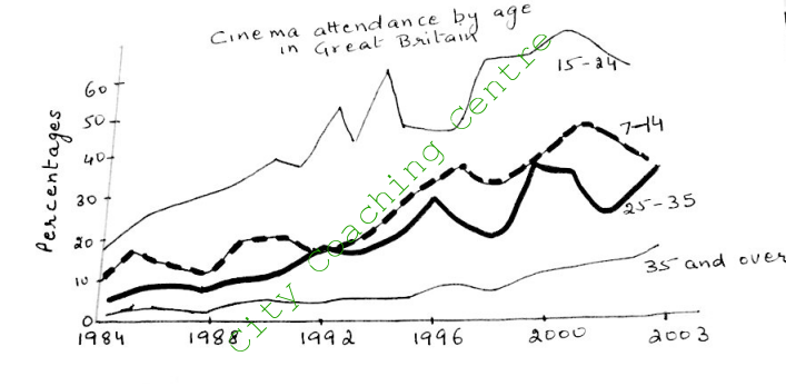
The given line graph illustrates the percentage of people of different age groups who attended cinema from 1984 to 2003. In general, cinema attendance increased significantly from 1984 to 2003. However, the number of people watching films varied with age.
From 1984 to 2003, cinema attendance rose considerably across all age groups, but the increase was the greatest for the 15-24 age groups, which rose from about 18% in 1984 to over 50% in 2003. Though the figures fluctuated between 1992 and 1998, this age group still went to cinema more than any other age group.
There was also a substantial rise in cinema attendance among older people (35 plus). In this case the figures increased over this period from about 2% to over 10%. Cinema attendance of 7-14 and 25-35 year-olds followed a similar pattern from 1984 to about 2002, which was characterized by some fluctuations throughout. However, from 2002 the trends differed in that 7-14 year olds went to the cinema less frequently while cinema attendance of the 25-44 year olds was on the increase.
Overall, cinema attendance grew in all age groups in the given period of time.
46.
The graph below shows the number of enquiries to tourist information office made by telephone, letter/email, and in person from January 2001 to June 2001. Summarise the information by selecting and reporting the main features, and make comparisons where relevant.
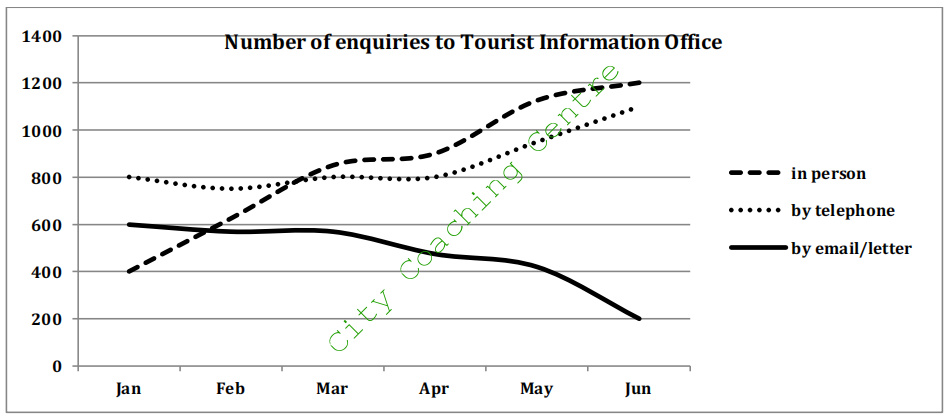
The given line graph illustrates the number of inquiries made to the Tourist Information Office through various means of communication, between January and June 2001. It is evident that the enquiries made in person and by telephone showed an upward trend, whereas those made by email and letter showed a downward trend.
As can be seen from the graph, there are three channels through which inquiries were made, namely – in person, by telephone, or by email or letter. Interestingly, the number of inquiries made in person increased continually over the period from 400 enquiries in January to 1200 enquiries in June.
Telephone enquiries started at 800 in January and stabilized at this number till April, after which telephone enquiries increased and reached 1100 by June. The e-mail or letter enquiries stood at approximately 600 in January and remained at almost the same level till March, but after that decreased moderately and touched an all-time low of 200 by June.
Overall, it is lucid that in-person inquiries became the most popular within the given period of 5 months.
47.The given graph shows the nitrogen oxide emissions produced by four vehicles. Summarise the information by selecting and reporting the main features and make comparisons where relevant.
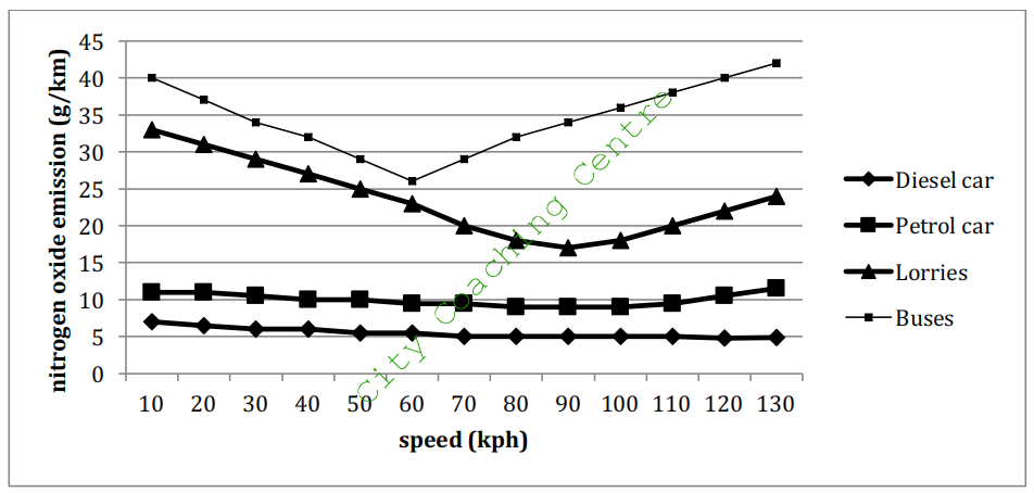
The given line graph compares the nitrogen oxide emissions from buses, lorries, petrol cars and diesel cars. It can be seen from the graph that the maximum emissions are from buses and the emissions vary with the speed of the vehicle.
At a speed of 10kph, buses produce 40 g/km emissions. However, as the speed of the bus increase to 60 kph, the emissions decrease gradually and reach a little over 25 g/km. It is interesting to note that if the speed of the bus goes beyond 60 kph, the emissions again begin to rise, and at a speed of 130 kph the emissions are over 40 g/km. Lorries also show a similar pattern but the overall emissions are lower than that from buses. Another point of difference is that emissions decrease till the speed of 90kph and only after that, begin to rise again.
The emissions from diesel car and petrol car show a similar pattern and also do not show much variation with speed. Emissions from diesel car are the least and hover around 5 g/km and those from petrol car are around 10g/km.
Overall, emissions from lorries and buses follow a similar pattern and those from diesel and petrol cars follow a similar pattern.
48.
The diagram below shows the percentage of good quality river water in four countries from 1995 to 2010. It also shows the prediction for 2018. Summarise the information by selecting and reporting the main features and make comparisons where relevant.
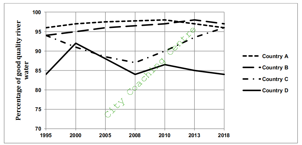
The line graph displays the changes in the proportion of river water in high quality in four countries between 1995 and 2018.
Between 1995 and 2010, the percentage of good quality river water in country A showed a very slight increase from about 96% to 98%. However, after that the percentage of good quality water started to decline and is predicted to reach 96% by 2018.
In 1995, the good quality river water in country B and country C stood at around 94%, but after that the percentage of good quality river water in country B has showed a steady increase upto the present time and has reached approximately 98%. It is predicted to show a slight fall till 2018. In contrast, the percentage of good quality river water in country C decreased moderately and reached a level of 87% by 2008. After 2008, the situation in country C improved and good quality river water showed a steady rise and reached 94% by 2013. This trend in expected to continue and percentage of good quality river water will soar to 96% by 2018.
The worst quality river water was in country D where 85% of river water was in good quality between 1995 and 2008. It peaked at about 92% in between in 2000. In 2008, the good quality river water in country D again showed a small peak but ever since has shown a slight fall and this fall is expected to continue in future also.
Overall, the percentage of good quality river water in country A and B showed a relatively stable trend where as in countries C and D showed opposing trends with some fluctuations.
49.
The line graph and the bar chart give the information and forecast about the vehicle numbers and CO2 emission in England and Wales between 2000 and 2020. Summarize the information by selecting and reporting the main features and make comparisons where relevant.
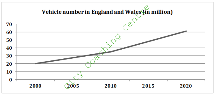
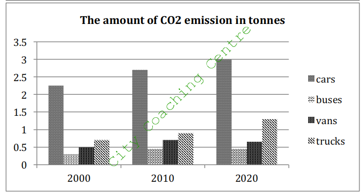
The given line graph depicts the number of vehicles in England and Wales from 2000 to the present time and also gives predictions upto 2020. The bar chart gives the information on the amount of CO2 emissions by four different forms of transport, which are cars, buses, vans and trucks over the same period.
There were nearly 20,000,000 vehicles in England and Wales in 2000. Then, the total number went up slightly to 35 million in the following 10 years and is expected to experience a rapid upward tendency reaching around 60 million by 2020.
The column graph shows four primary sources of CO2 emission. Cars emitted the largest amount of CO2 from 2000 to 2010 and this trend is predicted to continue and reach 3 tonnes by 2020. Interestingly, the trucks went through and forecast a similar trend as cars but the total amount is significantly less, from 0.6 tonnes in 2000 to 1.3 tons in 2020. The emission of CO2 from buses and vans is likely to keep steady at around 0.4 and 0.6 tons respectively.
Overall, vehicle numbers are expected to increase in future, and the CO2 emissions are also expected to escalate in future.
50.
The graph below shows the percentage of 18-25 year olds in universities in four different countries. Summarise the information by selecting and reporting the main features and make comparisons where relevant.
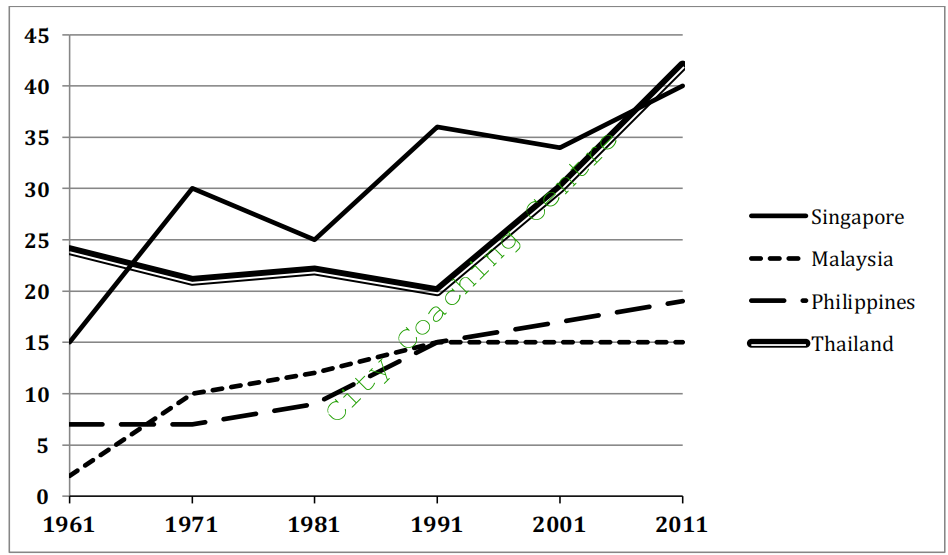
The given line graph illustrates the proportion of university students in four countries, namely Singapore, Malaysia, Philippines and Thailand, between 1961 and 2011. From a cursory glance it is manifest that more students went to universities from Singapore and Thailand than from Malaysia and Philippines.
A small minority (2%) of Malaysian students between the ages of 18 and 25 went to universities in 1961. This percentage increased significantly and reached 10% by 1971. Then there was a steady increase and by 1991, 15% students went for tertiary education, after which their number stabilized and remained at that level till 2011. Approximately 7% Filipinos of this age group attended universities in 1961. Their percentage also increased over the given period and reached a little under 20% by 2011.
Singaporean students going for tertiary education were 15% in 1961. Their percentage increased markedly and reached 40% by 2011. There were fluctuations in between, but overall the trend was upward. The Thai students studying in universities decreased from 24% to 20% from 1961 to 1991, but after that there was a dramatic increase and their percentage almost doubled in the next two decades.
Overall, there was an upward trend in the 18-25 year old tertiary education seekers, in the given four countries.
51.
The diagram below shows the number of marriages in the UK between 1951 and 2001. The data given is for all marriages, remarriages (any partner) and first marriages. Summarise the information by selecting and reporting the main features and make comparisons where relevant.
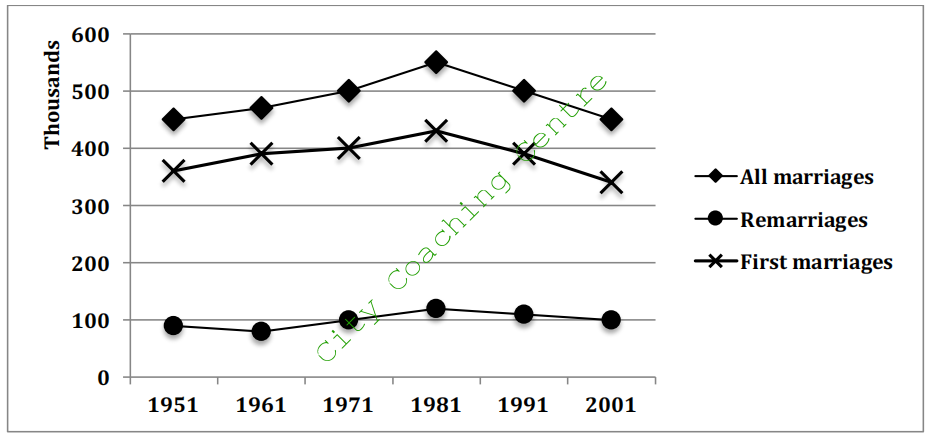
The given line graph illustrates data about the number of first marriages, remarriages (either partner) and the total number of marriages from 1950 to 2001. It is manifest from the graph that the number of remarriages was far lower than that of first marriages and hovered around the 100,000 mark throughout the given period of time.
Approximately 350,000 first marriages were solemnized in 1951. This number grew gradually and reached a peak of 430,000 marriages in 1981, after which it fell moderately and again reached 350,000 mark by 2001.
The total number of marriages showed a similar trend to the number of first marriages, as it was just the sum total of first marriages and remarriages. As the number of remarriages fluctuated between 90,000 and 120,000 between the years of 1951 and 2001, the line depicting the total number of marriages was almost parallel to that portraying the first marriages.
Overall, it is clear that the year 1981 witnessed the maximum number of marriages and remarriages.
52.
The first chart below shows the percentages of women and men in a country involved in some kinds of home tasks (cooking, cleaning, pet caring and repairing the house. The second chart shows the amount of time each gender spent on each task per day. Summarize the information by selecting and reporting the main features, and make comparisons where relevant.
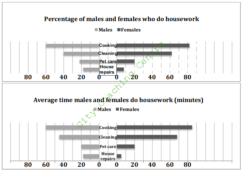
The given butterfly charts illustrate the proportion of males and females who do housework, and the average time both genders give to household chores. It is clear from both charts that cooking and cleaning are done by more women and men, and these tasks demand more time of both genders per day than the other two tasks, which are caring for pets and doing household repairs.
More females than males do cooking and cleaning. The percentage of women involved in these two tasks is 80% and 60% respectively, which is 20% more for each task than men. Almost equal percentage (20-22%) of men and women are involved in pet care. Almost double men (18%) than women (9%) are involved in house repairs.
As far as the average time spent on cooking and cleaning is concerned, here too women outstrip men by spending approximately 20 minutes more on each task per day than men. Both, males and females spend on an average 20 minutes per day on pet care. Women spend approximately 5 minutes per day, whereas men spend three times more time on house repairs.
Overall, apart from house repairs, in all the given household chores, women take the lead.
53.
The table and chart below show the time spent at leisure and household activities in Britain. Summarise the information by selecting and reporting the main features and make comparisons where relevant.
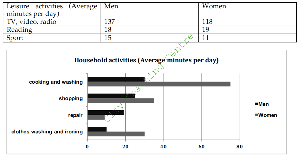
The given bar chart and table compare how much time males and females spend on various household activities every day with the recreational activities in Britain.
It is noticeable that except for repair work, women do more household work than men. On an average, women spend about 75 minutes on cooking and washing, which is more than double the time spent by men on the same activity. Shopping and doing the laundry are other two most important activities for housewives, which take 35 and 30 minutes per day respectively, whereas men are unwilling to do these chores. Men spend approximately 19 minutes per day on repair work, which is surprisingly more than double the time spent by women on the same work.
With regard to leisure activities, both genders spend almost similar time on all the three given activities, with TV, video and radio being the most popular and sports taking away the least of the leisure time. About two hours per day are spent on TV, video and radio, and nearly one third of an hour per day on reading. Compared to women, men spend slightly more time on sports.
The same graph can come with any past year given.
(The table and chart below show the time spent at leisure and household activities in Britain in 2008. Summarise the information by selecting and reporting the main features and make comparisons where relevant.
54.
The table below shows the percentage of first year students who gave “very good” rating to the resources provided by a college, for three courses. Summarise the information by selecting and reporting the main features and make comparisons where relevant.
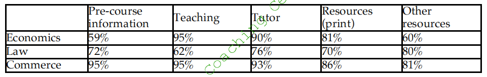
The given table represents the rating towards the facilities of three courses, namely – economics, law and commerce. It is interesting to note that commerce earned the highest satisfaction in all resources.
In terms of pre-course satisfaction, commerce tops in these three subjects, with 95% showing satisfaction. 72% of the students rated the pre-course information of law as ‘very good’ and the figure for economics was the least, with slightly lass than 60% being satisfied with it.
When it comes to teaching, tutor and print resources, approximately equal percentage (95%, 92% and 83% respectively) of economics and commerce students rated these facilities as very good. However, only about 70% law students were satisfied with these services.
Turning to other resources, about 80% each of commerce and law students were satisfied, whereas only 60% of economics students were satisfied with other resources.
Overall, the resources provided by commerce, law and economics showed varied popularity among the students.
55.
The table below describes the number of people (in million) who went for international travel in 1990, 1995, 2000 and 2005. Summarize the information by selecting and reporting the main features and make comparisons where relevant.
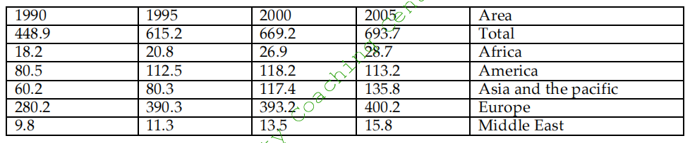
The given table compares the changes in the number of international travelers in different regions, in the years 1990, 1995, 2000 and 2005. It is clear that the total number of international travelers increased in the given 15 year period. However, the increase was the most marked from 1990 to 1995.
According to the statistics, Europeans like traveling abroad the most, with the highest figure of around 280 million in 1995 and reached an all time high of nearly 400 million in the year 2005. By contrast, the Middle East had the least number of people travelling abroad, which grew from 9.8 million in 1995 to 15.8 million in 2005. Africa and Asia and the Pacific experienced a similar increasing trend of international tourists from 1990 to 2005.
In America, people showed a great willingness to travel abroad between 1990 and 1995, from 80.5 to 112.5 million. Then, the number stayed more or less at the same level till 2005. Likewise, Europe also experienced a very significant increase from 1990 to 1995, in the overseas travel population, but after 1995 there was an increase of only 10 million.
Overall, Europe contributed the most in overseas travel, whereas the Middle East had the least share of overseas travelers.
56.
The chart below shows the resources used to make 1000 disposable cups in different materials: polystyrene and paper. Summarize the information by selecting and reporting the main features and make comparisons where relevant.
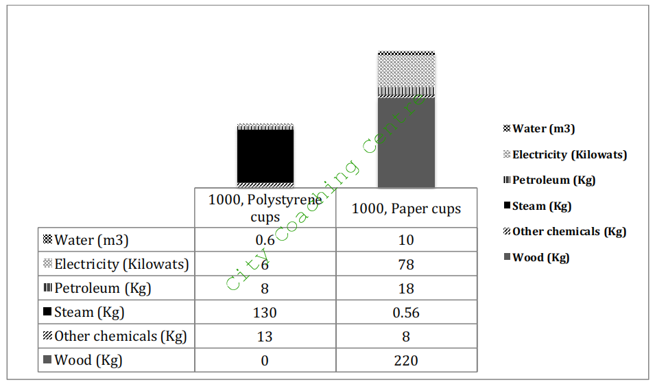
The stacked bar graph shows the amount of different elements required for making 1000 polystyrene and paper cups. It is clear that overall lesser energy is needed in making 1000, polystyrene cups than on making 1000 paper cups.
The production of 1000 polystyrene cups needs 8 kg of petroleum and 13 kg of other chemicals. Steam is required in a large quantity, which is 10 times as much as of other chemicals. This process is rather energy-saving, only costing 0.6 m3 of water and 6 kilowats of electricity.
However, in the process of making paper cups, the consumption of water and electricity is far more (10 meter cubics and 78 kilowats respectively) than that in polystyrene cups. It also requires more petroleum, which constitutes 18 kg. Steam is also required in negligible amount as compared to that needed in polystyrene cups. Amount of the chemicals is also needed lesser than that in polystyrene cups.
Overall, the production of polystyrene cups is environmentally friendly, because it costs less energy and doesn’t need any wood while 1000 paper cups almost needs 220 kilogram of wood.
(Note: Stacked bar graph is a graph that is used to compare the parts to the whole. The bars in a stacked bar graph are divided into categories. Each bar represents a total.)
57.
The table shows the population ratio of females per 100 males in six different areas in 1995 and 2005. (Africa, Asia, Europe, North America, Central America and Oceania). Summarize the information by selecting and reporting the main features and make comparisons where relevant.
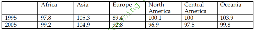
The given table illustrates the ratio of women per 100 men from six different regions in two separate years, 1995 and 2005. It can be seen from the table that in four out of the six given countries, the number of females per 100 males experienced a downward trend. However, in Africa and Europe, the number of females per 100 males increased over the period.
The proportion of women in North America decreased from 100.1 in 1995 to 96.9 in 2005. Central America and Oceania had similar trends. In both these areas, the number of women per 100 men fell from 100 to 97.5 and from 103.9 to 99.8 respectively. In Asia the figure went down by 0.4, which is nearly 10 times lesser than that in North America.
In contrast, the population of women witnessed an increase in Europe from 89.4 in 1995 to 92.8 in 2005 and the proportion in Africa also went up by 1.4 in the same period.
Overall, the ratio of men and women changed in all areas. The number of females per 100 males went up in some regions, whereas it came down in others.
58.
The two tables below show responses of different age groups to a questionnaire with their opinion about the range of books and the non-print material of a local library. Summarize the information by selecting and reporting the main features, and make comparisons where relevant.
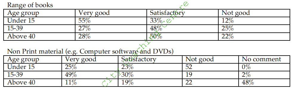
The given table graphs compare the ratings regarding the print and non-print resources of a local library. It is interesting to see that almost half the above 40 age group preferred not to comment on the non-print material, which is computer software and DVDs.
Regarding the range of books, the responses of 15-39 age group and those above 40 were almost similar. Almost half the under 15s gave the rating of very good, whereas a little over a quarter each of the other two age groups thought so. Satisfactory rating was given by approximately 50% of those above 15, whereas a third of the under 15 age group rated the range of books as satisfactory. Nearly 1 in 10 of the children below 15 were not happy with the range of books, but a quarter each of the other two groups rated the range of books as not good.
When asked about the non-print material, almost 50% of the under 15s were not happy. A quarter each rated these resources as very good and satisfactory. Almost 50% of those aged between 15 and 39 said that the non-print resources were very good, 30% were satisfied and about a fifth were not happy with these resources. A very small minority of this age group did not comment on these resources. In contrast, just-under 50% of those over 40, did not comment on them. About 11% rated these resources as very good, but a fifth rated them as satisfactory and a similar proportion gave a ‘not good’ rating.
59.
The tables below show response to a questionnaire given by two groups of people (club members and the general public) who showed their opinions about a new theatre. Summarise the information by selecting and reporting the main points and make comparisons where relevant.
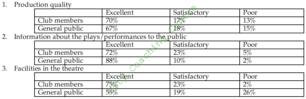
The three tables compare the responses of club members and general public regarding a new theatre. It can be seen that the responses were similar in some matters and different in others.
When asked about the production quality of the theatre, almost similar number (70% and 67%) of club members and general public respectively gave the rating as excellent. 17% and 18% respectively of both groups opined that production quality was satisfactory and almost equal number (13% and 15%) rated it as poor.
Regarding information about the plays and performances to the public, 72% and 88% club members and general public rated it as excellent; 23% and 10% respectively rated it satisfactory, whereas only a small minority of each group (5% and 2%) rated it as poor.
As to the facilities of the theatre, three quarters of the club members rated the facilities as excellent, as opposed to only 55% of the general public. 23% and 19% club members and general public respectively rated the facilities as satisfactory. However, the biggest discrepancy can be seen in those, who rated the facilities as poor. 26% of general public were very dissatisfied with the club facilities and rated it as poor where as only 2% of the club members thought so.
Overall, the proportion of those giving excellent or satisfactory rating in each criterion was higher than of those giving a ‘poor’ rating.
60.
The graph below shows the percentage of people who travelled by bus in the UK from 2009 to 2011. Summarise the information by selecting and reporting the main features and make comparisons where relevant.
The given table depicts the proportion of people who used the bus for travelling for various purposes between 2009 and 2011. It is evident from the table that bus was the most preferred mode for going shopping and the least preferred mode for going to work.
In 2009, 65% people went shopping by bus. This percentage dropped significantly and reached just over 50% by 2011. Nearly a fifth used the bus for visiting friends in 2009 and 2010. This percentage increased slightly and in 2011, when just under a quarter of people used the bus for this purpose.
Commuting for work by bus was done by 5%, in 2009. This percentage dropped significantly and by 2011, hardly any person travelled by bus for going to work. Using the bus for study and day tour showed similar trends, but the use of bus for day tour was done by about 3% more people in all the given years.
Overall, it can be seen that the use of bus for shopping and going to work became less, year by year, whereas for the other purposes the use of bus increased over the given time.
61.
The two tables below show the number of international students from different resource countries in Canada and the USA in two school years. Summarise the information by selecting and reporting the main features and make comparisons where relevant.
The given tables give some information about the number of international students in Canada and the USA in the school years from 2002 to 2004. It is evident that far more international students study in USA as compared to Canada.
The total number of international students in Canada increased by 17%, from approximately 60,000 to 70,000, in the two school years. Among the given three resource countries, the biggest change came from the number of Chinese students, which was 45 per cent. The USA and India experienced a rise of 9 percent and 35 percent respectively.
However, the total number of international students dipped by 2%, from over 580 thousand between 2002 and 2004. There was an increase of around 6% in the number of international students from China and Canada. By contrast, these two school years witnessed a drop of 9 percent in the number of Indian students, although it was the largest resource country in the USA.
Overall, the number of international students in the USA fell, while that of international students in Canada rose, although the former one outnumbered the latter one.
62.
The graph below shows the number of cars produced in three countries in 2003, 2006 and 2009. Summarise the information below in your own words.
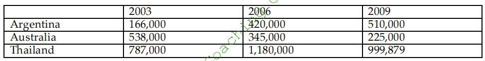
The given table compares the changes in the number of cars manufactured in three different countries, which are Argentina, Australia and Thailand, in the years 2003, 2006 and 2009. The maximum cars were manufactured in Thailand in all the three given years.
It is noticeable that the figures for Argentina increased considerably over the six-year period, while a significant fall in car output can be seen in Australia. Overall, Thailand had by far the largest number of vehicles in all the three years.
In 2003, over 160,000 automobiles were manufactured in Argentina, and this figure rose to more than 510 thousand in 2009, an increase of 350,000. By contrast, Australia produced the second largest number of vehicles (approximately 530,000) among the three given countries in the year 2003. However, the figures were the lowest in 2006 and 2009, with 345,000 and 225,000 cars being manufactured respectively.
Thailand is the main producer of cars. Nearly 800,000 cars were produced, and this figure reached its all-time high of 1,180,000 in 2006, but decreased slightly afterwards to a little below 1000,000.
Overall, the production of cars almost trebled in Argentina over a period of six years.
63.
The graph below shows the average retirement age of males and females in six countries in 2003. Summarise the information by selecting and reporting the main features and make comparisons where relevant.
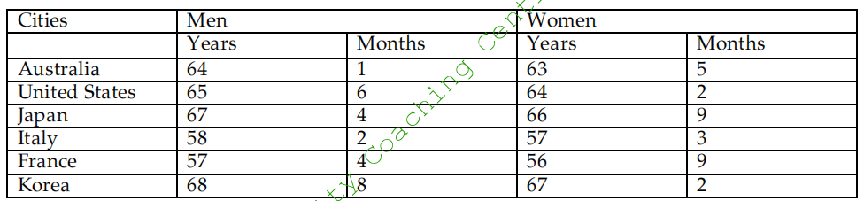
The given table elucidates information about the average age of retirement of men and women in 2003, in six countries, namely Australia, the US, Japan, Italy, France and Korea. It can be observed that Italy and France have lower retirement ages, as compared to those in the other given countries.
In Australia, men retired at the age of 64 years 1 month and the women at the age of 63 years 5 months. The average retirement age of American males was 65 and a half years, and that of females was 64 years and two months.
Japan and Korea had a higher average retirement age, both for men and women. Japanese and Korean men retired at the ages of 67 years 4 months and 68 years 8 months, respectively. The women in Japan and Korea retired at the ages of 66 years 9 months and 67 years 2 months, respectively. The retirement age in Korea was the highest among all the given countries.
Italy and France had lower retirement ages, as compared to the other given countries. Italian males and females retired at the ages of 58 years 2 months and 57 years 3 months, respectively. French men’s average retirement age was 57 years 4 months and the French women retired at the age of 57 years 9 months.
Overall, it can be said that the Korea had the maximum retirement age for both men and women and France had the minimum, among the given six countries.
64.
The graph below shows the population of three cities in 1990, the population forecast of 2000 and the actual population of 2000. Summarise the information by selecting and reporting the main features and make comparisons where relevant.
The given table illustrates the actual population of Sao Paulo, Jakarta and Shanghai in 1990 and 2000. It shows the predictions made in 1990 for the expected population in 2000. It is clear that the predictions made were quite different from the actual populations.
Sao Paulo had the highest population in 1990, which was 15 million. It was closely followed by Shanghai, where the population was 13.5 million. Jakarta had the least population of only 9.5 million. It was predicted that in 2000, the population of Sao Paulo would increase significantly and reach 24 million. However, the actual population of Sao Paulo in 2000 was only 18 million, which was 6 million lesser than expected. The population of Shanghai was expected to increase moderately and become 17 million by 2000. Surprisingly, the population of Shanghai fell slightly and by the end of the decade it was 12.5 million. The population of Jakarta was expected to rise by 4.5 million by 2000, but here the actual population was almost double of that of 1990. It was 17.5 million in 2000.
Overall, Sao Paulo and Jakarta had almost equal population (18 and 17.5 million) in 2000, whereas actually Shanghai had significantly lower population (12.5 million) in 2000. The predictions made in all three cases proved wrong.
65.
The table below gives information about the percentage of workforce employed in six industries in Australia between 1989 and 2009. Summarise the information by selecting and reporting the main features and make comparisons where relevant.
The given table illustrates the proportion of employees in six industries, which are Manufcturing, Retail, Healthcare, Construction, Education and Tourism in 1989 and 2009. It is clear that in manufacturing and retail the number of people employed decreased over the period, whereas in all other given industries the number of workers increased.
The highest percentage of workers (15%) worked in manufacturing industry in 1989. This proportion decreased by a third and reached a little below 10% in 2009. In retail, the percentage of workforce fell from 11.8 in 1989 to 10.1 in 2009. In healthcare, the percentage of employees increased from 9.6 to 11.3. In construction, education and tourism the percentage of workers increased from 7.6, 6.8 and 5.5 to 8.3, 7.5 and 7.3 respectively.
Overall, manufacturing industry employed the maximum number of people in 1989, while healthcare employed the highest number in 2009. In both these years, the least number of people worked in the tourism industry.
66.
The tables below show the consumption and production of potatoes in different regions of the world in 2006. Summarise the information by selecting and reporting the main points and make comparisons where relevant.
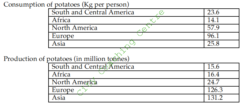
The given tables compare the yield of potatoes in million tonnes with the consumption in Kg per person in 2006 in five regions of the world, which are South and Central America, Africa, North America, Europe and Asia, in 2006. It is clear that except for the Americas, the production of potatoes outstripped the consumption in all other areas.
The production of potatoes was the highest in Europe and Asia at around 130 million tonnes each. The production in all the other regions was between 15 and 25 million tonnes. However, as far as the consumption is concerned, the Europeans seemed to be the most fond of potatoes, eating about 96 kg per person. North Americans took the second place in the consumption at just below 60 kg per person. People of South and Central America and Asia ate around 25 kg per person, but the Africans were the least fond of potatoes, consuming approximately 14 kg per person in 2006.
Overall, in North America, the production was less than half the consumption, whereas in Asia the production was six times more than the consumption.
67.
The table below gives information related to population growth, average birth per woman, life expectancy at birth in countries with different income levels in 2000 and 2004. Summarise the information making comparisons where relevant.
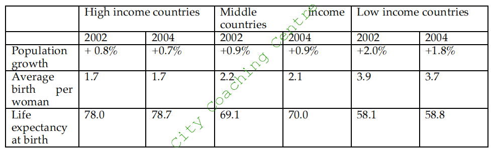
The given table compares the population growth, average birth per woman and life expectancy at birth, among high, middle and low-income countries in 2002 and 2004.
The population growth in the low-income countries was the highest at 2.0% in 2000, which however, declined by 0.2% after two years. It still remained the highest among all. The other two groups of countries had almost similar population growth in both the given years.
The average Birth Rate was also the highest in the low-income countries at 3.9 and 3.7 in 2002 and 2004 respectively. It was the lowest in the high-income group at 1.7 in both the given years, whereas in the middle-income group it was just over 2 in 2002 and 2004.
The life expectancy at birth was the highest in high-income group at 78 years in 2002. This increased further to 78.8 in 2004. Life expectancy increased from 69.1 to 70 years in middle- income countries, and from 58.1 to 58.8 in low-income countries.
Overall, life expectancy increased in all groups of countries, whereas the other two indicators either decreased or remained constant.
68.
The table below gives information about the employment rates and the average annual salaries of new graduates in an Australian University in 2009. Summarise the information by selecting and reporting the main points and make comparisons where relevant.
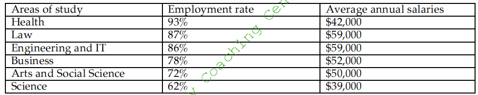
The given table elucidates the employment rates and the average yearly salaries of fresh degree holders of an Australian University in 2009. It is clear from the graph that the science graduates had the lowest employment rates (62%) and the lowest average salaries ($ 39,000) in 2009.
93% of the health graduates were employed and received and average annual salary of $42,000. Law and Engineering and IT graduates received the highest salaries of $59,000 dollars each. It is interesting to note that their employment rate was lesser than that of Health graduates but their average salaries were higher. 78% of those graduating from the business field got employment and their average salaries per year were $ 52,000. 72% of those holding a bachelors degree in Arts and Social Science were employed and their average annual salaries were $ 50,000.
Overall, the least paid jobs were in Health and Science, whereas Law and IT and Engineering graduates were the best paid.
69.
The graph below shows the fishing industry in a European country according to four indicators. Summarise the information by selecting and reporting the main features and make comparisons where relevant.
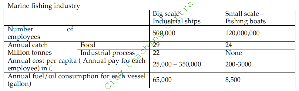
The given table illustrates the data about the big scale industrial ships and the small-scale fishing boats in a European country. It is interesting to note that even though the employees in small scale fishing boats far outnumber those in the big scale industrial ships, their annual catch for food is lesser than that of big scale industrial ships.
The number of employees in big scale ships is 500,000, which is far lesser than the 120,000,000 employees working in small-scale boats. The annual catch from the big ships is 29 million tones, where as that from small boats is 24 million tonnes. There is no catch for industrial process from the small boats, whereas it is 22 million tonnes from the big ships.
The annual pay for each employee of small ships is meager (£ 200 – 3000) as compared to that of the big ships (£25,000 – 350,000). The annual fuel consumption for each big vessel is 65,000 tonnes where as that for each small vessel is 8,500 tonnes.
It can be seen that although the small scale ships require a huge manpower to catch a lower amount of fish for the food industry, they have lower financial costs and require lesser fuel.
70.The table below gives information about students studying in six departments in an Australian university in 2011. Summarise the information making comparisons where relevant.
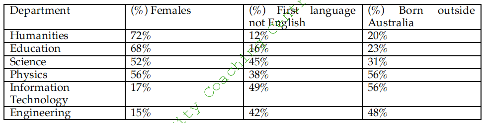
Specifically, in majors like humanities, education, science and physics, more than half the students were females. Among them, females seemed to favour humanities the most, with 72% students learning it, which is in sharp contrast with the departments of information technology and engineering, where females occupied only 17% and 15% seats.
Interestingly, the percentages of students whose mother tongue was not English, were less than half in all departments, with the figures for science subjects remaining relatively higher, ranging from 38% to 49%. In humanities and education, only 12% and 16% students were non-native speakers.
The pattern for the proportion of foreign students was quite similar to the group above, with physics and information technology departments taking the lead (56% each), followed by engineering (48%) and science (31%). Humanities and education again ranked the last, making up only 20% and 23% respectively.
71.
The table below shows the percentage of the population and the types of houses they live in 3 areas of a city. Summarise the information by selecting and reporting the main features and make comparisons where relevant.
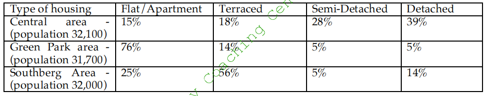
The given table compares the population and housing of three areas of a city. It is clear from the graph that the population of the three areas is very similar at around 32,000 but there is considerable difference in the choice of housing.
39% of the population of Central Area lives in detached houses. This is in sharp contrast to Green Park Area where only a small minority (5%) lives in detached houses. Even in the Southberg Area, only 14% people reside in detached houses.
The semi-detached houses are less popular in all three areas with 28% of Central Area people living there and 5% each of Green Park and Southberg area living there. Terraced houses are the most popular in Greenberg area with 56% of the people living there. Only 14% people of Green Park area and 18% of Central area people live there.
A large majority of Green Park area people (76%) live in flats or apartments, where as only a quarter of the population of Southberg area lives in apartments. Flats are the least popular among the Central Area people where only 15% people live in them.
72.
The table below gives information about population of over 60-year-olds in six regions in 2000, and the predicted numbers of population over 60 in 2050. It also shows the world population over 60 in 2000 and 2050. Summarise the information in the following three tables and make comparisons where relevant.
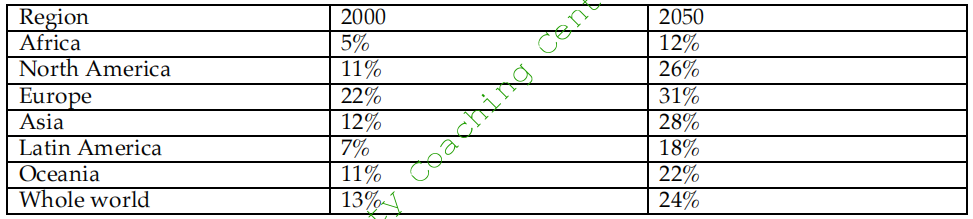
The given table depicts data about number of people who are more than 60 year old in six different regions, which are Africa, North America, Europe, Asia, Latin America and Oceania in the year 2000 and their predicted numbers in 2050. The table also shows the whole world population in both these years.
In 2000, the whole world population of the 60+ age group was 13%. The highest population of this age group was in Europe. It was 22% in 2000 and is expected to grow to 31% by 2050. Asia, Oceania and North America had a similar population (11-12%) of over-60-year-olds in 2000. The population of this age group in all these three areas is predicted to double by 2050. Latin America had 7% population of 60+ age group, and this is forecast to grow approximately two and a half times and reach 18% by 2050. Africa had the least population of this age group in 2000, but this is also expected to grow more than two times and reach 12% by 2050.
Overall, the figures suggest that population of 60 year olds will continue to grow in all regions but the growth will be more marked in the less developed regions.
73.
The table below shows the production of cacao beans in six regions between 1992 and 1998. Summarise the information by selecting and reporting the main features and make comparisons where relevant.
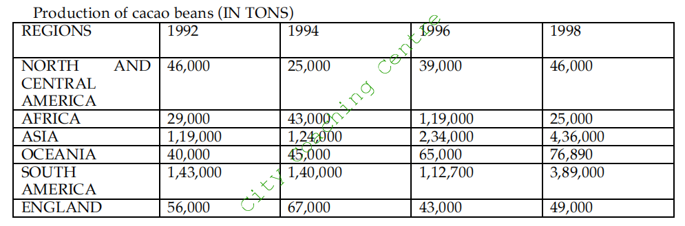
The given table illustrates the production of cacao beans in six global areas from 1992 to 1998. It can be seen that the production of cacao was higher in South America and Asia than all other given countries.
In 1992, the highest production of cacao was from South America at 1,43,000 tons, which decreased slightly in 1994 and 1996, but picked up again and reached 3,89,000 tons by 1998. Cacao production in Asia also increased considerably from 1,19,000 tone in 1992 to 4,36,000 tons in 1998 which was the highest figure for that year.
In Oceania, cacao production almost doubled from 40,000 tons in 1992 to 76,890 tons in 1998. Africa and Asia showed fluctuating trends. In Africa, cacao production almost trebled from 1992 to 1996, starting at 29,000 tons in 1992 and reaching 1,19,000 tons in 1996. However, in 1998, it fell drastically and reached an all time low of 25,000 tons. In England the production hovered between 43,000 and 67,000 over the given period.
Overall, cacao production increased in some areas and decreased in others.
74.
The table below gives information about the situation of marriage and age from 1960 to 2000 in Australia. Summarize the information by selecting and reporting the main features, and make comparisons where relevant.
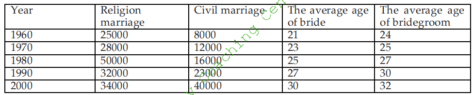
The given table illustrates the number of religion and civil marriages along with the average age of bride and groom from 1960 to 2000 in Australia. It is clearly seen that the number of religion marriages fluctuated, whereas the number of civil marriages grew over the period of four decades.
In 1960, the number of religion marriages was 25000, which increased slightly to 28000 in 1970, after which the number rose dramatically to an all time high of 50000 by 1980. However, religion marriages showed a drastic fall and reached 32000 in 1990, after which the number picked up slightly to 34000 by 2000. The number of civil marriages grew 5 times from 8000 in 1960, to 40000 in 2000.
The average age of the bride was 21 in 1960, but increased steadily to 30 years by 2000. The average age of the groom escalated from 24 to 32 over the given period of time.
Overall, it can be seen that civil marriages grew in popularity over the years, and in both genders the average age of marriage increased.
75.
The table shows the percentage of young people who were employed in different sectors in one country in 2005 and 2010. Summarize the information by selecting and reporting the main features, and make comparisons where relevant.
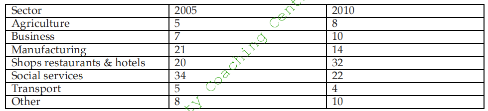
The given table illustrates the percentage of young employees in various employment sectors in a particular country in 2005 and 2010. It is clear that some sectors became more popular in 2010 and in some the percentage of employees reduced.
Agriculture and transport sector were the least popular in both 2005 and 2010, with only 5% employed in each sector in 2005. However, in 2010, 8% were employed in agriculture, an increase of 3%, whereas only 4% got jobs in transport, a decrease of 1% from the figure of 2005. In manufacturing and in shops, restaurants and hotels, almost equal proportion of young people worked (21% and 20% respectively). But in 2010, the percentage fell to 14% in manufacturing, whereas it rose to 32% in shops, restaurants and hotels, making it the most sought after sector to work in 2010. Social services was the most popular area among the young people in 2005, and almost a third (34%) worked in this sector, but this percentage declined to 22% in 2010. In business and other sectors (not mentioned in the graph), almost equal number worked in both the given years, with 7-8% working in 2005 and 10% each working in 2010.
Overall, it is clear that transport, manufacturing and social services employed lesser number of young people in 2010 as compared to 2005, whereas in all other departments, the employment of youth increased.
76.
The table shows the number of mobile phones and personal computers per 1,000 people in 2003 in 6 different countries. Summarize the information by selecting and reporting the main features, and make comparisons where relevant.
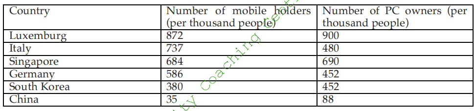
The given table illustrates the number of cell-phones and computers per thousand people in 2003 in six countries, namely – Luxemburg, Italy, Singapore, Germany, South Korea and China. It is clear that the number of cell phone owners was more than the number of PC owners in Italy and Germany, whereas in the other given countries the number of PC owners was more.
Luxemburg had the highest number of cell phones and PCs (872 and 900 per thousand people respectively). Surprisingly, China had the least number of cell phones (35) and PCs
(88) per thousand people. Singapore had almost equal number of cell phones and PCs (around 700 per thousand people). The highest discrepancy in cell phone and PC owners was seen in Italy, where the cell phones were owned by 737 per 1000 people and PC owners were only 480 per 1000 people. Germany and South Korea had 580 and 360 cell phone owners per 1000 people but the number of PC owners was the same (452 per 1000 people).
Overall, the cell phone and PC ownership was high in all given countries, except for China, where it was the lowest.
77.
The table below depicts the information about the posts held by women in parliament and in management in 5 countries in 2000. Summarise the information by selecting and reporting the main features and make comparisons where relevant.
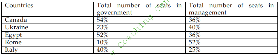
The given table compares the percentage of women working as government officials and as managers in five countries, namely Canada, Ukraine, Egypt, Rome and Italy in the year 2000. It is manifest from the table that more women worked in the parliament than as managers in Canada, Egypt and Italy, whereas Ukraine and Rome had more women in the management sector.
In Canada and Egypt, almost half of the posts in government were held by women, whereas the least (10%) worked as bureaucrats in Rome. 40% females worked as government officials in Italy, where as 23% worked in this department in Ukraine.
In the management sector, however, the scenario was quite different. Almost equal proportion (36%) worked as managers in Canada and Egypt. 40% women in Ukraine and 25% in Italy worked in management. The highest percentage (52%) worked in management sector in Rome.
Overall, it is interesting to note that the highest discrepancy among female workers in both the given departments was seen in Rome in 2000.
78.
The charts below give information about the amount and types of water in the world, and also tell the use of water in three areas in three countries. Summarise the information by selecting and reporting the main features and make comparisons where relevant.
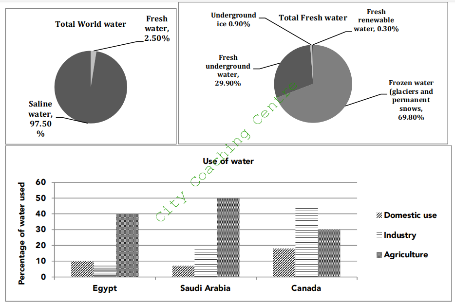
The given pie charts depict the quantity and sorts of water in the world and the column graph portrays the proportion of fresh water used for three different purposes in Egypt, Saudi Arabia and Canada.
From the first pie chart it is obvious that a major chunk (97.50%) of the global water is saline water and the remaining (2.5%) is fresh water. The second pie chart shows that a little over two third (69.80%) is frozen water in the form of glaciers and permanent snows, whereas a little under one third (29.90%) is fresh underground water. 0.90% of fresh water is in the form of underground ice, whereas a very small fraction, which constitutes 0.30%, is fresh renewable water.
From the column graph it is clear that in Egypt, 40% water is used for agriculture, which is the highest use, where as only 10% and 8% water is used for domestic purposes and industry respectively. The Saudis also used the maximum (50%) water for agriculture. They used 18% water for industry, which was more than two times of that used by the Egyptians for this purpose. The Saudi Arabians used only 8% for domestic use. It is interesting to note that the Canadians used the maximum (47%) water for industry. They used 30% for agriculture and around 18% in their households
Overall, it is clear that fresh water is a very precious commodity as only 2.5% of the total water on this planet is fresh, and out of that a very small fraction is usable water, which is used for domestic, industrial and agricultural use.
79.
The charts below show the percentage of five kinds of books sold by a bookseller between 1972 and 2012. Summarise the information by selecting and reporting the main points and make comparisons where relevant.
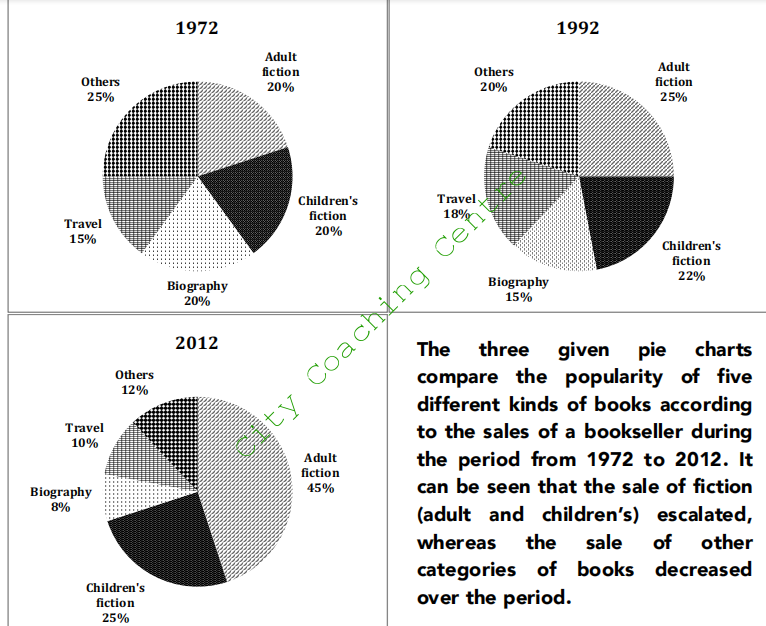
In 1972, there was an equal sale of adult fiction, children’s fiction and biographies, which constituted 20% each. Travel books had the least sale of 15%, whereas all other books had the maximum sale of 25%.
In 1992, a quarter of the sales were of adult fiction, which was a rise of 5% from the figures on 1972. The sale of children’s fiction and travel grew by 2% and 3% respectively, whereas that of biography and other books dropped by 5% each.
The sale of adult fiction almost doubled after another two decades (2012), and reached 45%. Children’s fiction had slightly more retail (25%) than that in 1992. Together, adult and children’s fiction, dominated the market with a sale of just under three quarters. The sale of all other categories fell markedly and together made up for just over a quarter of the sales.
Overall, fiction gained popularity, while biographies, travel books and other miscellaneous books lost their public appeal over the given period of four decades.
80.
The charts below show the proportion of the energy produced from different sources in a country between 1985 and 2003. Summarize the information by selecting and reporting the main features, and make comparisons where relevant.
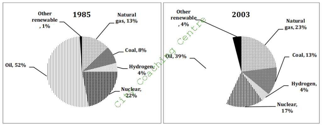
The given pie charts compare the percentage of energy generated from various sources in a particular country from 1985 to 2003. It can be seen that the use of some sources to produce energy increased with time, whereas that of others decreased.
Oil was the major source of energy production throughout the whole period, although its usage dropped from just over a half (52%) in 1985 to approximately two fifth (39%) in 2003. The use of nuclear also declined from 22% to 17% over the given period.
The use of natural gas and coal showed an increase from 13% and 8% in 1985 to 23% and 13% respectively in 2003. Interestingly, the proportion of energy produced from hydrogen remained stable at 4%, whereas that from other renewable sources increased from 1% to 4% over the given period of 18 years.
Overall, the maximum energy was produced from oil and the least from hydrogen and other renewable sources from 1985 to 2003.
81.
The graph below shows the number of people taking part in a wildlife survey in Britain between 2001 and 2009. Summarise the information by selecting and reporting the main features and make comparisons where relevant.
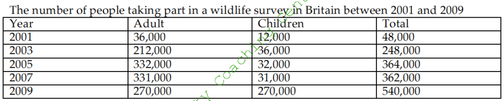
The given table illustrates the information about the numbers of people (adults and children), who participated in a survey about wildlife in Britain from 2001 to 2009. It is evident from the graph that the total participants grew more than eleven fold from 2001 to 2009. The number escalated from 48,000 to 540,000 in the given period.
The number of adults increased from 36,000 in 2001 to 212,000 in 2003, which was the biggest increase ever. It went up to 332,000 in 2005, after which the number of adults started falling and in 2009 only 240,000 took part in the survey.
A similar trend of increase in the number of participants was seen in children from 2001 to 2003, although the number of children was much lesser than that of adults. But, after that the numbers started to fall. Surprisingly, in 2009, the number of children participating in the survey grew dramatically to 270,000, an increase of nine times. The total numbers of adults and children participating was equal in 2009, at 270,000 each.
Overall, in all the given years the number of adult participants was way more than the number of children, except for 2009, in which both categories participated in equal numbers.
82.
The three pie charts below show the coffee production and consumption of coffee and where the profit goes around the world. Summarise the information by selecting and reporting the main features and make comparisons where relevant.
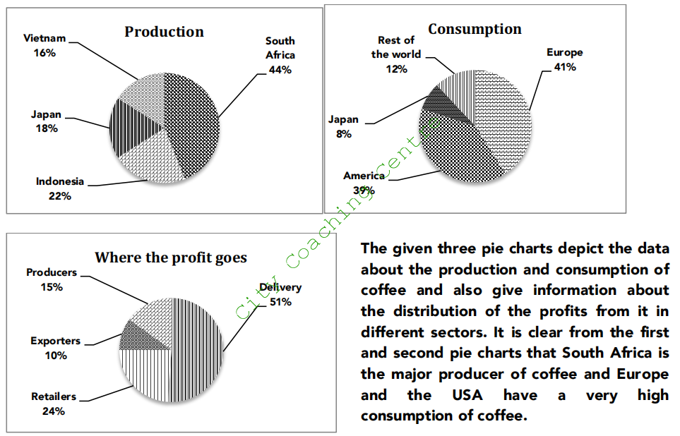
From the first chart it is clear that South Africa produces the maximum coffee. Its coffee production is 44% and Indonesia’s production is half of that. Japan and Vietnam stand at 18% and 16% of coffee production, respectively.
The second pie chart reveals that the maximum consumption of coffee is in European nations (41%) and the second highest consumption is in the USA (39%). Japan needs to import only 8% of the coffee, as it is also a coffee producer. The rest of the world consumes just over a fifth of the coffee.
The profit distribution in the coffee market is illustrated in the third pie chart. Half of the total profit is earned by the delivery sector, whereas the retailers earn almost a quarter of the profits. A tenth of the profits go the exporters and the remaining 15% profits are earned by the production sector.
Overall, it can be said that the countries that consume the most coffee are also the biggest importers of coffee. It is also surprising that the delivery sector earns more profit than any other sector.
83.
The graphs below show the different reasons of two groups of students to choose Dorrifod University. Summarise the information by selecting and reporting the main features and make comparisons where relevant.
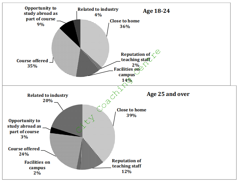
The given pie charts compare the reasons of choosing Dorrifod University by two different age groups which are 18-24 year olds and those above 25 years old.
It is clear from the graph that proximity to home is the reason chosen by over a third of both age groups. Course offered is the second reason given by 35% of 18-24 year olds and just under a quarter of the 25+ age group. Reputation of the faculty and relation to industry is given importance by 12 % and 20% of the older age group, where as only a small minority (2% and 4%) of the younger age group choose the university for these two reasons. In contrast, facilities to study abroad and facilities on campus are valued more by the 18-24 year age group, than those aged 25 and over. Under 5% of the 25 year plus age group enroll in the university for these two reasons.
Overall both age groups have some similarities and some differences in their reasons for opting to study in the given university.
84.
The pie charts below show the different types of courses, which were followed by the students during the years of 1984, 1994 and 2004. Summarize the information by selecting and reporting the main features, and make comparisons where relevant.
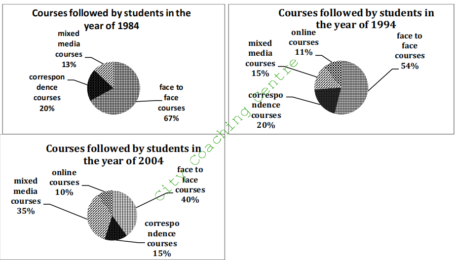
The given pie charts compare the ways in which students studied in 1984, 1994 and 2004. It is clear that some methods gained popularity while others lost popularity.
In 1984, face-to-face courses were most popular with two thirds (67%) of the students opting for such courses. A fifth (20%) of the students studied through correspondence courses and the least number (13%) opted for mixed media courses.
In 1994, the popularity of correspondence courses did not change. Mixed media courses gained slight popularity with 2% more students opting for them. Face to face method decreased by 13% and in their place online courses were opted by 11% students.
In 2004, the popularity of mixed media courses more than doubled and 35% students enrolled in such courses. Face to face courses reduced further and 40% students chose such courses in 2004.
Overall, it can be seen that with the passage of time fewer students chose face-to-face method, but the multimedia courses were chosen by more and more students.
85.
The diagram below shows the multistage production of pears as canned fruits. Write a report for a university lecturer describing the process below.
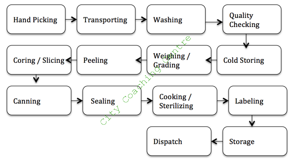
The diagram illustrates how to produce canned fruit step by step. It is clear that there are several main steps in the process, from the picking of the pears to the final canned product.
In the first stage of the process, ripe pears are picked by hand and then transported to the factory where the pears are washed and then checked for quality under a magnified view. Next, the defective pears are taken away and the good ones are cooled in storage at a specific temperature. Then the pears are weighed and graded into different grades. Following this, the pears are peeled before slicing them, and then their cores are also removed.
In the next step, these cored and sliced pears are put in cans and sealed before being cooked. This also sterilizes the cans filled with pears. After this, the cans are labeled and stored and are finally dispatched to the supermarkets for sale.
Overall, it can be seen that the process of canning pears is a complex process involving many steps.
86.
The diagram below illustrates how a simple water filter is constructed and how it functions to produce clean drinking water. Write a report for a university lecturer describing the diagram below.

The given diagram shows the process of producing clean drinking water by a water filter. It can be seen that there are numerous steps in the process from the initial impure water to the final potable water.
In the first step, impure water is put into a metal (iron or steel) container with a wooden top. In the metal container there are three filtering layers, namely sand, charcoal and gravel, with sand at the top and gravel at the bottom. In the bottom part, the water, which is filtered through the three layers, is stored temporarily.
An angled metal pipe is there which has the lower opening in the bottom part of the water filter tank. The upper part of the pipe comes out from the upper part and is linked to another closed metal tank. The filtered water from the first tank is brought into the second tank, which is at a lower level than the first tank. There is a tap attached to the bottom part of the tank, through which the clean drinking water can be taken out for drinking.
87.
The diagram below shows the stages of processing cocoa beans. Write a report for a university lecturer describing the process below.
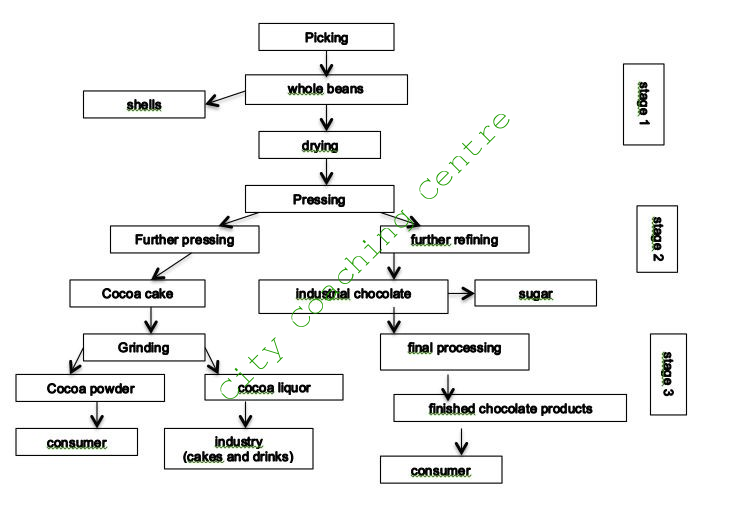
The given flow chart illustrates how cocoa beans are processed to obtain different products. It can be clearly seen that there are three stages in the process, from the initial whole beans to the final products in the market.
In the first stage, the whole beans are picked from the cocoa tree. After being picked, their outer shells are removed and they are dried for the next stage. Stage 2 consists of many steps. Firstly, the dried beans are pressed. Some of these pressed beans are further pressed to make cocoa cake, whereas the rest are refined to make industrial chocolate to which sugar is added.
In the third and final stage, the cocoa cake is ground to make cocoa powder and liquor is also obtained. The cocoa powder is sent to the market to be used by the consumer, whereas the cocoa liquor is used in the industry to make cakes and drinks. The industrial chocolate is sent for final processing after which the finished chocolate products are finally consumed by consumers.
Overall, there are three stages in the process of making different products from cocoa beans.
88.
The following maps show the changes that have taken place in Sydney International Airport since 1930. Summarise the information by selecting and reporting the main features and make comparisons where relevant.
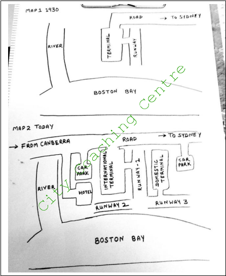
The given maps allow us to see changes in Sydney International Airport, over a period of 85 years. It can be seen that radical changes have taken place in the airport over the given period of time.
In 1930, the airport was relatively small and consisted of one terminal and one runway, which can be seen in the centre of the layout between the Boston Bay towards the south and the road to Sydney towards the north. Towards the west of the terminal, a river flowing from the north to south can be seen merging into the Boston Bay.
The second map shows the present Sydney International Airport. The road on the north has been extended towards the west for traffic coming from Canberra. The terminal has now become the International Terminal. A Domestic Terminal has been constructed towards the east with the runway 1 between both terminals. Two more runways have been added towards the south between the terminals and the Boston Bay. Two car parks have been made, one near each terminal. A hotel has also been constructed between the International Terminal and the river.
Overall, the Sydney International Airport has witnessed a major development in a period of eight and a half decades.
89.
The map shows the village park, now and 10 years ago. Summarize the information by selecting and reporting the main features, and make comparisons where relevant.
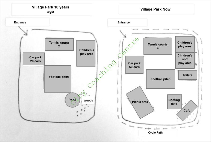
The given maps depict the developments that have taken place in a village park over a period of a decade. It can be seen that radical changes have taken place over a period of 10 years.
10 years ago, the park was fairly simple, with entrance at the north-west corner. The football pitch was there in the centre of the park, towards the north of which were two tennis courts and on the north-west, a car park to accommodate about 20 cars was there. A children’s play area was there on the north-east and towards the south east were some woods and a pond.
The second map shows that the park has undergone great changes in 10 years time. A cycle path has been made all around the periphery of the park. The tennis courts have doubled and the car park has expanded to house about 50 cars. Children’s play area has not changed, but it has a soft children’s play area incorporated in the south. Toilets have been added towards the south of the children’s area. The pond has been converted into a boating lake and the trees have been cut to make a café. A picnic area has been made on the south-west side.
Overall, the total area of the park is the same, but many things have been added and the functionality of the park has improved.
90.
The diagram below shows the changes made in an Australian park. Write a report for a university lecturer describing the changes made.
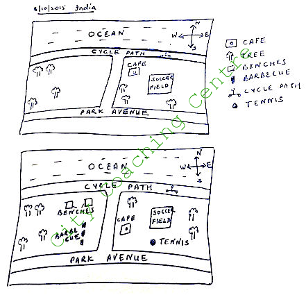
The given maps illustrate the changes an Australian park has undergone. There are a few things that remained unchanged and some new things have been introduced in the park.
The first map depicts the park in the past. A cycle path ran just south of the ocean. The park was divided into two sections by a path. The right side of the park had a cafe towards the northwest corner. There was a soccer field in the middle of the park and a few trees were there in the park. The left section of the park had only a few trees. Towards the south of the park, there was a road named Park Avenue.
There have been some changes, which can be seen in the park now. The cycle path has remained unchanged. The park still has two sections, but there are many changes that can be seen in the park. The soccer field is in the same location. The cafe has been moved a little southwards. A tennis court has been made towards the south of the soccer fields. In the left section of the park, a few benches have been setup in the northeast part and an area for barbecue has been made in the southeast section of the park.
Overall, it can be said that some additions have been made to the park to make the park more attractive for people to visit.
91.
The picture below shows the changes of a park from 1980 to now. Summarise the information by selecting and reporting the main features and make comparisons where relevant.
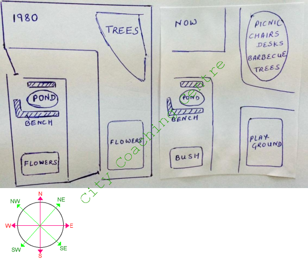
The given pictures illustrate the layout of a park, in 1980, and also show the changes till the present time. It can be seen that there are a few similarities but many differences in the two layouts.
In 1980, the rectangular park was walled on all four sides with two gates, one towards the west and one towards the south. An ‘L’ shaped road connected the two gates. A small pond was there between the road and the west wall of the park. There were benches on three sides of the pond. On each side of the road, towards the southeast and southwest were flower beds, with beautiful flowers. In the north east of the park, there was an area full of trees.
A lot of changes can be seen in the present view of the park. The boundary wall has been totally removed. The main road has been extended to the north and the east side. Amidst the trees, some picnic chairs and tables have been placed and people can also enjoy the barbecue over there. The flower area on the southwest has been replaced by a bush, and that on the south east has been replaced by the play ground. The small pond and the benches have not been touched.
Overall, the park has become an open space with no walls and gates.
92.
The diagram below shows the changes, which took place in a coastal area called Pentland from 1950 to 2007. Write a report for a university lecturer describing the diagrams below.
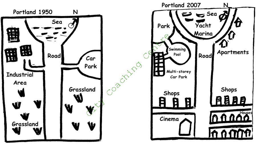
The given diagram shows the changes, which occurred in a coastal town, Pentland, between 1950 and 2007. It can be seen that the area developed a lot in the given period of 57 years.
In 1950, Pentland was located towards the south of the sea. There was a straight main road bisecting the town into two. Two side roads were there, one to the left and the other to the right. The left road led to an industrial area, whereas the right one led to the car park. The rest of the area was mainly grassland.
57 years later, the sea was developed as a Yacht Marina, circled by a newly built road, which was linked to the original straight road. Many apartments were built to the right. The industrial area on the left, was replaced by a park, a swimming pool and a multi-storey car park. The side roads were shifted further southwards. The car park on the right was removed and many apartments were built in its place. On the south east corner of Pentland, many houses were built and a cinema was constructed in the corner between the main road and the left side road. Many shops were opened along the northern side of both side roads.
Overall, Pentland developed into a busy commercial coastal town over a period of half century.
93.
The pictures below show the plan of Walton Museum in 2008 and the plan in 2012, after it was redeveloped. Summarise the information by selecting and reporting the main features and make comparisons where relevant.
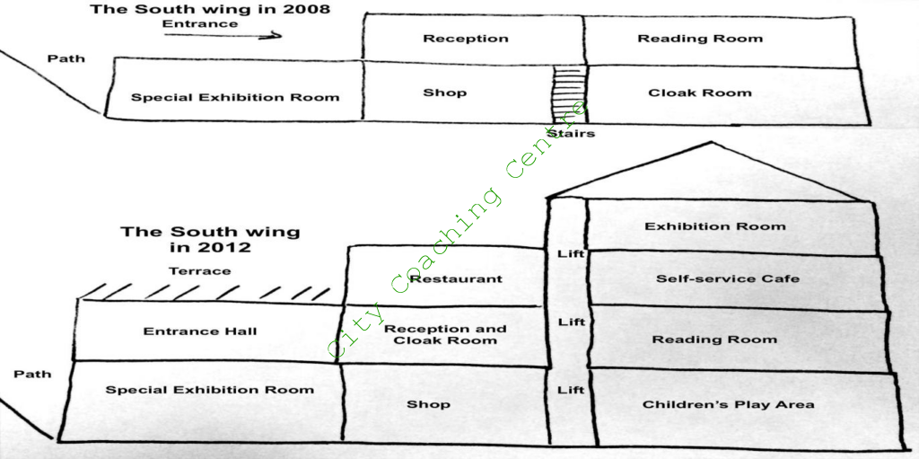
The given maps depict the development of Walton Museum between 2008 and 2012. It is clear that massive changes took place in just four years.
In 2008, the South wing had two storeys with a path on the west of it. On the first floor there was a special exhibition room, a shop and a cloak room. The entrance and reception were on the second floor. Stairs were there between the shop and the cloak room. Next to reception was a reading room.
By the year 2012, this building had four storeys with a lift from the first floor to the top floor. Children’s play area was there in place of the cloak room, which was moved to the reception. On the second floor a self-service café was opened towards the eastern side of the lift above the reading room. On the west of the lift, above the reception and cloak room, a restaurant was constructed. Another exhibition room was built on the topmost floor above the café. Above the special exhibition room an entrance hall was made, which had a terrace above it.
Overall, except for the special exhibition room and the shop, the rest of the South Wing saw a major transformation.
94.
The process below shows how drinking water is made using solar power. Write a report for a university lecturer describing the information given below.
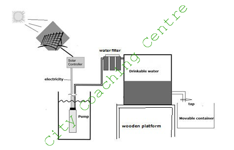
The given process illustrates how underground water is pumped out and made fit for drinking by using energy from the sun. It can be seen that mainly four steps are involved in the process.
In the first step, heat from the sun is stored using solar panels. Then this is converted to electricity. This electricity is then used in a pump which pumps out underground water. After this step, the pumped out water is made to pass through a water filter and then stored in a big water tank, which is placed on a wooden platform. There is an outlet pipe on the lower end of this water tank which has a tap attached to it from which potable water can be taken out in a movable container as and when needed.
Overall, it can be seen that solar energy, which is a renewable energy can be used very effectively to pump out water from below the ground and then filter it to convert it into safe water fit for drinking.
95.
The graph below shows a typical American and a Japanese office. Summarise the information by selecting and reporting the main features and make comparisons where relevant.
The given picture compares the layout of a classic American and Japanese office. It can be seen that there are a few similarities and many differences between the two.
In both layouts there is room for one department manager and two section managers and a few junior employees. However, in the American office there are separate cabins for the department manager and section managers. There are also separate cubicles for the other junior employees whereas in the Japanese office the whole working is from one big hall. The employees in the Japanese office have to sit around tables headed by the section managers, and the section managers in turn are supervised by the department manager sitting behind them. In the American office the windows are on both the east and the west walls whereas in the Japanese office the windows are towards the north. The major difference is that in the American office, there are two conference rooms, a room for storage and another room for the printer and copier whereas in the Japanese office there is no such facility.
Overall, it is clear that the standard American and Japanese office represent the different styles of working of the Japanese and the Americans.
96.
The diagram below shows the process of getting a driving licence. Write a report for a university lecturer describing the information below.
The given flow chart illustrates the process of obtaining a driving licence. It is clear from the graph that there are many steps involved in the process.
First of all the person has to visit a licence centre and complete the application form. After the form is submitted, the person has to take the eye test. If he fails in the eye-test then he is not applicable for the licence and the process ends there. However, if the person passes the eye test, then he pays the fee and takes the written test. The written test can be taken three times in the same fee, but if the person fails the written test three times then the fee has to be paid again. On clearing the written test the person is eligible for the driving test. On clearing the driving test the person finally gets the licence, but if the driving test is not cleared then the person has to pay the fee again before re-taking the driving test. Only after the driving test is cleared, the licence is issued to the person.
Overall it can be seen that many steps are involved in getting a driving licence.
97.
The flow chart below shows the recycling procedure of glass bottles. Summarise the information by selecting and reporting the main features, and make comparisons where relevant.
The given picture illustrates the stages in the recycling of glass bottles. It is clear that seven steps are involved in the process.
In the first step, glass bottles are collected from the public and segregated into green, brown and clear colours. In the second step, they are transported to the processing plant where classification is done based on the metal and plastic caps, which are removed. In the fourth step, the glass is broken and then in the fifth step, this broken glass is transported by car to a glass factory where there is a furnace in which glass and other raw materials are mixed and heated at 1200 degree C. In the seventh and final step, the melted mixture is then used to make new glass bottles in the glass factory.
Overall, it can be seen that recycling of glass bottles is a long and tedious process involving many steps.
98.
The diagrams below show the water supply system in Australia at present and in future. Summarize the information by selecting and reporting the main features.
The given pictures illustrate Australia’s current water supply system and the changes proposed to it in future. It can be seen that the changes proposed are for better recycling of water, and also the wastewater will not be released into the river.
At present, the city receives its supply of pure water from a dam. This pure water is supplied to households, factories and shops in the city. From the city, the storm water is released into the river. The wastewater generated by the city is sent to the water treatment plant. From the recycling plant, the treated waste water is sent to the river.
The future plan of the water supply system shows that the city will continue receiving its pure water supply from the dam. However, the storm water will not be released into the river. Instead, the storm water and waste water from the households, shops and factories will be sent to the water treatment plant. After the water is treated, pure water will be sent back to the city for use. There will not be any water released into the river.
Overall, Australia’s water supply system will be based on a better recycling process and the river will not have any water released into it.
99.
The diagram below shows the plan of a medical centre in 2008 and 2010. Summarize the information by selecting and reporting the main features and make comparisons where relevant.
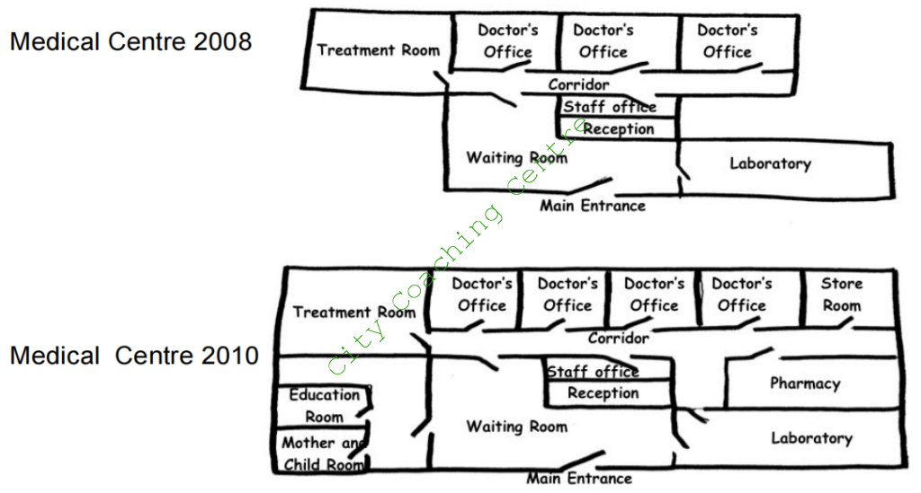
The given diagrams compare the layout of a medical centre in 2008 and 2010. It is manifest from the graph that a lot of changes were made to the medical centre in just two years time.
In 2008, the main entrance which was towards the south, opened into a waiting room. The waiting room opened into a corridor towards the north. There was a reception in the waiting room, behind which there was a staff room, which also opened into the corridor. Towards the right of the waiting room and the southeast corner of the whole building was the laboratory, which also had its access from the waiting room. The treatment room was on the northwest corner of the building, and there were three doctor’s offices along the northern wall of the medical centre, all of which had entrance through the corridor. There was vacant space on the northeast and southwest corner of the building.
In 2010, in the southwest corner a mother and child room, and an education room were made, whereas a store was constructed in the northeast corner. The doctor’s offices were made smaller and instead of three, there were four small doctor’s offices. A pharmacy was also opened just behind the laboratory. This pharmacy opened into the corridor. The laboratory was given another access through the corridor. The rest of the plan was the same as in 2008.
Overall, the medical centre witnessed many additions in a period of two years.
100.
The graph below shows the unemployment rate in Ireland and the number of people leaving the country between 1988 and 2008. Summarize the information by selecting and reporting the main features and make comparisons where relevant.
The given line graph compares the relation with the unemployment rate and the number of people emigrating or migrating from Ireland between 1988 and 2008. It is manifest from the graph that from 1990 to 2008, unemployment rate and number of people leaving Ireland showed similar trends.
From 1988 to 1990, there was a dramatic escalation in the number of people leaving Ireland. It increased from 20,000 in 1988 to nearly 60,000 in 1990. After 1990, there was a sharp decline in the number of Irish people moving out from their home country, to nearly 30,000. This was followed by a slow drop in numbers, with minor fluctuations, to 20,000 by the year 2000. After 2000, there was again a moderate rise in the number of people quitting Ireland and by 2008 this number was 40,000.
However, the unemployment rate was steady at 18% from 1988 to 1990. After that it followed similar trend as the number of people leaving Ireland and it fell significantly to 6% in the mid 1990s. Unemployment rate remained fairly stable till 2006, but showed a growth after that and reached 9% by 2008.
Overall, it is clear that if people do not get employment, they move out for greener pastures.
101.
The diagrams below show the categories of workforce in Australia and the unemployment within the three groups. Summarize the information by selecting and reporting the main features and make comparisons where relevant.

The given pie chart and line graph depict the total workforce in Australia and also the unemployment rate among the given three workforce groups, between 1998 and 2003. It is clear that the English-speaking non-natives of Australia had the highest unemployment rate.
The pie chart clearly shows that the native Australians had slightly over three quarters share of the workforce in Australia. By contrast, the English-speaking immigrants constituted one in ten share of the workforce. The non-English speaking people made up 13% of the total workforce.
The line graph depicts that among the total workforce, the non-English speakers had the unemployment rate of 4% in 1998. However, this decreased gradually and reached an all time low of 1% by 2003. The native Australians also saw a decrease in unemployment rate from 4% to 2% in the given 5 years. However, there was a small upsurge of unemployment in 1999. The non-native English speakers had the highest unemployment of 8% in 1998. There was a slight fall in the unemployment rate till 2001, but after that there was a sharp downfall till 2003 to 3%. In between there were fluctuations.
Overall, although the non-English speaking workers constituted the least share of the workforce, they had the maximum employment rate.
102.
The table below shows information about age, average income per person and population below poverty line in three states in USA. Summarise the information by selecting and reporting the main features and make comparisons where relevant.
The given table gives a breakdown of the proportions of people aged under 18 and over 60 in California, Utah and Florida, as well as their average annual income and population who are very poor.
It is clear that Florida has more elderly people than California and Utah, and people in Florida and California boasted higher income despite having a larger percentage of them living in poverty.
Utah has the largest percentage of young people aged under 18 (28%), followed by California (17%) and Florida (16%). It is surprising to note that Florida with the lowest percentage of people under 18, has the highest number (23%) of those aged 60+, while the figure for Utah is the lowest, which is about one-third that of Florida for the same age group.
Although residents in California have the highest average yearly income per person among the three ($23,000), 16% of Californian people are poor. In contrast, only 9% of the people of Utah are below poverty line, whereas the average income in this state is only $17,000.
103.
The line graph shows the average prices of tickets sold at a theatre and the bar chart shows the average percentage of tickets sold in 2010 and 2011. Summarise the information by selecting and reporting the main features and make comparisons where relevant.
The given line graph and column chart illustrate the quarterly figures of the average price in pounds of tickets sold at a theatre and the percentage of tickets sold in 2010 and 2011. It is clear from the graphs that despite the sharp hike in price of tickets in the third quarter of 2010, there was no fall in the percentage of tickets sold.
The line graph depicts that the average ticket prices remained steady at £ 9.25 in the first and second quarter of 2010, after which there was a sharp increase and the ticket prices reached £10.5 in the third quarter of 2010. Then the prices remained stable till the second quarter of 2011, after which there was a slight dip and the price fell to £10.25 in the third quarter of 2011, but picked up again and in the fourth quarter reached £10.5 again.
The column graph shows that the percentage of tickets sold was 60 in Q1 and Q2 of 2010. Despite the sharp hike in prices of tickets, there was only a small fall in the percentage of tickets sold (50%), and after that in the Q4 of 2010, 80% of tickets were sold which was the highest percentage in all the given 8 quarters. The least percentage of tickets was sold in Q1 and Q2 of 2011, but then the figures picked up again and by the end of Q4 2011, the sale of tickets reached 70%.
104.
The charts below show the percentage of time working adults spent on different activities in a particular country in 1958 and 2008. Summarise the information by selecting and reporting the main features and make comparisons where relevant.
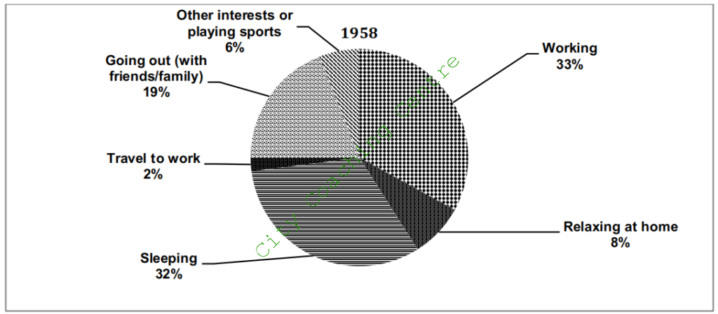
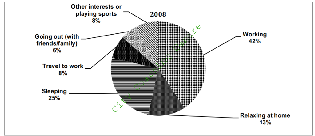
The two pie charts show the daily schedule of working adults in one country in two specific years: 1958 and 2008. Overall, people spent more time on working than on sleeping, and the time spent on relaxing at home increased, where as that on going out decreased over the years.
In 1958, almost one third of the day was spent on working (33%), and marginally less time on sleeping (32%). Going out with friends and family was then a common pastime, taking up 19%. All the other activities combined such as travel to work, other hobbies or playing sports and relaxing at home, just accounted for 16%.
In 2008, the time spent on working increased by 9%, whereas the time spent on sleeping decreased by 7%. The time spent on travelling to work increased four fold from 2% to 8%. There was a significant decline in the time spent on going out with friends and family. It dropped from 19% to 6%. In contrast, the time spent relaxing at home increased from 8% to 13%. Time spent on playing sports or pursuing other hobbies did not show any change and stood at 6% in both the given years.
Overall, working took more time of the day and relaxing at home also became more popular.
105.
The diagram below shows the process of making soft cheese. Summarise the information by selecting and reporting the main features and make comparisons where relevant.
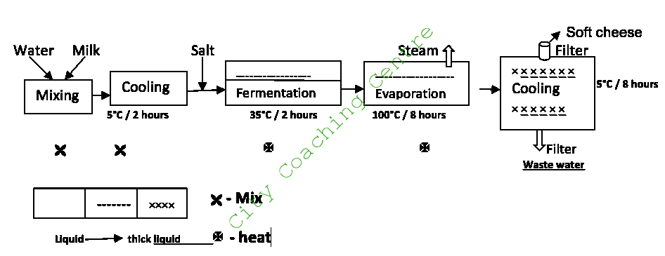
The given picture illustrates the steps in the production of soft cheese. It can be clearly seen that five main steps are there in the making of soft cheese.
Initially, water and milk are mixed in a mixer. After this step the mixture is cooled at 5°C for 2 hours. In the following step, the cooled mixture is sent for fermentation at 35°C for 2 hours. But, before fermentation, salt is added to the cooled mixture. Then, the fermented mixture is evaporated at 100°C for eight hours. Steam is allowed to escape through an outlet. Finally the mixture is sent for cooling. This is done at 5°C for eight hours. The mixture becomes very thick on cooling. At the bottom is a filter through which the water is filtered out and on the top is an outlet through which the cheese is filtered out. This is very soft in consistency.
Overall, it can be seen that the process of making soft cheese is a very complicated process involving many steps. However, the final product is a very soft cheese, which is delicious to eat.
106
The graph shows the spending on education, medical care and pension in a particular country from 2001 to 2051. Summarise the information by selecting and reporting the main features and make comparisons where relevant.
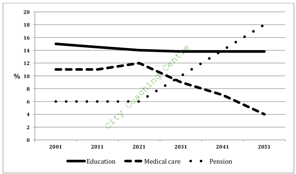
The given line graph compares the government spending on three sectors, namely – education, health and medical sectors from 2001 to the present, and gives projections till 2051.
It can be seen that in 2001, spending on education was the highest, with about 15% being spent on this sector. This expenditure has fallen slightly till the present time and is expected to fall further to 14% by 2021, after which it is projected to remain stable till 2051.
Approximately 11% was spent on medical care from 2001 to 2011, after which there has been an increase in the health budget, which is projected to continue till 2021. However, there are projections of a sharp downfall in the spending on medical care to about 4% by 2051.
The least proportion of spending was on pensions in 2001, which has remained stable till now and is expected to be stable till 2021. The expenditure on pensions is estimated to grow rapidly and become nearly 18% by 2051.
Overall, spending on education is forecast to remain stable, but that on health and pensions will show opposing trends in the future, with the former declining and the latter escalating.
107
The graphs below show the total percentage of films released and the total percentage of ticket sales in 1996 and 2006 in a country. Summarise the information by selecting and reporting the main features and make comparisons where relevant.
The given column graphs compare the percentage of four genres of films released with their respective sales in 1996 and 2000. It is interesting to note that even though more drama than comedy films were released, the sales of comedy films was the maximum in both the given years.
Out of the four genres of films, drama films took the lead as approximately 27% were released in 1996. This was followed by comedy at nearly 20%, fantasy at 11% and romance at 5% being released in that year. In 2000, the proportion of drama, comedy and fantasy films increased, but the release of romantic films showed stability.
As far as the sales are concerned, comedy films were the most popular with 20% tickets being sold in 1996. Drama films followed with approximately 16% tickets sold. Romantic films saw a sale of 5%, whereas fantasy films were the least popular with about 3% tickets being sold. In 2000, drama, comedy and fantasy grew in popularity, with ticket sales picking up in all three genres, but the genre of romance saw a sharp drop to about 2%.
108
The charts below show temperature and rainfall in Equatorial climate and Mediterranean climate. Summarise the information by selecting and reporting the main features and make comparisons where relevant.
The given column graphs compare the rainfall and temperature of Equatorial and Mediterranean climates. It can be seen that Equatorial climate is generally hotter and wetter than the Mediterranean climate.
In the Equatorial climate, November, December and January are the wettest months, with rainfall ranging between 230 and 270 cubic millimeter. In all other months, the rainfall fluctuates between 180 and 190 cu mm. The temperature is fairly stable throughout the year and ranges between 24 to 26 degrees Celsius, with May and June being slightly hotter than the other months.
The Mediterranean has the maximum rainfall in January at around 170 cu mm. December also has a rainfall of 150 cu mm. February, March and November have rainfall of 70 – 90 cu mm. All other months are relatively drier with rainfall below 20 cu mm. The temperature is around 11C in January, which rises gradually and reaches a peak of 28C in August, after which again it drops and reaches 11C by December.
Overall, Mediterranean climate is cooler and drier than Equatorial climate.
109
The bar chart gives us the information about the life expectancy in Japan, United States, Korea and Indonesia and the table shows us the change in the life expectancy between 1953 and 2008. Summarise the information by selecting and reporting the main features and make comparisons where relevant.
The bar chart displays the life expectancy in 2008 in four different countries and the table shows the growth in life expectancy between 1953 and 2008.
In 2008, the life expectancy of Japan was the highest at 81.7 years, far exceeding that of Indonesia, where life expectancy was the lowest at only 70.3 years. The USA and Korea were in the middle with life expectancy of 79 and 77 years respectively.
The table shows that Indonesia had the maximum surge in life expectancy, which grew by 15.7 years. Korea, too had an increase of 12.5 years. The USA and Japan saw a rise in life expectancy of 3 and 3.5 years respectively. This depicts that in 1953, the life expectancy in the US was more that that of Korea.
Overall, the life expectancy in Japan was the highest in 1953 and 2008, whereas Indonesia had the lowest life expectancy in both 1953 and 2008, even though the escalation was the highest.
110.
The diagram shows the total length of high-speed tram track (in kilometers) in three countries in 1990, 2010 and the projection for 2020. Summarise the information by selecting and reporting the main features and make comparisons where relevant.
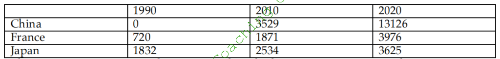
The given table illustrates the total length of high-speed train track in China, France and Japan in 1990 and 2010, with estimates for 2020.
Looking at the data for 1990, it is clear that Chinese high-speed train track was not there then. However, Japan had the longest train track of 1832 kilometers and France had only 720 kilometers of train track.
Turning to 2010, it is interesting to note that China superseded the other two nations with a train track of 3529 kilometers being constructed. The train tracks of Japan and France also grew by 702 kilometers and 1151 kilometers respectively.
According to the predictions, these three nations will maintain an increase in their figures. However, the growth would be the most pronounced in case of China, which will go up three times.
Overall, the high-speed train track saw massive rises from 1990 to 2010 and the trend is expected to continue in future.
111
The two pie charts show the percentage of pollutants entering a particular part of ocean in 1997 and 2007. Summarize the information by selecting and reporting the main features, and make comparisons where relevant.
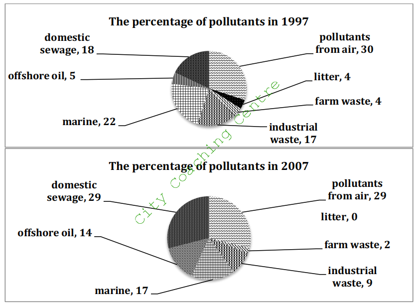
The two pie charts give information about the percentage of pollutants that entered a specific section of ocean in 1997 and 2007.
The quantity of domestic sewage entering the ocean increased significantly, from 18 percent to 29 percent, during the ten-year period. The pollutants from air were approximately the same at about 30 percent in both the given years. 14 per cent of pollution was from offshore oil in 2007, which was about three times the figure, a decade ago.
By contrast, industrial waste and marine saw a fall of 8 percent and 5 percent during this period. The pollution from litter accounted for 4 percent in 1997. However, it is interesting to note that there was no litter in this part of ocean in 2007. The amount of pollutants from farm waste declined from 4% to 2% in ten years time.
Overall, the pollution from domestic sewage and offshore oil increased, while there was a drop in the amount of other pollution.
112
The graphs below show the size of the ozone hole over Antarctica and the production of three ozone-damaging gases from 1980 to 2000. Summarise the information by selecting and reporting the main features, and make comparisons where relevant.
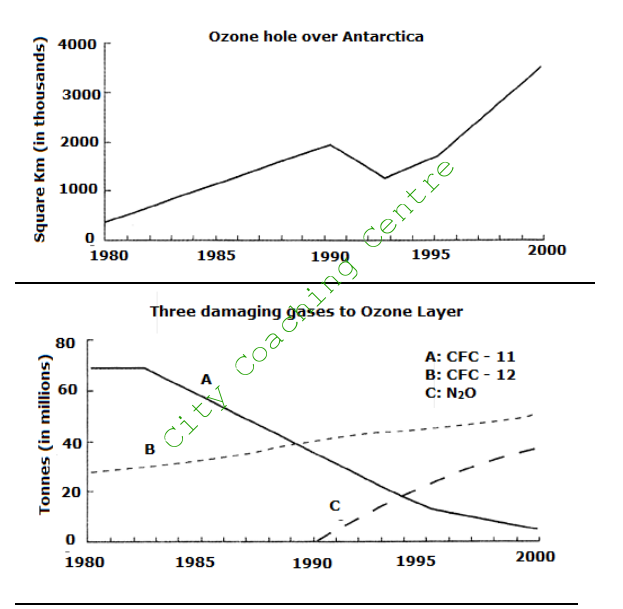
The given line graphs illustrate the changes in the Ozone hole size over the Antarctica region and the amount of three gases produced which caused damage to the ozone layer from 1980 to 2000.
The ozone hole was at its smallest size of about 400 thousand square kilometres in 1980, but 20 years later, it grew drastically to 3.6 million square kilometres. It increased by nine times. The only period when there was a reduction in the size was in the early 1990s (from 2 to 1.2 million square km).
In 1980, about 70 million tonnes of CFC–11 was produced, which remained stable for 3 years before undergoing a steady decline to below 10 million tonnes in the late 1990s. The production of CFC–12, on the other hand, showed an upward trend throughout the 20-year period from 25 to 50 million tonnes, surpassing the production of CFC–11 in 1989. N2O, however, was not produced until 1990, but its production grew rapidly to about 40 million tonnes by the year 2000.
Overall, the two graphs indicate that it was mainly CFC–12 and N2O, which gave rise to the expansion of ozone hole over Antarctica in the last two decades of the 20th century.
113
The diagram below shows the plan of a library in 2001 and 2009. Summarise the information by selecting and reporting the main features and make comparisons where relevant.
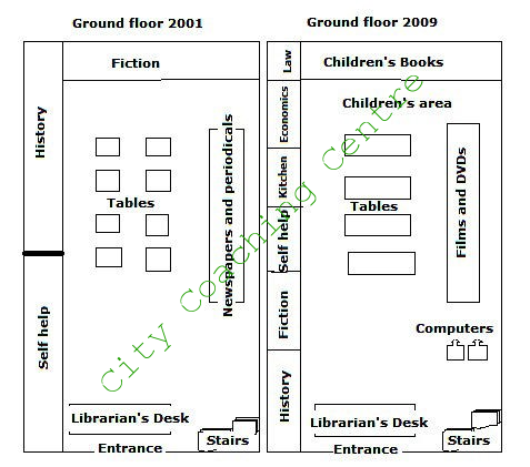
The given diagram compares the map of the ground floor of a library in 2001 and 2009. It can be clearly seen that a lot of changes took place in the ground floor over a period of eight years.
In 2001, the self help and history section occupied the whole left wall, but in 2009 fiction, kitchen, economics and law sections were also added. The fiction section on the back wall of the ground floor, was replaced by the children’s books in front of which the children’s area was made. On the right wall the newspapers and periodicals area was there in 2001. However, in 2009, films and DVDs were placed in front of which computers were placed. The eight smaller tables in 2001 were removed and in place of these four bigger tables were placed.
No changes were made to the entrance, the librarian’s desk and the stairs. The librarian’s desk was right after the entrance and the stairs were in the front right corner in both the years.
Overall, a lot of additions can be seen in the ground floor of the library over a period of eight years.
114
The graph below shows the average monthly salary and the prices of black and white and colour TV in Japanese yen from 1953 to 1973. Summarise the information by selecting and reporting the main features, and make comparisons where relevant.
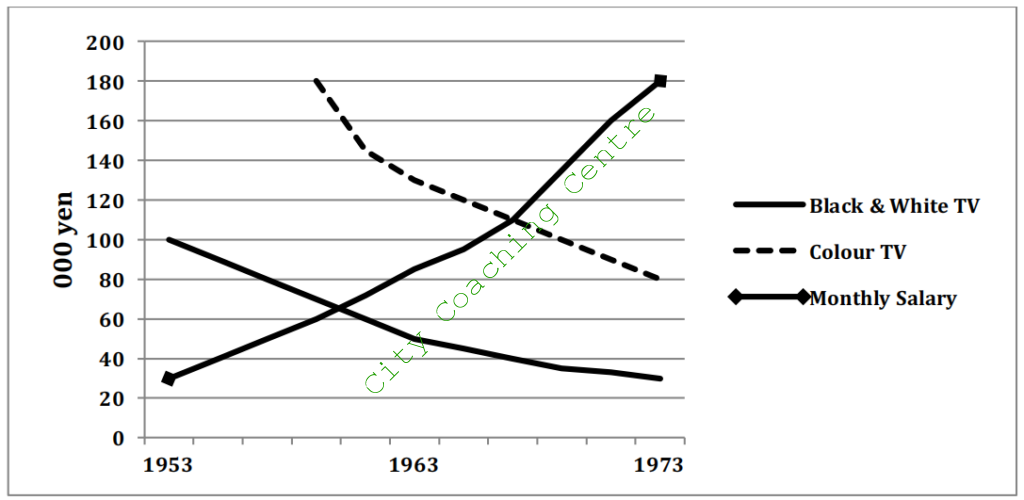
The given line graph illustrates the changes in the cost of black and white, and coloured TV over a period of two decades, starting in 1953. A cursory glance at the line graph is enough to make it clear that the TV prices showed a downward trend, whereas average monthly salary showed an upward trend in the given time period.
In 1953, the price of black and white TV stood at 100,000 yen. The price dropped significantly to just half (50,000 yen) by 1963, after which there was a moderate decline in price and it reached approximately 30,000 yen by 1973. Colour TV appeared in the market in the late 1950s, with a cost of about 180,000 yen, but in the next four to five years the cost fell dramatically to about 110,000 yen. After that, there was a steady decline and the price reached 80,000 yen by 1973.
Average monthly salary was a meager 30,000 yen in 1953, but rose considerably and reached 110,000 yen by 1968, after which there was a steep escalation and it reached about 180,000 yen by 1973.
Overall, it is clear that comparing the salary with the cost of TVs, even a black and white TV was a luxury for the common man in 1953. However, after two decades, even the colour TV could be bought within one month’s salary.
115
The table below shows the employment of students from four countries in the UK after their first courses in 2001. Summarise the information by selecting and reporting the main features and make comparisons where relevant.
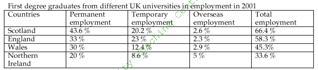
The given table illustrates the employment status of first degree graduates from four European nations in 2001. A cursory glance at the graph is enough to make it clear that the maximum Scottish graduates got employment, whereas the minimum graduates from Northern Ireland got jobs in the given year.
Out of the total Scottish graduates, 66.4% got employed and out of these 43.6% got permanent jobs, 20.2% got temporary jobs, but only 2.6% were employed in other countries. The degree holders from England showed a similar pattern, with 58.3% landing into some sort of a job. 33% got permanent job, 23% got adhoc employment and the remaining 2.9% went for overseas jobs.
In total, 45.3% Welsh graduates got hired, of which 30% had permanent jobs, 12.4% had temporary jobs and only 2.9% had overseas jobs.
Overall, it is interesting to note that although the recruitment rate of grads from Northern Ireland was the lowest, yet the highest went for overseas employment among the given four countries.
116
The diagrams below show how an office building looks at present and the plan for its future development. Summarise the information by selecting and reporting the main features and make comparisons where relevant.

The given layouts depict the current and proposed plans of an office building. It is manifest from the graph that radical changes have been planned for the future office building.
Presently, there are two grass areas located on the west and east of the building, with a wash room and a reception towards the lower left part of the eastern grass land. Four offices are there on the south between the western grass area and the reception. Opposite these offices towards the north, a kitchen, a canteen and a stock room can be seen.
Enormous changes have been planned for the future office building. The western grassland will be converted into an outdoor activity area, whereas the eastern one will be modified into a coffee counter at the north and a meeting area in the south. The reception and the entrance are also intended to be relocated to the mid of the two office rooms on the south. The kitchen and the canteen on the north are planned to be replaced by two office rooms. The stock room will retain its place.
Overall, it is clear that the office building is planned to be totally renovated in the future.
117
The diagram below shows the number of marriages and divorces in the UK between 1950 and 2000. Summarise the information by selecting and reporting the main features and make comparisons where relevant.
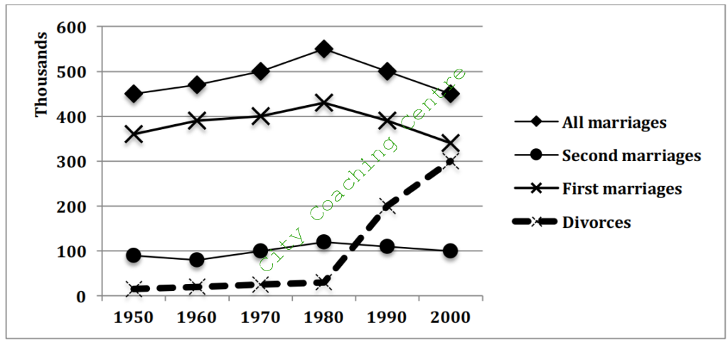
The given line graph illustrates data about the number of first marriages, second marriages, total number of marriages and divorces from 1950 to 2000. It is manifest from the graph that the divorce rate showed a dramatic escalation after 1980.
Approximately 350,000 first marriages were solemnized in 1950. This number grew gradually and reached a peak of 430,000 marriages in 1980, after which it fell moderately and again reached 350,000 mark by 2000.
The total number of marriages showed a similar trend to the number of first marriages, as it was just the sum total of first marriages and remarriages. As the number of remarriages fluctuated between 90,000 and 120,000 between the years of 1950 and 2000, the line depicting the total number of marriages was almost parallel to that portraying the first marriages.
Divorce rates increased minimally from approximately 15000 to 20,000 between 1950 and 1980, but after that increased exponentially and touched the number of 300,000 by 2000.
Overall, it is clear that the year 1980 witnessed the maximum number of marriages and remarriages, and that was also the year when divorce rates started seeing a sharp upswing.
118
The line graph below shows the land used for organic crops in two countries between 1985 and 2010. Summarise the information by selecting and reporting the main features, and make comparisons where relevant.
The given line graph compares the areas of land for growing organic crops in two different countries from 1985 to 2010. A cursory glance at the graph is enough to make it clear that the land allocated to organic farming grew considerably in both countries.
In 1985, both countries, A and B, grew organic crops in 25 thousand hectares each. In the next five years, the land for organic farming increased slightly in both countries and reached 30 and 60 thousand hectares respectively. From 1990 to 1995, there was a sharp escalation and over 150,000 hectares was used in both countries for organic agriculture. After 1995, the figure for country A continued to grow and reached a peak of 280,000 hectares. The country B showed only a moderate increase in the land used for organic farming. After 2000, however, both countries showed a minimal decrease in organic farming. From 2005 to 2010, the decreasing trend continued in both countries, but the fall was more marked in country A and the arable land for organic crops fell to 150,000 hectares each in both countries.
Overall, the area for organic crops increased till 2000, but after that the popularity of organic farming decreased.
119
The line graph shows the percentage of different age groups of cinema visitors in a particular country from 1978 to 2008. Summarise the information by selecting and reporting the main features, and make comparisons where relevant.
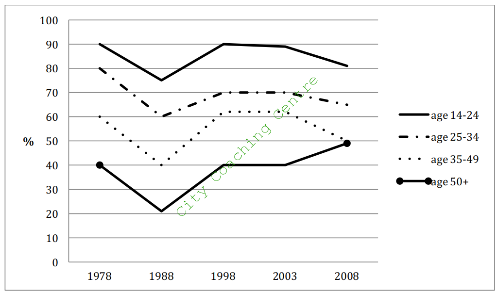
The given line graph illustrates the proportion of movie goers among four age groups in a particular nation. A cursory glance at the graph is enough to make it clear that the 14 to 24 year olds were the most fond of cinema throughout the given period of three decades beginning 1978.
From 1978 to 1988, the percentage of cinema attenders fell from 90, 80, 60 and 40 to 75, 60, 40 and 20, among the 14-24, 25-34, 35-49 and the 50+ age groups respectively. The next decade saw an increase in the percentage of cinema watchers in all age groups. However, the next five years after that saw stability in the cinema attendance in all age groups. From 2003 to 2008, the popularity of cinema decreased in all age groups except for the over 50s, who started going to the cinema in more numbers.
Overall, it is clear that going to the cinema was more popular among the younger age groups and the trends were almost similar throughout, except for the 50 plus age group, after 2003, when their percentage of cinema attendance increased, whereas that of all other age groups decreased.
120
The charts below show the total number of cruise passengers, and their percentage according to age in 1975 and 2003 in the UK. Summarise the information by selecting and reporting the main features, and make comparisons where relevant.
The given table and column graph depict information about the total number of British cruise passengers and their proportion according to age in 1975 and 2003. A cursory glance is enough to make it clear that the total number of cruise passengers more than doubled and the maximum of those over 64 went for cruise in the given years.
The table shows that in 1975, just-under 4 lac people went for cruise in the UK. This number increased two and a half times and reached a little-over 10 lac by 2003.
The column graph illustrates that among all age groups the percentage of those going for cruise increased with time. In 1975, 5% each of the <24s and the 25-34 age group went for cruise. Their percentage increased by 5% and 10% respectively in 2003. The percentage of cruisers in the 35-44 and the 45-54 age groups doubled from 10 to 20 and from 12 to 24 in the given period of 28 years. The least discrepancy can be seen in the 55-64 year olds, in whom the percentage increased only from 28 to 34 in the given time period. The maximum cruisers were the over 64s in both the given years. Their percentage also increased from 37 in 1975 to 50 in 2003.
Overall, it is manifest that the popularity of going for cruises increased with time and the popularity also grew with advancing age.
121
The graph below shows the percentage of immigrants to Australia from five countries in 1962, 1982 and 2002. Summarise the information by selecting and reporting the main features, and make comparisons where relevant.
The given column graph illustrates the percentage of immigrants from five countries to Australia in three years, which are 1962, 1982 and 2002. A cursory glance at the graph is enough to make it clear that the Italians and New Zealanders immigrating to Australia showed a downward trend, where as those from India, Vietnam and the UK showed a fluctuating trend.
In 1962, 40% immigrants to Australia were from Italy. Their percentage fell dramatically and reached 20% by 1982. After that, there was a moderate decline and by 2002, the percentage of Italians shifting permanently to settle in Australia became 15%. Similarly, the proportion of New Zealand immigrants to Australia decreased from 8% in 1962, to 6% in 1982, to approximately 4.5% in 2002.
The least percentage (2%) was of Indians who immigrated to Australia in 1962. They grew significantly to 15% by 1982, but after that showed a small drop and reached 14% by 2002. The British and Vietnamese immigrants escalated from 10% each in 1962 to 17% and 25% respectively in 1982. After that their percentage dropped to 12% and 13% respectively by 2002.
Overall, the Indian and Italian immigrants showed the most dramatic changes over the given period of time.
122
The picture below shows the plan of a new town. Write a report for a university lecturer describing the information below.
The given map shows the plan of a new town. A cursory glance at the layout is enough to make it clear that the town is planned to be well connected and provide all facilities to people.
It has been planned that the centre of the town will have some bus stands and parking lots. Four roads will emerge from the centre and lead to north, south, west and southeast. A ring road is also planned to go around the town. The housing areas are planned towards the inside and outside of the ring road. Four recreational areas are planned towards the south and one towards the east. Two industrial areas have also been planned, one on the southeast and one towards the northwest. These would provide job opportunities to people.
Overall, the town is well designed as the transport facilities seem to provide good connectivity and the recreational centres would be there for entertainment. The industries in the suburbs would provide employment to people.
123
The chart below shows the number of four different species of fish between 1982 and 2007. Summarise the information by selecting and reporting the main features, and make comparisons where relevant.
The given line graph compares the number of four species of fish, namely Atlantic Cod, Yellow-fin Tuna, Haddock and the Swordfish from 1982 to 2007. A cursory glance at the table is enough to make it clear that the Atlantic Cod dominated in numbers, except for the year 1992, when the Yellow-fin Tuna was the maximum in number among the given four species.
In 1982, there were 225,000 Atlantic Cod, but after that their numbers dropped dramatically, and reached approximately 150,000 by 1992. After 1992, however, the numbers picked up again and reached 175,000 by 2002. From 2002 to 2007, the Atlantic cod decreased in numbers and reached a figure of nearly 125,000. The Yellow-fin Tuna showed an opposing trend to Atlantic cod till 2002, but after that their numbers fell and reached 100,000.
The swordfish were in minority and their numbers were around 10,000 during the entire 25- year period. The Haddock were stable at around 75,000 in numbers throughout the given period.
Overall, the number of Atlantic cod and Yellow-fin tuna declined over the period with some fluctuations, but the other two species were more or less unchanged.
124
The picture below shows a place in 1980 and after the construction of a hydroelectric dam in 1990. Summarise the information by selecting and reporting the main features, and make comparisons where relevant.
The given layout shows an area in 1980 and then after construction of a hydroelectric dam in 1990. It is manifest that the area changed radically after the dam was constructed.
In 1980, there was a river flowing from north to south among mountains. On the left side of the river, there was a forest, which was located to the north of some structures of architecture. Some rare plants and animals were there near these structures. On the right side of the river, a large piece of irrigated land was spread along the river, near a village.
In 1990, the place experienced a significant change. Forests were removed and even the structures were removed. The irrigated land was replaced by a hotel, and the villages were shifted to the southeast. A hydroelectric dam was constructed in the south of the river. As a result the river was enlarged and fishing could be done there. Some electrical towers were made towards the south of the dam.
Overall, the place became modern and more functional for the people. However, some biodiversity had to be sacrificed.
125
The picture below shows the use of renewable energy accounting for the total energy from 1971 to 2006. Summarise the information by selecting and reporting the main features and make comparisons where relevant.
The given line graph depicts the percentage use of renewable energy of the total energy in six countries from 1971 to 2006. A cursory glance at the graph is enough to make it clear that Finland was the leader in the use of alternative resources of energy, where as the United Kingdom used these resources the least throughout the given period of 35 years.
Finland used almost a quarter of renewable energy in 1971. This percentage fell to just over 15% by the late 1980s, but picked up again and reached its starting level by 2006 despite some fluctuations throughout. Denmark ranked second, among the given six countries, in the use of renewable sources. The usage of such resources in this country fluctuated between 10% and 15%.
8% of renewable resources made up for the total energy used in France in 1971. Despite some fluctuations throughout, the percentage grew slightly and reached about 11% by 2006. Germany started at 5% use of renewable energy in 1976. A moderate growth was seen and the percentage became 10% approximately by 2006. In the UK, the use of renewable energy escalated from 1% in 1971 to near about 5% by 2006.
It is interesting to note that the highest increase in the use of these non-conventional sources of energy was seen in USA, where it rose from 2% to 16% in the given period of three and a half decades.
126
The graph below shows the information about medical care in three European countries between 1980 and 2000. Summarise the information by selecting and reporting the main features and make comparisons where relevant.
The given table illustrates the health care facilities in three European countries namely Austria, France and Sweden from 1980 to 2000. A cursory glance at the graph is enough to make it clear that the hospital beds per thousand people increased, whereas the average stay in hospital decreased with time.
In Austria, the number of doctors grew marginally from 0.8 per 1000 people in 1980 to 1.0 per 1000 people. Surprisingly, the availability of physicians fell in France, from 2.4/1000 to 1.3/1000 people, from 1980 to 2000. Sweden had the best healthcare with 3.6 doctors per 1000 people in 1980. This number fell in 1990 to 3.0/1000 people, but picked up again in 2000 and became 3.8/1000 people.
France saw the most marked growth in the number of hospital beds per thousand from 0.2 in 1980 to 1.6 by 2000, which was an eight-fold increase. In Austria, the escalation in the number of hospital beds per 1000 people was from 1.4 to 3.7 in the given period. Sweden took the lead here also by having 6.4 beds /1000 people in 1980 and 1990. In 2000, the number of hospital beds was 6.9 / 1000 people.
The average stay in hospitals was the maximum in Sweden at around 20 days on an average throughout the given time period. In France, the average stay in hospital decreased gradually from 9 days in 1980 to 5 days in 2000. Austria saw a marked decrease in the days of hospitalization from 18 in 1980 to 8 in 2000.
Overall, it is manifest from the graph that the Swedes enjoyed the best healthcare, whereas France was at the last position among the given three countries over the given period of two decades.
127
The graphs below show the percentage of men and women aged 60-64 who were employed in four countries in 1970 and 2000. Summarise the information by selecting and reporting the main features and make comparisons where relevant.
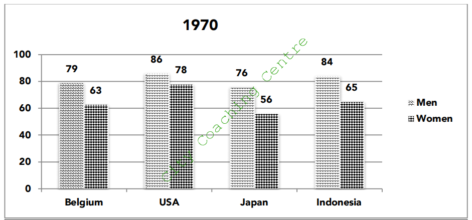
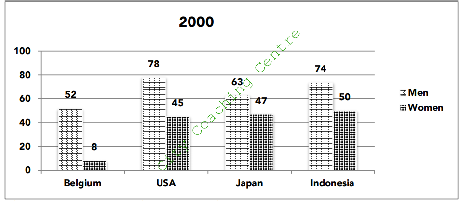
The given column graphs compare the percentages of employed males and females in four countries namely – Belgium, the USA, Japan and Indonesia in 1970 and 2000. It is manifest from the graph that in both the given years more males were employed than females.
In 1970, the USA had the highest employment rate with 86% males and 78% females doing jobs. Indonesia came in second with 84 and 65% employed men and women respectively. 79% Belgian males and 64% females were working in 1970. The lowest employment rate was in Japan, where 76% males and only 56% females were employed.
In 2000, the percentage of men and women employed was far lesser than that in 1970 in all the four given countries. In USA, the percentage of employed males and females fell by 8% and 33% respectively from the figures of 1970. Indonesia also witnessed a decrease in employment among men and women by 10 and 15% respectively. In Japan the percentage of employed men and women dropped by 13% and 9% respectively. 27% lesser Belgian men were employed in 2000. The biggest brunt of recession was faced by the Belgian women, with the figures falling from 63% in 1970 to 8% in 2000.
Overall, the year 2000 witnessed a period of recession in all the four given countries, but the Belgian and the American women were the worst hit.
128
The graph below shows four methods of dealing with waste in four countries. Summarise the information by selecting and reporting the main features and make comparisons where relevant.
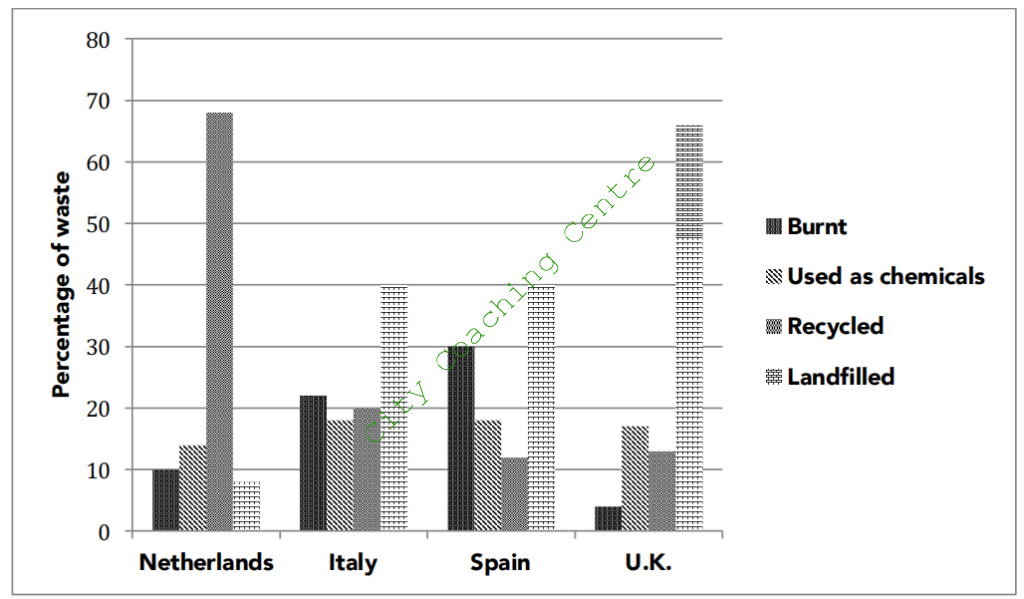
The given column graph illustrates the data on four different waste disposal methods used in the Netherlands, Italy, Spain and the UK. A cursory glance at the graph is enough to make it clear that land-filling was the method by which Italy, Spain and the UK dispose of most of their waste, but recycling is used the most for waste disposal by the Netherlands.
According to the graph, the Netherlands recycles about two thirds of its waste. About 14% of its waste is composited, which means it is used as chemicals. About 8% and 10% is landfilled and burnt respectively.
Italy and Spain landfill about 40% of their waste and use approximately 18% of their waste as chemicals. Burning is the second most popular method used in these countries. Spain burns 30% of its waste, whereas in Italy, about 22% waste is burnt.
In the UK, about 65% of the waste is put in landfill sites. About 17% is converted into compost, and about 13% is recycled. Only about 5% waste is incinerated in the UK.
Overall, the least popular method is burning in the UK, whereas landfilling, compositing and recycling are the least popular in the Netherlands, Italy and the Spain respectively.
129
The picture below shows the life cycle of the salmon. Summarise the information by selecting and reporting the main features and make comparisons where relevant.
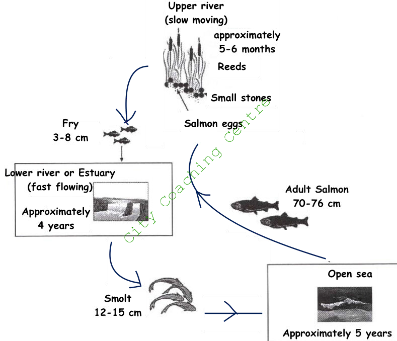
The given diagram illustrates the life cycle of the salmon. It is interesting to see that the salmon lives in both fresh water as well as sea water.
The salmon lays its eggs in the upper river, where the water is slow moving. The spawn rests in the cover of reeds and small stones for 5-6 months, after which the eggs hatch into ‘fry’, which are 3-8 cm in length. These ‘fry’ live in the lower fast flowing river or estuary for the next 4 years approximately. Here the ‘fry’ grow bigger and are now called ‘smolt’, which are 12-15 cm in length. The ‘smolt’ then migrate further downriver into the open sea, which is their home for another 5 years roughly. Eventually, the salmon attains its full size of 70-76 cm in the ocean. After about 5 years, the salmon swims back to its birthplace to lay its eggs and die.
Overall, the salmon passes through three distinct stages – the ‘fry’, the ‘smolt’ and the adult salmon. The first two stages are in fresh water and the last stage is in saline water. No wonder the salmon is called the super fish, as it lives in both – fresh and saline water.
130
The diagram below shows the process of canning of fish. Write a report for a university lecturer describing the process below.
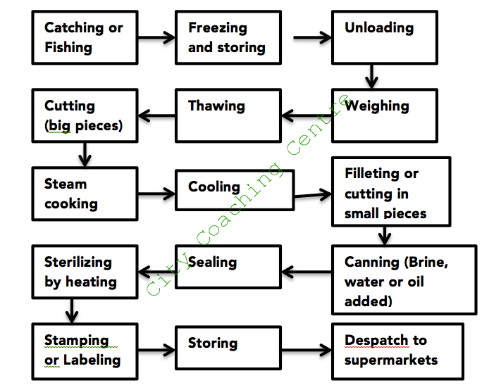
The given picture illustrates the process of canning of fish. It is manifest from the graph that 15 steps are involved from the initial catching to the final dispatch to supermarkets.
First, the fish are caught and then frozen and stored in the next step. Then they are unloaded and weighed before being thawed. After thawing, they are cut into big pieces and then are steam cooked. After cooking, these are cooled and then these are filleted or cut into small pieces. Then these pieces are canned. Brine, water or oil is added in the cans. In the next step the cans are sealed and then heated for sterilization. Then, stamping or labeling of the cans is done before storing them for final dispatch to supermarkets for sale.
Overall, it is clear that canning of fish is a lengthy and tedious process involving many steps. Each step is very important to retain the freshness of the fish and to make it consumable for a long time.
131
The chart below shows the percentage of UK households with selected consumer durables between 1998 and 2005. Summarise the information by selecting and reporting the main features and make comparisons where relevant.
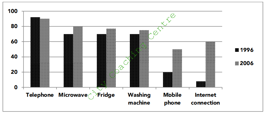
The given table illustrates the percentage of households in the United Kingdom owning consumer durables from 1996 to 2006. A cursory glance at the table is enough to make it clear that except for telephone, all other consumer durables gained popularity, with more households possessing them in 2006 as compared to 1996.
In 1996, a little more than 90% households had telephone. This percentage dropped very slightly to 90% by 2006. Microwave, fridge and washing machine was owned by similar percentage of households (70%) in 1996. However, the percentage owning the microwave escalated by 10%, whereas those owning the fridge and washing machine grew by only 5% each. The percentage of households with a mobile phone rose from 20% in 1996 to 60% by 2006. This was a three fold increase. Houses with internet connection showed the highest discrepancy, increasing from approximately 8% in 1996 to roughly 60% by 2006.
Overall, the maximum households had the telephone and the lowest had the Internet connection in 2006.
132
The table below shows a survey on the preference of different age groups in a European country on different TV programmes in 2012. Summarise the information by selecting and reporting the main features and make comparisons where relevant.
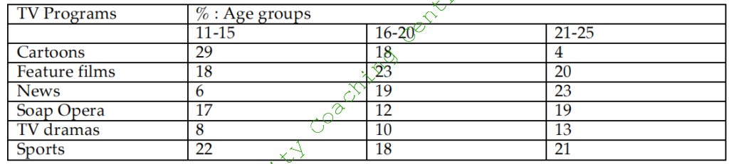
The given table illustrates the result of a survey on the preference for varied TV programmes by different age groups in a European country in 2012. It is clear that the choice of programs varied with age.
The 11-15 year olds were the most fond of cartoons. 29% of this age group like cartoon programs, whereas sports programs were liked by 22%. Feature films and soap opera were almost equally popular and were liked by just under a fifth. Only 6% and 8% respectively said that they liked News and TV dramas.
In the 16-20 year age group, just under a quarter liked feature films. These were the most popular in this age group. Cartoons, sports and news were liked by an almost equal proportion (18%) of this age group. Soap opera and TV dramas were preferred by 10-12% of this age group.
News programmes were favourites of 23% of 21-25 year olds, but cartoons were the least liked and were watched by only 4% of this age group. Approximately equal percentage liked feature films, soap operas and sports programmes. TV dramas were liked by 13% of this age group.
Overall, news programs became more popular with advancing age, where as the popularity of cartoons decreased as age advanced.
133
The chart below shows the percentage of young people at a university in 2000 and 2007. Summarise the information by selecting and reporting the main features and make comparisons where relevant.
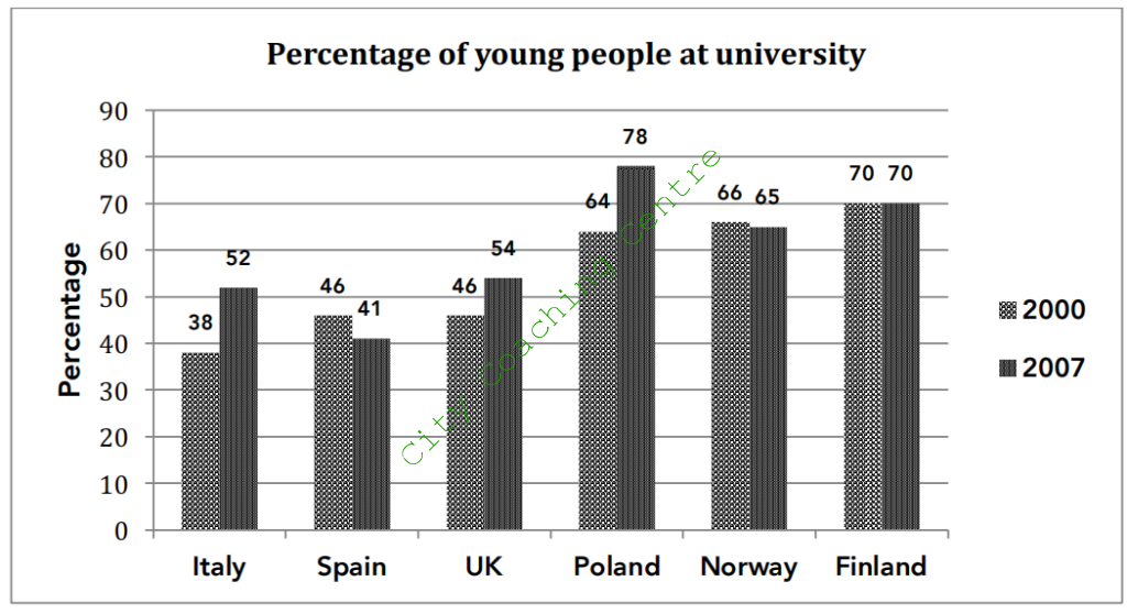
The given column graph gives the percentage of young people studying in universities in six countries in 2002 and 2007. A quick glance at the graph is enough to make it clear that Italy and Poland saw the maximum surge in the percentage of Italian and Polish students over the given period of seven years.
In 2000, 70% Finnish students studied at university, which was closely followed by the Polish and Norwegian students at 64 and 66% respectively. 46% students went to university in Spain and the UK. The least (38%) Italian students enrolled in university.
In 2007, Finland saw no change in the percentage of students, whereas Norway and Spain saw a decrease of 1% and 5% respectively in the percentage of university going students. Italian and Polish students grew by 14% in each case. This was the maximum escalation seen over the years. In the UK, the proportion of students rose moderately by 8%, from 46% in 2000, to 54% in 2007.
Overall, in 2007, the percentage of Polish students at universities was the highest, whereas that of the Spanish was the least.
134
The table below shows the percentage of employers in various sectors having difficulty in finding staff in 2003 and 2004. Summarise the information by selecting and reporting the main features and make comparisons where relevant.
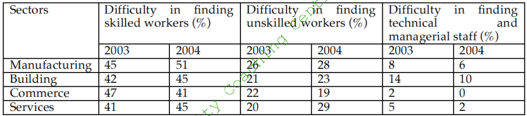
The given table illustrates the percentage of job providers of various areas who had problem in finding employees in 2003 and 2004. A quick look at the table is enough to make it clear that the maximum shortage was of skilled workers and the minimum of technical and managerial staff.
In 2003, in the manufacturing, building, commerce and services sectors, almost equal percentage (41-47%) found difficulty in hiring skilled workers. This percentage increased slightly in all sectors except for the commerce sector, in which it decreased in 2004.
Between 20 and 26% of employers found it hard to find unskilled labour in 2003. The percentage increased in all sectors except the commerce sector, where it fell to 19%.
The technical and managerial stall was the least difficult to find. In the construction sector the percentage of employers who found it tough to find staff was 14%, but it decreased by 4% in 2004. In the manufacturing, services and commerce sectors, the percentage fell from 8, 5 and 2% in 2003 to 6,2 and 0% by 2004 respectively.
Overall, the employment in the commerce sector was the best in 2003 and 2004, among the given sectors.
135
The chart below shows the hours of teaching per year done by each teacher in four different countries in 2001. Summarise the information by selecting and reporting the main features and make comparisons where relevant.
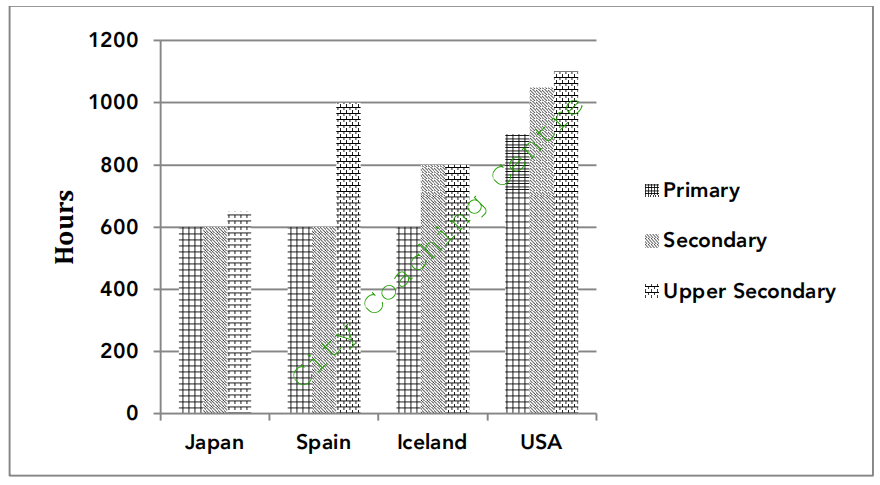
The given column graph compares the annual number of hours of teaching by every teacher of primary, secondary and upper secondary classes in Japan, Spain, Iceland and the USA. It is manifest from the graph that the teachers of the USA taught for the maximum hours in all the three classes.
The Japanese and the Spanish teachers taught 600 hours annually in their primary and secondary classes. The Spanish teachers taught 1000 hours to their upper secondary classes, which was much more than the 650 hours given to upper secondary classes by the Japanese teachers. The Icelandic teachers taught 600 hours to their primary classes in a year, whereas 800 hours were devoted to teaching secondary and upper secondary classes. The teachers of the USA taught about 900 hours per year to primary school students, whereas they taught 1050 and 1100 hours respectively to secondary and upper secondary classes.
Overall, the primary and secondary classes were given less importance by all given countries as compared to the secondary and senior secondary classes.
136
The given charts describe responses of undergraduate and postgraduate students to a questionnaire about a university library. Summarise the information by selecting and reporting the main features and make comparisons where relevant.
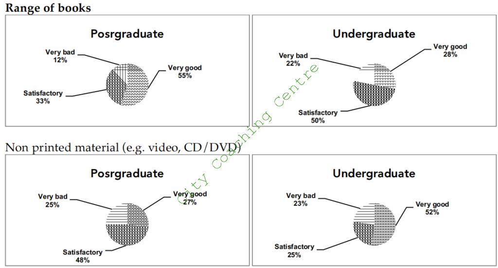
The given pie charts compare the responses of undergraduate and postgraduate students to a questionnaire about the range of books and the non-print material of a university library. It is manifest from the graph that more postgraduate students gave very good rating to the range of books, whereas more undergrads were very happy with the non-print material.
Just over half the postgrads opined that the range of books was very good, whereas almost a third said that it was satisfactory. By contrast 50% undergrads were just satisfied with the range of books and over a quarter said that the range of books was very good. Just under a quarter of undergrads and 12% postgrads were not happy with the range of books.
As far as the non-print material is concerned, just over a quarter postgrads and just over half undergrads rated it as very good. Almost half the postgrads were satisfied with the non- print material, whereas the percentage of satisfied undergrads was just a quarter. Approximately a fourth of undergrads and postgrads were not happy with the non-print material and rated it as very bad.
Overall, a majority of university students were satisfied or very happy with the range of books and the non-print material of the library.
137
The table below shows the expenses per week of a retired single person and a couple in Australia, for their comfortable lifestyle. Summarise the information by selecting and reporting the main features and make comparisons where relevant.
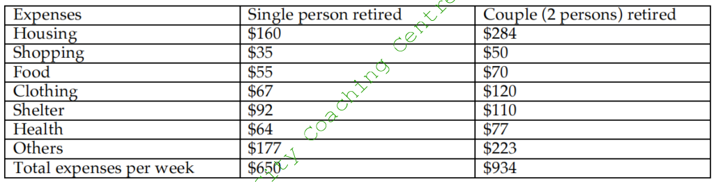
The given table compares the weekly expenditure of retired single person with that of a retired couple in Australia. It is manifest from the graph that the couples have to spend more than a single person on all the things, but the biggest difference is in housing and clothing.
The total weekly expenses needed by a single retired person are $650, whereas a retired couple spends $934 weekly for a comfortable lifestyle. Out of this, the maximum goes into housing and other miscellaneous expenditures by both categories of retirees. $160 and $284 are spent on housing by single and couple retirees respectively, whereas $177 and $223 are devoted weekly to other things.
A single retired person spends $64, $92, $67, $55 and $35 on health, shelter, clothing, food and shopping respectively, whereas a couple has to spend moderately more ($77, $110, $120,
$70 and $50) on these things.
Overall, the least expenditure is incurred on shopping and food by the retired people and the maximum on housing and other things.
138
The graph below shows the types of transport used by tourists who visited New Zealand from five countries in 2004. Summarise the information by selecting and reporting the main features and make comparisons where relevant.
The given column graph illustrates the percentage of tourists from Britain, Germany, Japan, Korea and Australia who used different modes of transport, such as air, coach, car or ferry when they visited New Zealand in 2004. A quick glance at the graph is enough to make it clear that the Japanese preferred air travel the most, where as the other given countries used car the most.
60% British tourists and approximately 52, 50 and 45% German, Korean and Australian tourists used the car to visit various places in New Zealand. The least percentage of the Japanese tourists (25%) used the car to travel around New Zealand. The tourists from Japan were the most fond of air travel. Roughly 55% Japanese tourists used air transport to travel within New Zealand. Air transport was used by 35% British, 30% Korean and 25% German tourists. By contrast only 11% Australians used air transport. A similar percentage (20%) British and German tourists used the coach, whereas the percentage of Koreans using the coach was almost double (40%) than that of the British and Germans. Coach was used the most (52%) by the Japanese tourists, whereas the least Australian tourists (8%) used the coach. Nearly 48% German tourists and 35% British tourists used the ferry. The tourists from japan, Korea and Australia were less than 15% in each case, who used the ferry as a means of transport.
Overall, coach was the least preferred mode of transport among the British, German and Australian tourist, whereas the ferry was used the least by the Japanese and Koreans.
139
The graph below shows the total amount of waste produced by cities and towns of six countries in 1980, 1990 and 2000. Summarise the information by selecting and reporting the main features and make comparisons where relevant.
The given table illustrates the total amount of waste generated in million tonnes by urban areas of Japan, Korea, Ireland, Portugal, Poland and the USA, over a period of two decades. A cursory glance at the table is enough to make it clear that the USA generated the maximum waste over the given period of time.
In 1980, Japan produced 0.6 million tonnes of waste, which was the least among the given six countries. No figures are given for Korea. From 1980 to 1990, the waste generated by Portugal and Poland increased minimally from 2 and 9 million tonnes to 3 and 10 million tonnes respectively. The waste from Australia increased considerably from 141 million tonnes in 1980 to 213 million tonnes in 1990. There was sharp increase in the waste generated in Ireland from 20 to 41 million tonnes from 1980 to 1990. The data for Japan is not available for 1990.
The decade from 1990 to 2000, however did not see such a profound escalation in the amount of waste as the previous decade. Interestingly, Korea produces far lesser waste (19 million tonnes) in 2000 than in 1990 (31 million tonnes). In Poland, the waste was almost the same as in 1990. Ireland, Portugal and the USA saw a moderate growth in the amount of waste produced.
Overall, although Japan is one country where the waste grew five times from the figures of 1980, but still it produced the minimum waste among the given six countries throughout the entire period.
140
The diagram below shows how rainwater is collected and converted to drinking water in an Australian town. Write a report for a university lecturer describing the picture below.
The given diagram illustrates how rainwater is harvested to use as drinking water in an Australian town. A quick glance at the diagram makes it clear that rainwater is filtered and also treated chemically before sending it back to the houses for use by the people.
Initially, every house collects rainwater and sends it through drains to a water filter, where the water is first filtered to remove the impurities. After that the water is sent to a storage tank. From this point onwards, the water is sent to a treatment plant, in which chemicals are added to treat the water. After the chemical treatment the water becomes germ free. This potable water is then sent to the houses for consumption by people.
Overall, it can be seen that rain water is not wasted and successfully made fit for drinking in a very simple yet effective way by the residents of the Australian town.
141
The graphs below show the viewership of different TV programmes among three different age groups. Summarise the information be selecting and reporting the main features and make comparisons where relevant.
The given pie charts compare the different types of TV programmes watched by 10-15, 16-20 and 21-25 year olds. It is clear that watching news is more popular among the older age groups whereas sport is less popular among the older age groups.
Among the 10-15 year olds, cartoon and sport programs are equally popular with a little over a quarter each viewing such programs. Drama is liked by 23% and films by 19% of this age group. News programs are watched by a small minority (6%) of these adolescents.
Moving over to the 16-20 age group, drama is the most popular with 30% watching drama. Films are the second most popular programs in this age group. Cartoons and sports are almost equally popular at 15 and 14% respectively. Surprisingly, news are three times as popular in this age group than the 10-15 year olds.
Talking about the 21-25 year age group, the popularity of news is double of that of the 16-20 year olds with 33% of this group watching news. Drama, films and cartoons are almost equally popular in this age group with around 20% watching these programs. Watching sports is the least popular among this age group with only 4% viewership.
Overall it can be seen that watching news is more popular among the older age groups and drama programs are the favourites of the 16-20 year olds.
142
The pictures below show the differences in the layout of a conference centre between its present and its future plan. Summarise the information be selecting and reporting the main features and make comparisons where relevant.
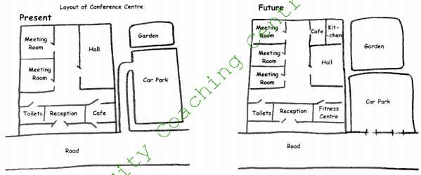
The given maps illustrate the layout of a conference centre and its proposed changes for the future. It is manifest from the two layouts that radical changes are planned for the future.
Presently, people can enter the reception through a door. There is a café next to the reception towards the east, and the toilets are towards the east of the reception. There are two meeting rooms on the west wall and a big hall on the east wall.
According to the plan, the café will be replaced by fitness centre. The two meeting rooms will be converted to three, slightly smaller, meeting rooms. The original big hall will be divided into a café, a kitchen and a hall. The car parking is planned to be made smaller, and there will be no path leading to the car park. There will be two entrances to the car park from the main road. The garden will be more than two times its present size. The reception and the toilets will remain as they are.
Overall, except for the entrance and the toilets, everything else is planned to change in the future.
143
The bar chart below shows the number of miles travelled in a year by men and women for six different purposes in a particular country. Summarise the information be selecting and reporting the main features and make comparisons where relevant.
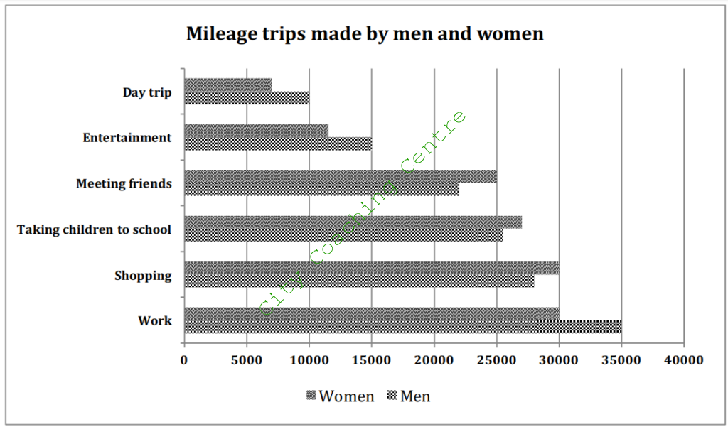
The given bar graph illustrates the number of miles travelled annually for different purposes by both genders. It is clear that men travelled more for work, entertainment and meeting friends, whereas women travelled more for shopping, meeting friends and taking children to school.
About 35000 miles were travelled by men for work, which was much more compared to the 30000 miles covered by women. By contrast day trip was the least popular reason to travel among both genders. Women travelled 7000 miles, whereas men travelled 10000 miles for this purpose.
Shopping and meeting friends were more popular reasons among females to travel. They covered 30000 and 25000 miles for these two purposes, as opposed to men, who covered 28000 and 22000 miles for these two purposes respectively.
Overall, the least discrepancy among the miles covered by both genders is for taking children to school. 26000 miles were travelled by women for taking children to school, where as just 2000 less miles were covered by men for this reason.
144
The table below shows the production of milk annually in four countries in 1990, 2000 and 2010. Summarise the information by selecting and reporting the man features and make comparisons where relevant.
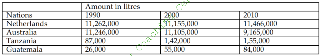
The given table illustrates the yearly production of milk in the Netherlands, Australia, Guatemala and Tanzania in 1990, 2000 and 2010. A cursory glance at the graph is enough to make it clear that the maximum production of milk was in the Netherlands throughout the given period.
The Netherlands produced 11,262,000 litres of milk in 1990, but in 2000, the production fell slightly to 11,155,000 litres, but after that it picked up again and reached an all time high of 11,466,9000. Australia was closely behind the Netherlands in the production of milk in 1990. It produced 11,246,000 litres of milk in 1990, but the production fell gradually and reached 9,165,000 litres by 2010. Tanzania, and Guatemala increased their milk production from 87,000 and 26,000 in 1990 to 1,55,000 and 84,000 litres respectively in 2010. The least milk production was in Guatemala throughout the period of twenty years. However, the biggest proportionate increase was also seen in Guatemala as the milk production more than doubled from 1990 to 2000.
Overall, the production of milk increased in all given countries except for Australia, where it decreased over the given period of two decades.
145
Compare the town of Brindell and local areas in 1800, 1900 and 2000. Summarize the information by selecting and reporting the main features, and make comparisons where relevant
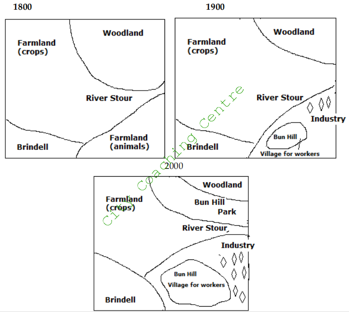
The three maps illustrate the major alterations that Brindell and its neighbouring areas underwent over two centuries from 1800-2000.
In 1800, the whole district was largely separated by River Stour, which can be seen in the centre of the layout. Brindell was situated in the south west end of the river. There were two agricultural zones near Brindell – one to the north was for growing crops and the one to the east was for animals to graze. At northeast end of the river was an area of woodland.
The district witnessed several changes in 1900. Noticeably, the entire grazing area was converted. The upper part of grazing area was substituted by an industrial zone. A village called Bun Hill was constructed in the lower part for workers.
In 2000, many more changes were observed. Brindell expanded and became almost double in size. The farmland for crops shrunk because of the construction of Bun Hill Park. Bun Hill also grew in size and many more industries were opened towards the east of the village.
Overall, Brindell transformed itself from an agricultural based town to an area with versatile functions.
146
The graph below shows the amount of energy lost from generation of electricity to the time it reaches the consumer from brown and black coal. Summarise the information by selecting and reporting the main points and make comparisons where relevant.
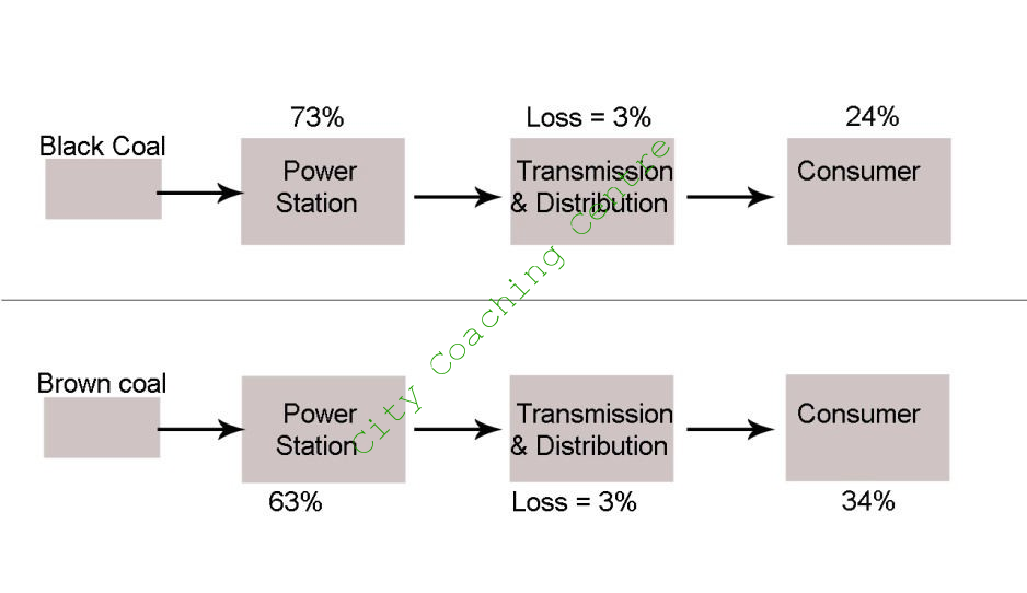
The graph compares the energy produced from black and brown coal and its loss in power station and transmission and distribution before finally it reaches the consumer. It can be clearly seen from the graph that there is more loss of energy from brown coal than from black coal.
Seventy three per cent of energy is lost in the power station from black coal where as the loss in the power station is sixty three percent from brown coal. Therefore, there is ten percent lesser energy loss from brown coal than from black coal. The loss of energy during transmission and distribution is equal (3%) from both sources. Finally twenty four per cent energy reaches the consumer from black coal but 34% energy reaches the consumer from brown coal.
Overall, it is clear that a substantial amount of energy is lost on the way before finally reaching the consumer in both these cases. However, brown coal is more energy efficient than black coal.
147
The graphs below show the number of hours Canadians spend on watching TV from 1990 -2000. Summarise the information by selecting and reporting the main features and make comparisons where relevant.
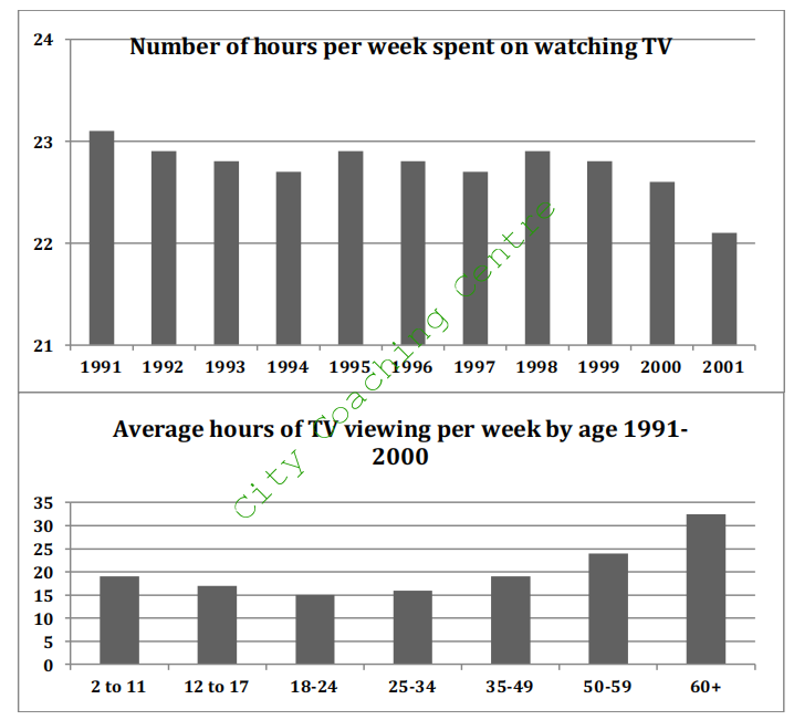
The two charts give information about the TV viewing habits of Canadians. It is clear that the time spent on watching TV fluctuated over the period.
In 1991, an average Canadian watched TV for slightly over 29 hours per week, which declined steadily over a three-year period to around 22.7 hours in 1994. The next year saw a clear recovery in TV viewing to a little below the 1991 level. From 1995 onwards, Canadians began to watch less TV gradually except in 1999, when there was a marginal increase compared with the previous year. In 2000, the number dropped to an all-time low of 22.1 hours per week.
The second graph shows that the old people clearly watched the most television, with 32.5 hours per week for those over 60 and 24 hours for those between 59 and 59. By contrast, those aged 18-24 were the least interested in TV programs, watching just below 15 hours every week. The figures for the remaining four age groups (2-11, 12-17, 25-34 and 35-49) averaged between 16 and 20 hours.
In conclusion, the overall population in Canada watched less TV over the given decade and TV viewing tended to increase with age among adults but decrease with age among children and teenagers.
148
The picture below shows Bell Hill farm in 1976 and the changes that took place in 2006. Summarise the information by selecting and reporting the main features and make comparison where relevant.
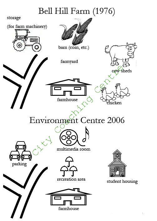
The given map shows the Bell Hill farm in 1976 and the changes that took place over a period of thirty years. It can be seen that the farm was transformed into an Environment Centre by 2006.
In 1976, there was a farmyard in the centre, which was replaced by a recreational area by 2006. The barn in which corn etc. was stored in 1976 was replaced by a multimedia room in 2006. The storage for farm machinery on the northwest was converted into a car parking area. The farmhouse on the south side was not changed at all. The cow-sheds and poultry area on the east were converted into student housing. The roads on the west were also not altered and remained as they were in 1976.
Therefore, it can be seen that the Bell Hill farm of 1976 underwent a complete transformation and became an Environmental Centre over a period of three decades.
149
The graph below shows a conference hall built in 1981 and planned for 2020. Summarise the information by selecting and reporting the main features and make comparisons where relevant.
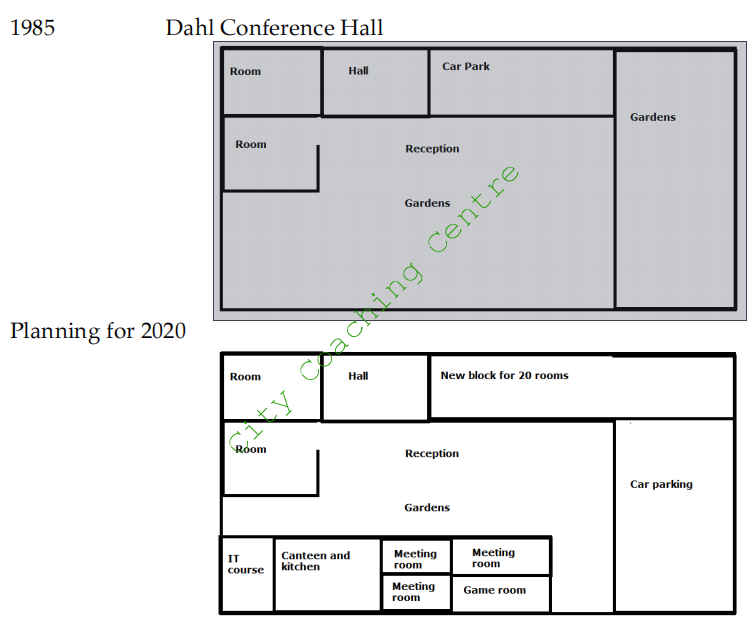
The given diagrams show the plan of a conference hall in 1985 and the proposed plan of the same hall for 2020. It is evident that some parts of the hall are planned to remain the same, where as some radical changes are planned for some sections.
In 1985, the hall had gardens on the eastern side. The northern side had a room, a small hall and a car park running from west to east side. There was another room on the western wall just in front of the room on the extreme north-west side. The reception was in the centre and the whole southern side had gardens.
Many changes are proposed for 2020. The two rooms, the small hall and the reception are proposed to remain in the same place, but the car park and part of the garden on the northern side are planned to be changed to a new block for 20 rooms. The rest of the garden area of the east is proposed to be converted in the car park.
The IT course is planned to be built on the south-west side. A canteen and kitchen are proposed to be made by the side of the IT course room. Three meeting rooms and a game room on the southern side are also included in the plan for 2020.
Overall, it can be seen that the conference hall will have many new rooms added in 2020, which would largely be at the expense of the garden area.
150
Two charts below show the percentage of qualified graduates in a particular country. Summarise the information by selecting and reporting the main features and make comparisons where relevant.
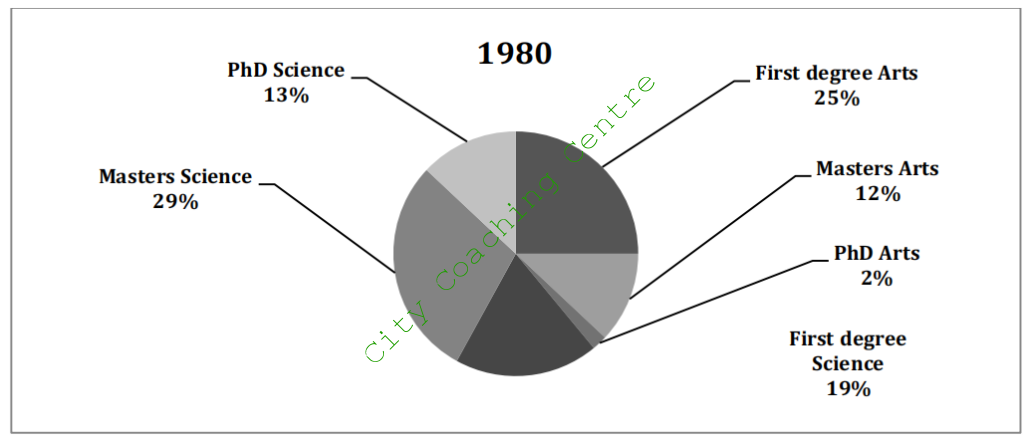
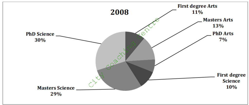
The given pie charts depict the proportion of graduates who held various degrees in a given country in 1980 and 2008. It is clear from the charts that the First degrees in Arts and Sciences lost popularity whereas the Masters and Doctoral courses gained popularity after a period of nearly three decades.
In 1980, a quarter of the graduates held a first degree in Arts, whereas only 12% went for Masters in Arts and a very small minority (2%) went for PhD in Arts. First degree Science graduates were a little under a fifth where as the Masters in Science graduates were nearly a third of the total. Only 13% held PhD degrees.
In 2008, Graduates holding Masters in Arts and Sciences were 11% and 10% respectively. This percentage was considerably less as compared to that of 1958. The proportion of Masters in Arts and Science graduates was almost similar to that of 1958. PhD degree holders in Arts grew significantly from 2% to 7% and the PhD in Science was held by 30% which was also much higher than the figures of 1958.
Overall, it is interesting to see that undergraduate or the first degree courses became less popular over time but the graduate courses were pursued by more people.
151
The charts provide information about students in 2007 who were happy with different facilities at a university of UK. Summarise the information by selecting and reporting the main features and make comparisons where relevant.
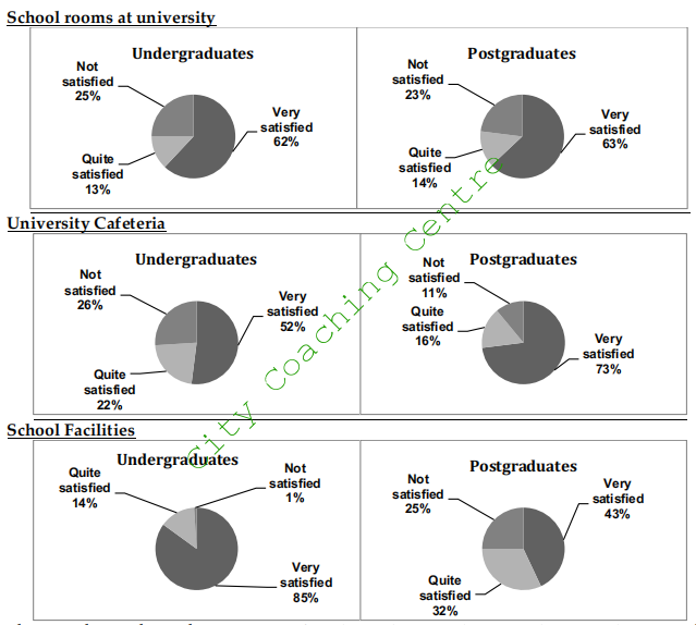
The pie charts show the opinions of undergraduate and postgraduate students on the different facilities at a university. It can be seen that the satisfaction levels are similar in some matters and different in others.
Both undergrads and postgraduates had similar feelings about the school rooms at the university. About 2/3rd of both were very satisfied, a quarter were not satisfied and the remaining 13-14% each were quite satisfied.
There was a marked difference of opinion regarding University cafeteria. Approximately 3/4th of the postgraduates were very satisfied but only about a half of undergrads were very satisfied. 16% and 11% of postgraduates were quite satisfied and not satisfied respectively where as these figures were 22% and 26% respectively. The major discrepancy was regarding school facilities for which only a small minority (1%) of undergrads was not satisfied but a quarter (25%) of postgraduates were not satisfied. A vast majority (85%) of undergrads were very satisfied whereas less than half (43%) postgraduates were very satisfied. 14% undergrads were quite satisfied but almost a double (32%) postgraduates were quite happy with school facilities.
Overall, school facilities satisfied the majority of undergrads, university cafeteria was the favourite of postgraduates.
152
The two diagrams describe the main parts of a hot air balloon and indicate how it works. Write a report for a university lecturer describing the information given below.
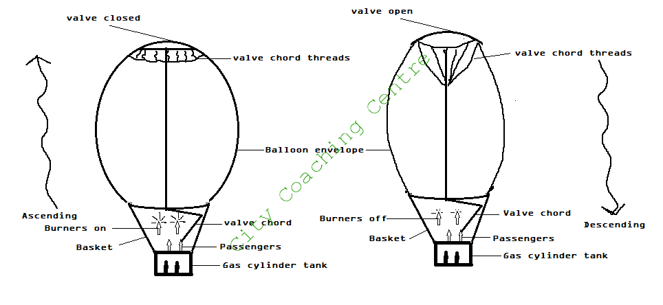
The given picture illustrates the working of a hot air balloon. It is evident that to make the balloon descend, the burners have to be extinguished.
The first picture shows the ascending hot air balloon. The gas cylinder tank is at the bottom of the balloon above which there is a basket which has arrangement for the passengers to sit or stand. When the burners are on the balloon envelope inflates and rises up. There is a valve at the top of the envelope which is closed when the balloon is rising up. The cord of the valve is in the hand of the passengers.
The second picture shows the descending hot air balloon. The burners are swithed off and the valve cord is pulled as a result of which the valve on the top is opened and the air is let out. All this deflates the balloon and the balloon descends.
So, it can be seen that the hot air balloon is scientifically designed to allow it to ascend or descend and the controll of the burners and the valve is in the hands of the passengers.
153
The diagrams below show the present building of a college and the plan for changes to the college site in the future. Summarize the information by selecting and reporting the main features, and make comparisons where relevant.
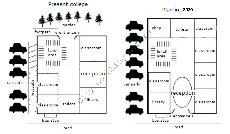
The given pictures depict the present and the future map of a college building. It is clear that many radical changes are proposed for the building in the future.
At present, to the north of the rectangular campus is a garden opposite to the entrance. Along the west wall there is a footpath and a car park, and towards the south there is the bus stop. There are two classrooms on the southwest side and there is also a slightly bigger classroom on the north-eastern corner. Towards the south of the classroom is the reception and the library. An open area for lunch is seen on the southwest side. The toilets are on the south.
The most significant change planned is that the new building will have its entrance on the front side where as the present entrance is in the back. Therefore, in the time to come, the college will face the main road and the bus stop would be right at the entrance. The footpath on the west side of the building will also become redundant and is planned to be merged with the car parking so as to widen it. The present toilet on the south is planned to be shifted to the north. On the northwest a shop is planned to be made and the lunch area is proposed to go towards the south of the shop. Instead of two classrooms on the western side the plan is to have one classroom and the library. The library is also planned to be smaller than the present library. The reception is planned to be in the middle and all along the left side there would be four classrooms.
Overall it can be seen that the college of the future would look very different from the present and would have five classrooms instead of three.(Note the use of language for talking about the future and also the use of directions)
154
The flowchart below compares three methods to recruit new employees. Summarise the information by selecting and reporting the main features, and make comparisons where relevant.
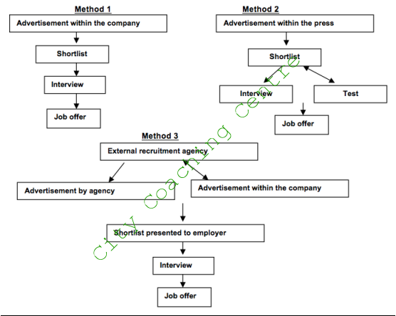
The flowcharts compare the three approaches of recruiting employees for a particular company.
The first method of finding a suitable person for the company is to publish announcements for relevant jobs. Qualified workers would be added to the shortlist, and then enter the next step of being interviewed by HR or managers. Those who are eligible get the job in the end.
The second method is to place recruitment adverts in the papers. Similarly, the names of suitable applicants could be seen on the shortlist , and these applicants are divided into two groups; the first would be interviewed directly whereas the second group would have to sit for the exam. As a result, candidates who pass the exam would get the job they want as well as those who passed the interview.
Also, companies would use recruitment agencies for the staffing strategy. The agencies not only cooperate with headhunters, but also advertise the recruitment. The following steps are similar to the first method.
Overall, these three approaches are quite simple and similar in order to find qualified employees for the company, but the first one may save more time and money.
155
The following are two filter systems. Summarise the information by selecting and reporting the main features, and make comparisons where relevant. Write at least 150 words.

The given process compares the steps of purifying water by two types of filter systems. It is clear from the graph that the basic principal of purifying water in both systems is filtration.
In the first system there is a 200 litre water container which has an inlet on the top through which dirty water is sent in. The top one third has sand to filter the water. Below the sand are tiny stones and below the layer of stones are pipes with holes. After passing through the three layers the water which comes out is pure and fit for drinking.
The second system is a bit more advanced. The untreated water is stored in a container which has a tap and from that container the water is sent to another container with sand. After being filtered through the sand the water is again stored in another container with a tap from which the water is finally used for household purposes.
So, it can be seen that water can be purified for household use using a very simple and inexpensive method of filtration.
156
The graphs below show the percentage of household energy used and the amount of greenhouse gases produced in Australia. Summarise the information making comparisons where relevant.
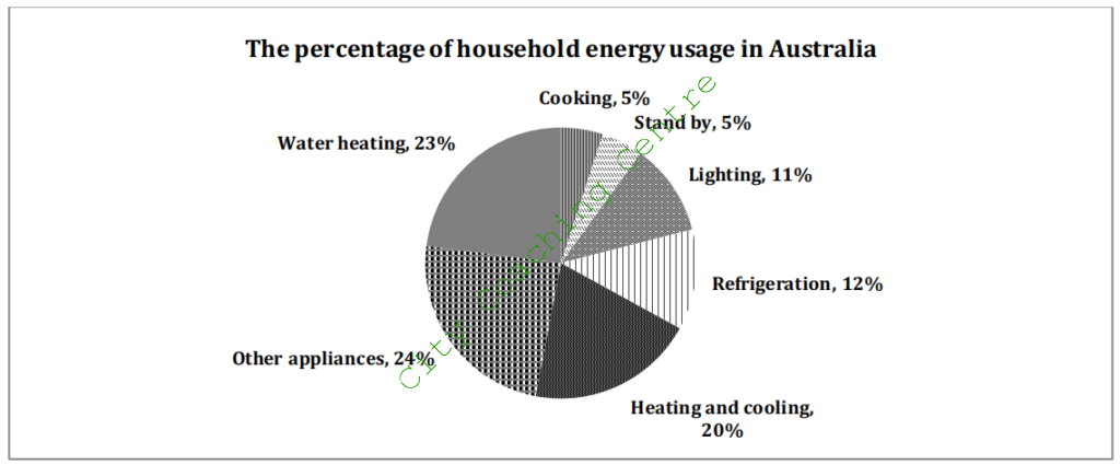
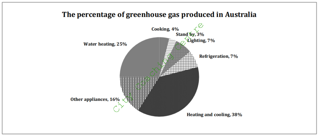
The given pie charts compare the energy consumption for various domestic areas with the emission of greenhouse gases through these sources in Australia.
The most striking feature of the graph is that a fifth (20%) of energy is used for heating and cooling whereas the greenhouse gas emission through this is about two fifths (38%) which is just about double. Greenhouse gas emissions because of water heating is 25% which is also slightly more than the usage at 23%. The least amount of energy is used for cooking and for stand-by purposes. 5% energy is used for each of these two purposes. The emission of greenhouse gases is also approximately similar from both these sources at 4 and 3% respectively.
Approximately a tenth of the energy is used for lighting and a similar amount for refrigeration. However, these two areas are the most energy efficient as the greenhouse gas emission through both is 7%. Approximately a quarter of the energy is used for other appliances and the greenhouse gas emission through these is only 16% which is slightly over a fifth.
Overall it can be seen that heating and cooling contribute the most to global warming whereas cooking and standby appliances contribute the least.
157
The graph below shows the weekly spending of an average family in a European country. Summarise the information by selecting and reporting the main features, and make comparisons where relevant.
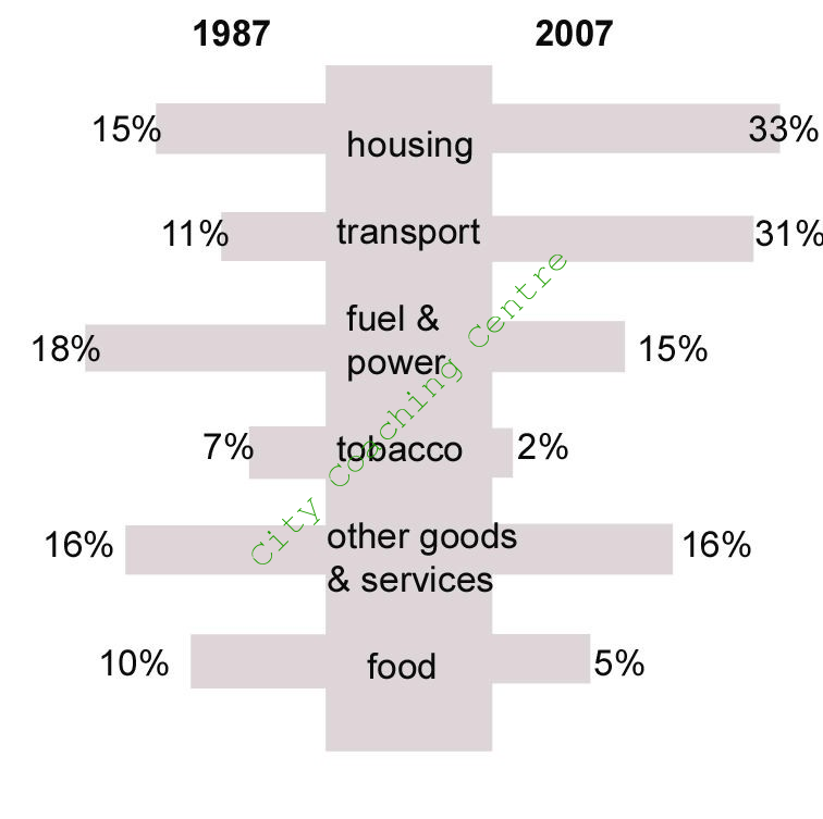
The given bar graph compares the expenditure per week of an average family in Europe. It is clear from the graph that the spending on housing and transport increased over a period of two decades whereas the expenditure on all other things decreased or remained the same.
The most striking difference is seen in the money spent on transport which grew almost threefold (11% to 31%) from 1987 to 2007. The expenditure on housing also increased from 15% to 33% which is also a very significant change. It is interesting to note that the expenditure on fuel and power decreased slightly from 18% to 15%. There was a considerable decrease in the spending on tobacco from 7% to 2% which is obviously a good thing. The weekly spending on food also halved from 10% to 5%. However, the spending on other goods and services not mentioned in the graph remained stable at 16%.
Overall, housing and transport became costlier over the period and so people had to spend more on them.
158
The first chart below shows the value of goods that Australia imported from China and those exported to China from Australia. The second chart shows the types of goods imported from China. Summarise the information by selecting and reporting the main features, and make comparisons where relevant.
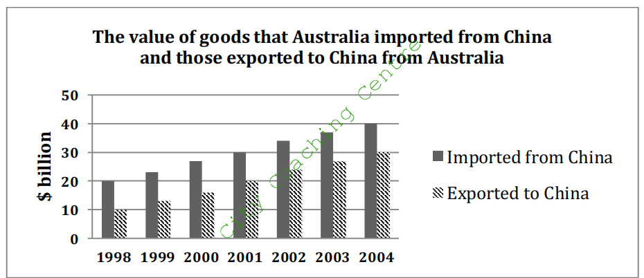
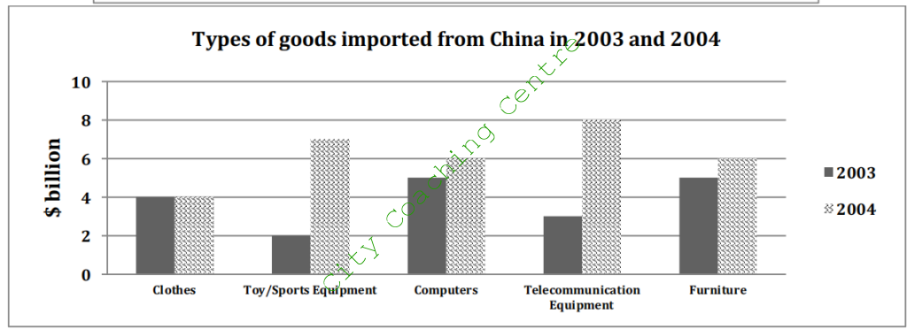
The given column graphs provide some detailed information about the importation and exportation of goods between Australia and China. It is clear from the graph that Australia imported more things from China than it exported.
Australia imported goods worth $20 billion in 1998. The imports increased steadily and reached $40 billion by 2006. In contrast, the exports to China were worth 10 billion dollars in 1998, but the exports grew rapidly and reached $30 billion dollars by 2006.
In 2003, approximately $5 billion dollars worth of computers and furniture each were imported from China. $4 billion of clothes were imported from China. Telecommunication equipment imports accounted for $3 billion. The least imports were of toys and sports equipment, which were of the value of $2 billion.
In 2004, imports of all things increased, except for clothes, which remained the same. There was a slight increase of $1 million in the import of computers and furniture. The greatest change can be seen in the import of toys/sport equipment and telecommunications equipment, which grew from $2 and $3 billion in 2003 to $7 and $8 billion respectively in 2004.
Overall, toys/sports and telecommunication equipment saw a huge surge in imports to Australia from China in just one year.
159
The graph below shows the percentage of self employed workers of the total workforce in five countries in 1998 and 2008. Summarise the information by selecting and reporting the main features, and make comparisons where relevant.
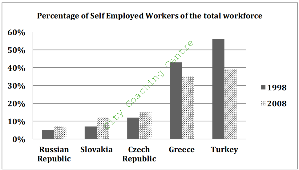
The given column graph illustrates the percentage of workers who were doing their own work, out of all employed people in five countries, in 1998 and 2008. It is manifest from the graph that the Turks and Greeks were more interested in entrepreneurship than the Russians, Slovakians and the Czechs.
The percentage of self-employed people from the Russian Republic, Slovakia and the Czech Republic was 5%, 7% and 11% respectively, in 1998. However, in just a decade the percentage rose in all three countries and reached 7%, 12% and 14% respectively, by 2008. The people of Greece and Turkey doing own business were 43% and 56% respectively, but decreased to 35% and 39% respectively by 2008.
Overall, it is interesting to see that although the percentage of entrepreneurs in the Russian Republic, Slovakia and the Czech Republic were much lesser than those in Greece and Turkey, their interest in doing their own work grew with time. Whereas, the people of Greece and Turkey were much more who were running their own business, but their interest in doing their own work dwindled with time.
160
The table below gives information about the weekly consumption of ordinary milk and butter, and high and low fat alternatives of milk and butter among different age groups in one European country. Summarise the information by selecting and reporting the main features and make comparisons where relevant.
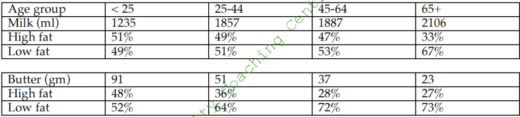
The given tables illustrate the weekly intake of milk and butter and their high and low fat alternatives, among different age groups in a European country. A quick glance at the tables is enough to make it clear that the intake of milk is more as the age groups grow with advancing age, but the intake of butter decreases with advancing age.
In the less than 25 year old age group, the intake of milk was 1235 ml, where as that of butter was 91 gram per week. Almost equal percentage consumed high-fat and low-fat milk and butter. Among the 25-44 your olds, the intake of milk was considerably more (1857ml), but their intake of butter was considerably lesser (51gm) than that of the younger age group. In this age group also, almost equal percentage had high-fat and low-fat milk, but high fat butter was consumed by only 36%, whereas the other 64% consumed low-fat butter. The 45- 64 age group had 1887 ml of milk weekly, but the butter intake was even lesser that the younger age groups at 37 gm per week. There was very slight difference in the percentage of high and low fat milk consumers, but slightly more than a quarter took high fat butter. The senior-most age group that is the 65+ age group consumed the highest amount of milk, and the lowest amount of butter per week, among the age groups given. In this age group only a third had high fat milk and high fat butter.
To sum up, the older age groups went for low fat versions of milk, even though they consumed more milk, and their butter intake also grew less with advancing age.
161
The plans below show the changes of the particular area from 1965 to the present- day and the plans also give a description of the proposed changes proposed changes proposed changes in future. Summarize information by selecting and reporting the main features and make comparisons where relevant.
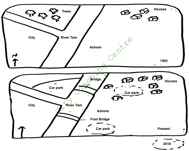
The two given pictures show the layout of an area in a city in 1965 and 2015 and also show some changes planned for 2018. It can be seen that the area around the river has been developed a lot over the given period and the development is expected to continue in the coming years.
In 1965, there was a Tam River flowing from north to south, with a branch flowing from the west to the east. Between this branch and the main river, in the northwest, some trees were there, whereas in the southwest, a city was there. A few houses were there in the northeast, whereas the southeast area was totally barren.
Now a car park has replaced the trees on the northwest, and the number of houses has increased on the northeast. One bridge has been made on the river towards the north of the tributary and one footbridge has been made towards the south of the tributary. Two car parks, one amidst the houses, and the other on the south west of the river, have been projected for 2018.
Overall, the area has seen a lot of development over the past 50 years and more changes are proposed for the future.
5/12/2015 China
162
The diagram below shows the production of olive oil. Write a report for a university lecturer describing the information below.
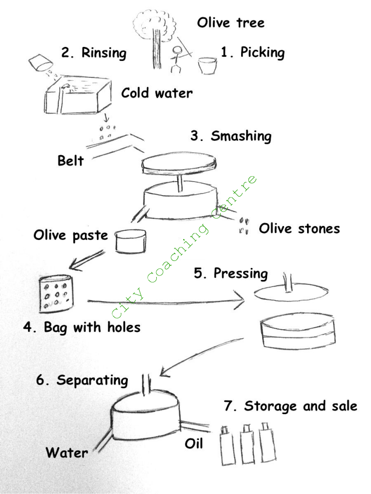
The given process depicts the stages in the production of olive oil. It is clear from the picture that there are seven main stages from the picking to the final sale.
To start with, olives are picked from the olive trees. After that, the fresh olives are washed in cold water and rinsed several times until they are clean enough. Then the olives are put on a belt before being put in a smashing device in which they are smashed and separated into olive stones and olive paste. In the fourth stage, the olive paste is put into a bag with holes and the whole thing is put in a pressing apparatus where it is pressed to get the maximum possible liquid. In the sixth step this liquid is put in another separating device in which it is separated into oil and water. The water and oil come out through separate outlets. Finally, oil is packed in bottles for storage and sale in the market.
Overall, it is seen that olive oil manufacturing is a complex process involving many steps and many devices.
163
The diagram below describes the structure of a home smokery and how it works. Summarise the information by selecting and reporting the main features and make comparisons where relevant.
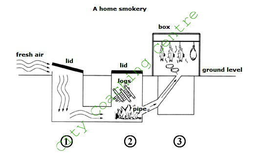
The diagram demonstrates how a home smokery works. It can be seen that there are mainly three steps involved in the process.
The home smokery machine has three parts. The first part is an empty underground section with a lid on top at ground level. Fresh air is allowed to flow into the machine by opening the lid. The fresh air then goes into the second part of the machine which is very similar to the first part. In this part, a fire is started by adding logs through the lid on top. Once the fire is burning, the heat from it is coursed through a narrow pipe that leads to a box. This box is the third part of the machine and is located at ground level. In the box the food items that need to be cooked are placed. The heat coming from the second part of the machine cooks the food items.
Overall, the diagram depicts that there are three steps in the process of cooking food in a Home Smokery.
164
The tables below are the results of research, which examined the average percentage marks scored by boys and girls of different ages in several school subjects. Write report for a university lecturer describing the information below. You should write a minimum of 150 words.
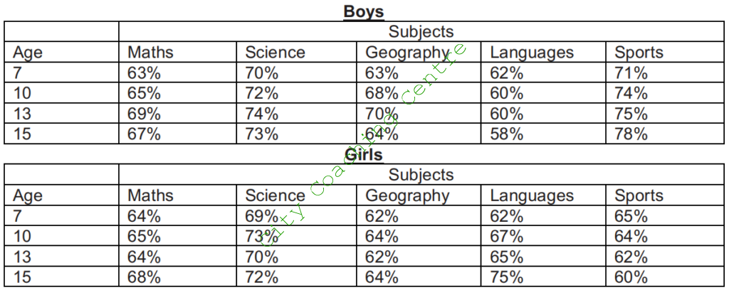
The tables show the average percentage of marks obtained in school subjects of Maths, Science, Geography, Languages and Sports by children aged 7,10,13 and 15 according to sex.
Boys scored the highest in sports (78%), whereas girls scored the highest in languages (75%). Apart from these two subjects the performance of boys and girls was comparatively similar. Boys tended to score higher in Geography, with scores ranging from 63-70%, while scores for girls ranged from 62-64%. However, at the age of 15, both boys and girls alike averaged a score of 64% for this subject. The differences between the sexes for scores for Maths and Science were negligible.
Comparing the scores for different age groups, for both boys and girls, children tended to improve as they got older. Boys improved in all subjects till age 13, but the scores were less for age 15 for all subjects except Sports. Among girls, the scores of all subjects grew as age grew, but in Sports the scores fell with advancing age.
Overall, it is clear that males in this age range performed better in sports and females in languages.
165
The graphs below show the development of the cutting tools made by stone, one was made 1.4 million years ago, and the other was made 800 thousand years ago, viewing from back view, front view and side view. Summarize the information by selecting and reporting the main features, and make comparisons where relevant.


The given diagram illustrates the cutting stone tool and how it was advanced, from 1.4 million years ago to 800 thousand years ago. It can be clearly seen that the stone tool was improved into a sharper and better one, over the years.
The stone tool made 1.4 million years ago was more rounded at the top and bottom edges. From the front and the back view of the tool it is clear that the diameter in the middle was almost 5 cm and towards the top and bottom, it was around 3 cm wide. The side view shows that the tool was wider in the middle, with a diameter of around 3 cm and it tapered towards the top and the bottom ends. The back of the stone had fewer cuts than the front and they were also not very fine.
800 thousand years ago, this tool developed into a sharper, more refined tool. In the front and the back view it can be seen that the maximum diameter of the tool was the same as in the older tool, but it was more towards the lower side. The bottom tapered into a 1 cm point, but the top tapered more sharply into a 1 cm point. The side view makes it clear that it was much lesser in width (1.5 cm) than the older tool. The stone was more chiseled than the previous one.
Overall, it can be observed that the tool was improved over the years to a more refined and finer cutting tool.
166
The table below shows the production of carbon dioxide in five different countries in 2006. Summarize the information by selecting and reporting the main features, and make comparisons where relevant.
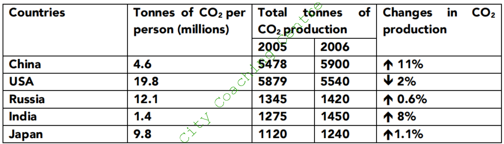
The given table illustrates the CO2 emissions per person in five countries, namely – China, the USA, Russia, India and Japan in 2006. It also compares the total tonnes of CO2 emissions in 2005 and 2006. The percentage change in CO2 emissions from 2005 to 2006 is also given.
It is manifest from the table that the developed countries had a high per capita emission of CO2. The USA produced 19.8 million tonnes of CO2 per person, which was followed by Russia and Japan at 12.1 and 9.8 million tonnes/person respectively. China produced 4.6 million tonnes CO2 per person. India produced the least CO2 per person, which was 1.4 million tonnes.
As far as the total CO2 emission is concerned, the USA again took the lead and produced 5879 million tonnes CO2 in 2005. China followed closely behind with a production of 5478 million tonnes. Russia, India and Japan produced below 1500 million tonnes of CO2. Japan produced the least CO2 emissions in 2005. In just a period of one year, China superseded the USA in CO2 emissions, with an increase of 11% from the figures of 2005. Russia, India and Japan also had a slight increase in the total CO2 generation.
Overall, the USA is the only country where there was a decline in CO2 emissions from 2005 to 2006.
167
The table below gives information about the average annual spending of university students in three different countries. Summarise the information by selecting and reporting the main features and make comparisons where relevant.
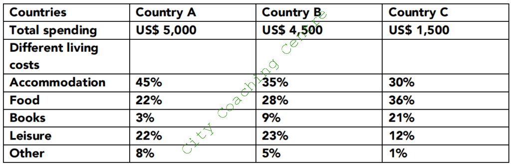
The given table compares the average yearly expenditure of university students on accommodation, food, books, leisure and other miscellaneous things in three countries. It is manifest from the graph that the least spending ($1500) was done annually by students of country C, whereas students of country A and B spent three times more than students of country C.
Students of country A spent $5000 annually, out of which a major chunk (45%) went on accommodation. Food and leisure was given equal importance and 22% was spent on each of these things. Other miscellaneous expenses accounted for 8%, and the least (3%) was spent on books.
The spending pattern of country B was almost similar, except that these students spent 9% on books, which was three times more than the expenditure done by students of country A on books. Country C spent $1500 per year, out of which more than a third (36%) went on food. 30% was spent on accommodation, and slightly over a fifth of their budget was taken away by books. These students gave much less priority to leisure, spending only 12% on it. The least (1%) was spent on other things.
Overall, it is interesting to note that although students of country C spent much lesser than students of country A and B, they gave more priority to books and food.