Line Graph 49
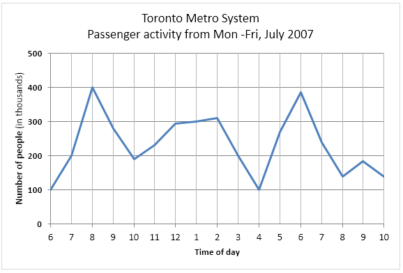
The graph below shows the weekday volume of passenger activity on the Toronto Metro system for July 2007. Summarize the information by selecting and reporting the main features, and make comparisons where relevant.

The line graph demonstrates the passenger activities on the Toronto Metro System for a week in July 2007. The x-axis of the graph shows different hours of the day while the y-axis gives the number of passengers in thousands. Overall, it is apparent from the line graph that the highest number of passengers used the Toronto Metro System at 8 in the morning and 6 in the evening.
As can be seen, the activity at Toronto Metro Station begins at 6 in the morning with the rush of 100 thousand people and a fairly similar pattern can be noticed at 4 in the evening. The Toronto Metro, in these two hours, received the lowest number of travellers. The passengers rushed in during 8 in the morning and 400 thousand of them were in this metro at that time. A similar number of passengers used this subway at 6 in the evening. Moreover, with a drastic downfall, the travellers’ number reached to about 200 thousand at 10 in the morning.
Moving further, after a climb to 300 thousand passengers at 12 in the noon, it stabilization till 2 pm before a significant fall at 4 pm. However, afterwards, the number kept on increasing before reaching to approximately 400,000 at 6 in the evening. From that point, fewer passengers used the Metro and at 10 pm there were roughly 150,000 travellers present on the Metro System.