Bar Graph 40
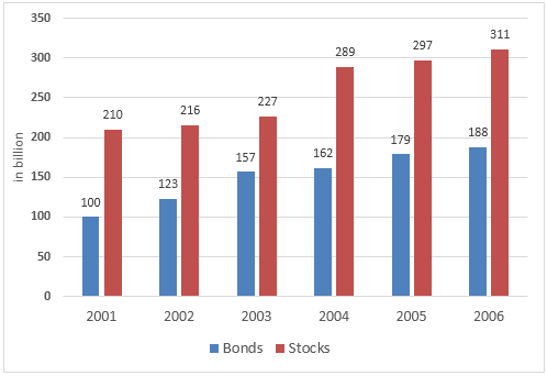
The graph below shows the way people of a country invested their money in stock market during the years 2001-2006. Summarize the information by selecting and reporting the main features, and make comparisons where relevant.

The diagram illustrates how much money citizens of a country invested in the stock market from 2001 to 2006. The investment amount is given in billion and is categorised in bonds and stocks. A glance at the bar chart depicts that amount invested in stock market increased steadily over the time and people funded considerably more money in stocks than they did in bonds.
As is presented in the graph, people bought bonds worth 100 billion and more than double than that of stocks in 2001. Next year the investment slightly raised both for bonds and stocks and went further up in 2003. People’s investment in stock went as high as 289 billion in 2004 compared to 162 billion in bonds. The same trend continued in the next two years and in 2006, total investment in stocks by the people of this country amounted over 300 billion, almost a 50% increase than that of 5 years earlier. In this year, people purchased bond worth 188 billion, around 120 billion less than that of stocks and exactly 88 billion more than that of 2001.