Pie Graph 17
The pie charts below show the coffee production, coffee consumption and the profit distribution around the world.Summarise the information by selecting and reporting the main features, and make comparisons where relevant.
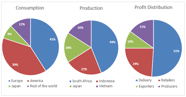
The pie charts correlate global coffee consumptions, coffee production in four countries as well as profit distributions among business segments related to coffee. It is obvious that Europeans and Americans are the primary coffee consumers while South Africa is the largest coffee producer among the given countries. Moreover, companies that deliver coffee make more profit than other organisations that do business in this industry.
According to the illustration, Europeans drink more than 40% coffee which is the highest ratio of coffee intake in the world. America consumes 2% less than that while Japanese dissipate only 8% of global coffee. Rest of the world merely consumes 12% coffee.
South Africa contributes to 44% coffee production which is the highest. Indonesia harvests 22% coffee, exactly half of the South African coffee assembly. Japan and Vietnam make 18% and 16% coffee respectively. Interestingly, despite Japan’s being one of the top countries to produce coffee, its consumption ratio is comparatively lower.
Finally, more than half of the profit from coffee is made by the delivery industries. Coffee retailers’ share of profit is roughly a quarter while coffee producers and exporters make 10% and 15% profits respectively.