Line Graph 14
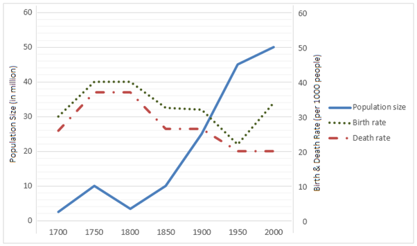
The line graph below shows the population size, birth and death rate of England and Wales from 1700 to 2000.Summarise the information by selecting and reporting the main features and make comparisons where relevant.

The line graph gives data on the birth rate, death rate and total population of England and Wales over the span of three centuries, from 1700 to 2000. As a general trend, the population in England and Wales increased overwhelmingly after the 19th century and the death rate declined while the birth rate after 1950 went upward.
As the diagram suggests, the population of England and Wales at the beginning of the 18th century was only 3 million which went as high as 10 million in 50 years. During the next 50 years, the population noticeably declined and reached to just over 3 million again at the beginning of the 19th century. However, a rapid population growth could be observed and it soared in the following centuries before reaching to 50 million in 2000.
The birth rate, childbirth per 1000 people, in England and Wales was 30 in the year 1700, which grew to 40 after 50 years. The death rate, number of mortality per 1000 people, followed a similar trend and reached to almost 38 in 1750. Afterwards, both the birth and death rates sank steadily and reached to just over 20 in 1950 with some fluctuations in the preceding decades. After that, the birth rate sharply increased and skyrocketed while the death rate stabilized. In 2000, the birth rate in the UK and Wales was as high as 34 while the death rate was 20.