
| Graph 41 |
| Graph 42 |
| Graph 43 |
| Graph 44 |
| Graph 45 |
| Graph 46 |
| Graph 47 |
| Graph 48 |
| Graph 49 |
| Graph 50 |
| Graph 51 |
| Graph 52 |
| Graph 53 |
| Graph 54 |
| Graph 55 |
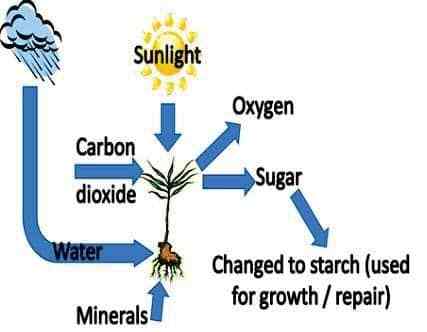
IELTS Graph #41
The process shows how plants create food
Sample answer:
The illustration shows the process by which plants are able to produce food.
Plants require input from four different sources to produce the sugars that are needed. First, the roots absorb water. Added to this, the plant is able to convert sunlight into energy needed for the process to be able to take place. Additionally, carbon dioxide is taken from the atmosphere through the leaves. Finally come the minerals which are extracted from the soil through the roots.
When combined, these four factors allow the plant to produce sugar, which is then converted into starch and stored in the leaves and the stem until required, when it is used for growth and repair of damaged leaves, stems or roots. A byproduct of this process is the conversion of carbon dioxide to oxygen, which is released into the air.
Overall, the process requires four elements to function, and in turn produces two different effects.
(154 words)
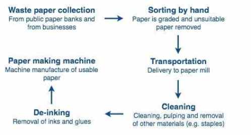
IELTS Graph #42
The chart shows the process of waste paper recycling
Sample answer:
The flow chart shows how waste paper is recycled. It is clear that there are six distinct stages in this process, from the initial collection of waste paper to the eventual production of usable paper.
At the first stage in the paper recycling process, waste paper is collected either from paper banks, where members of the public leave their used paper, or directly from businesses. This paper is then sorted by hand and separated according to its grade, with any paper that is not suitable for recycling being removed. Next, the graded paper is transported to a paper mill.
Stages four and five of the process both involve cleaning. The paper is cleaned and pulped, and foreign objects such as staples are taken out. Following this, all remnants of ink and glue are removed from the paper at the de-inking stage. Finally, the pulp can be processed in a paper making machine, which makes the end product: usable paper.
(160 words)
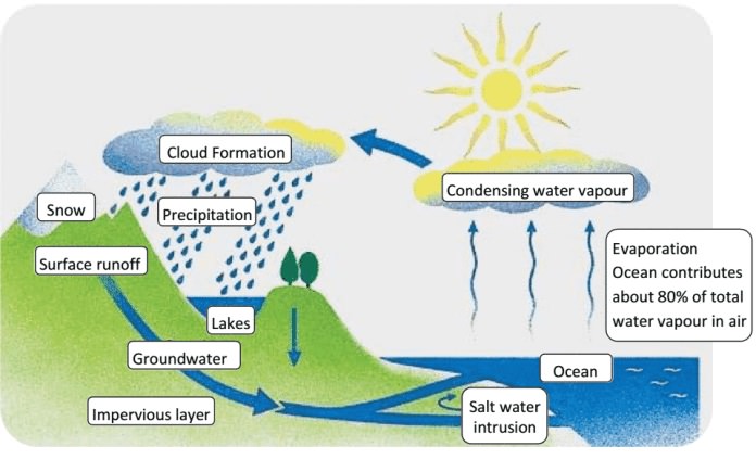
IELTS Graph #43
The diagram shows the water cycle, which is the continuous movement of water on, above and below the surface of the Earth.
Summarize the information by selecting and reporting the main features, and make comparisons where relevant.
Sample answer:
The picture illustrates the way in which water passes from ocean to air to land during the natural process known as the water cycle.
Three main stages are shown on the diagram. Ocean water evaporates, falls as rain, and eventually runs back into the oceans again.
Beginning at the evaporation stage, we can see that 80% of water vapour in the air comes from the oceans. Heat from the sun causes water to evaporate, and water vapour condenses to form clouds. At the second stage, labelled ‘precipitation’ on the diagram, water falls as rain or snow.
At the third stage in the cycle, rainwater may take various paths. Some of it may fall into lakes or return to the oceans via ‘surface runoff’. Otherwise, rainwater may filter through the ground, reaching the impervious layer of the earth. Salt water intrusion is shown to take place just before groundwater passes into the oceans to complete the cycle.
(156 Words)
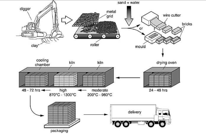
IELTS Graph #44
Brick Manufacturing
The diagram shows the process by which bricks are manufactured for the building industry.
Sample answer:
The diagram illustrates different stages in the process of manufacturing bricks from the digging step to delivery.
At the beginning of the process, clay is dug from the ground. Then, the clay is put through a metal grid, and it passes onto a roller where it is mixed with sand and water. After that, the clay can be shaped into bricks in two ways: either it is put in a mould, or a wire cutter is used.
At the fourth stage in the process, the clay bricks are placed in a drying oven for one to two days. Next, the bricks are heated in a kiln at a moderate temperature (200 – 900 degrees Celsius) and then at a high temperature (up to 1300 degrees Celsius), before spending two to three days in a cooling chamber. Finally, the finished bricks are packaged and delivered to be sold in the market.
(150 Words)
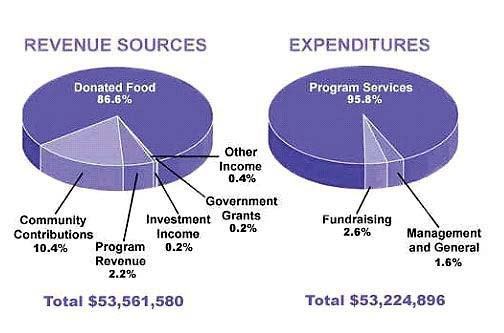
IELTS Graph #45
The pie chart shows the amount of money that a children’s charity located in the USA spent and received in one year
Sample Answer:
The pie charts show the amount of revenue and expenditures over a year of a children’s charity in the USA. Overall, it can be seen that donated food accounted for the majority of the income, while program services accounted for the most expenditure. Total revenue sources just exceeded outgoings.
In detail, donated food provided most of the revenue for the charity, at 86%.
Similarly, with regard to expenditures, one category, program services, accounted for nearly all of the outgoings, at 95.8%.
The other categories were much smaller. Community contributions, which were the second largest revenue source, brought in 10.4% of overall income, and this was followed by program revenue, at 2.2%. Investment income, government grants, and other income were very small sources of revenue, accounting for only 0.8% combined.
There were only two other expenditure items, fundraising and management and general, accounting for 2.6% and 1.6% respectively. The total amount of income was $53,561,580, which was just enough to cover the expenditures of $53,224,896.
(164 words
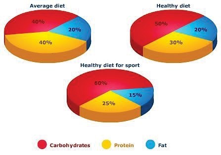
IELTS Graph #46
The proportion of carbohydrates, protein and fat in three different diets
The pie chart gives information on the proportion of carbohydrates, protein and fat in three different diets.
Write a report for a university lecturer describing the information shown below. Make comparisons where relevant.
You should write at least 150 words.
Sample Answer:
The pie charts compare the proportion of carbohydrates, protein and fat in three different diets, namely an average diet, a healthy diet, and a healthy diet for sport.
It is noticeable that sportspeople require a diet comprising a significantly higher proportion of carbohydrates than an average diet or a healthy diet. The average diet contains the lowest percentage of carbohydrates but the highest proportion of protein.
Carbohydrates make up 60% of the healthy diet for sport. This is 10% higher than the proportion of carbohydrates in a normal healthy diet, and 20% more than the proportion in an average diet. On the other hand, people who eat an average diet consume a greater relative amount of protein (40%) than those who eat a healthy diet (30%) and sportspeople (25%).
The third compound shown in the charts is fat. Fat constitutes exactly one fifth of both the average diet and the healthy diet, but the figure drops to only 15% for the healthy sports diet.
IELTS Graph #47
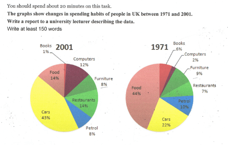
The graphs below show changes in spending habits of people in the UK between 1971 and 2001.
Write a report to a university lecturer describing the data.
You should spend about 20 minutes on this task.
Write at least 150 words.
Sample Answer:
The pie charts illustrate the changes in household spending in the UK between 1971 and 2001. It is clear that the cost of petrol made up the largest proportion of the household spending in 1971 while expenditure on cars was the greatest share of the household spending in 2001.
Firstly, British citizens spent more than a third of their money on petrol and almost a third on furniture followed by money spent in restaurants, which was precisely a quarter. The smallest proportion of expenditures was the cost on computers with only seven percent in 1971.
Secondly, after 30 years in 2001, British citizens spent significantly less money on petrol, furniture and restaurants- 8%, 8%, 14% respectively. In comparison to 1971, they spent nearly double on computers. The greatest proportion of household spending was on cars with more than 40%. The proportion of expenditure on foods were 14% and for books it was vanishingly small, only one percent in 2001.
IELTS Graph #48
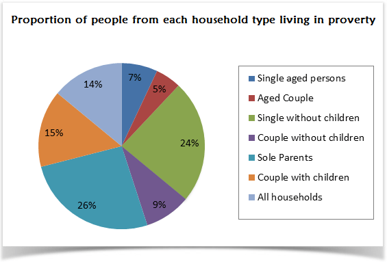
The pie chart shows the proportion of different categories of families living in poverty in the UK in 2002.
Summarise the information by selecting and reporting the main features, and make comparisons where relevant. You should spend about 20 minutes on this task.
You should write at least 150 words.
Sample Answer:
The given pie chart shows data on the different family types that lived under the poverty line in the year 2001 in the UK. As is presented in the pie chart, sole parents and single persons without children were the highest in percentages who lived in destitute conditions in the UK in 2002.
According to the pie chart, people in the UK who lived under poverty mostly fall under sole parent category for the year 2002. This was the highest among all the given categories (more than 25%) that lived in paucity for the given year. The second largest segment who were needy were the single persons without any child and their percentage was 24%. Couples with children family type had 15% poverty rate while this percentage was less than 10% for single aged person, aged couple and couples with children.
In this year 14% of all household of the UK were living in poverty. Interestingly aged people had less percentage of poverty and couples with children enjoyed better economic condition than the couples without children.
IELTS Graph #49
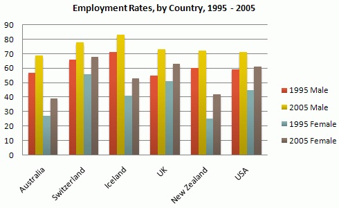
The graph shows information on employment rates across 6 countries in 1995 and 2005.
Summarise the information by choosing and describe the main idea, and make comparisons where appropriate.
- You should write at least 150
- You should take 20minutes to complete this task.
Sample Answer:
The bar graph compares the employment rates between men and female in 6 different countries for the years 1995 and 2005. As is observed from the given data, the male employment percentage was higher than the female employment percentage in all of the given six countries and the overall employment conditions in Iceland, Switzerland is comparatively better than the other four countries.
As is given in the presentation, initially in 1995, more than 65% male were employed in Switzerland and in Iceland while in other four countries this rate was less than 60%. After 10 years, the male employment percentage reached over 70% except in Australia. On the contrary, in 1995, the female employment percentage was over 50% only in Switzerland and for the rest of the countries, this was from 28 to 58%. This percentage also increased over the 10 years and in 2005, female employee percentage reached to almost 70% in Switzerland and for the rest of the countries, it was 50%.
In summary, the male had a better employment record than the female and in 10 years the employment opportunity for both male and female increased.
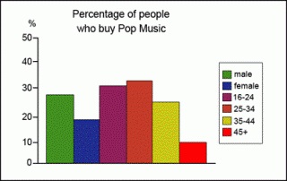
The graphs below show the types of music albums purchased by people in Britain according to sex and age.
IELTS Graph #50
Write a report for a university lecturer describing the information shown below.
You should write at least 150 words.
You should spend about 20 minutes on this task.
Sample Answer:
The three provided graphs represent data on the type of music albums purchased by the different age group and sex in England. As is observed, Rock music is most popular among the three music types mentioned here and people purchasing classical music album are mostly over 45 years.
In all cases, men purchase more music album than women. Rock and pop music are most popular among young people while classical among the people over 45 years. The market of rock music is mainly dominated by men with a purchase record of 30% compared to 17% purchase done by women. From the first graph, it is obvious that interest in pop music seems steady among the population who aged from 16 to 44 with 20% and after getting 45 years old people continue to buy pop type music albums.
Among the population of 25 to 34 years old, the rock music is most revered and it reaches its pick. Opposite to the classic music graph, the interest in rock music keeps falling after the 35 years age and a sharp fall after the age 45.
The bar chart shows the results of a survey conducted by a personnel department at a major company. The survey was carried out on two groups of workers: those aged from 18-30 and those aged 45-60, and shows factors affecting their work performance.
IELTS Graph #51
Write a report for a university lecturer describing the information shown below.You should write at least 150 words. You should spend about 20 minutes on this task
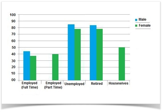
Leisure time in a typical week in hour- by sex and employment status, 1998-99.
Sample Answer:
The graph compares the amount of leisure time enjoyed by people of different employment levels in a typical week in the year 1998-1999.
In the given column graph, no data has been provided for the part-time employed and house-staying men. For rest of the cases, Men have more leisure time than women of the same category. The highest amount of leisure hours is enjoyed by those, who are unemployed. Unemployed men had approximately 85 hours of spare time and women from the same category had about 83 hours. The retired people also enjoyed the same amount of leisure activities as did the unemployed men and women. On the contrary, full-time employed men had a total of 40 hours leisure time compared to about 37 hours of women from the same status. Finally, women with part-time jobs had 40 hours to spend for their leisure activities and housewives had 50 hours leisure time per week.
In conclusion, unemployed and retire people, both men and women enjoyed more leisure time than employed people and men compared to women had more time for leisure activities.
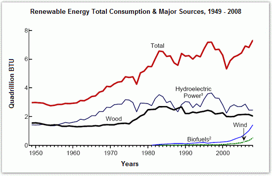
The diagram shows the consumption of renewable energy in the USA from 1949-2008.
IELTS Graph #52
Write a 150-word report for a university lecturer identifying the main trends and making comparisons where relevant. You should write at least 150 words.
You should spend about 20 minutes on this task.
Sample Answer:
The given line graph shows the main sources through which renewable energy is produced in USA and also tells about its total consumption from 1949 to 2008.
Water and wood have been the main means of producing energy. Initially from 1950 to 1960 the energy provided by them has approximately been same being 2 Quadrillion BTU, but from 1960 to 1980, the production of hydroelectric power doubled than fuel provided by wood. This increased trend of making energy through water is consistent with the total energy usage. The generation of energy through biofuels and wind was introduced in 1980. Since then, they have made a contribution of less than 1 Quadrillion BTU in production of total energy. Yet this is a significant contribution as the overall consumption of energy increased in subsequent years reaching up to a maximum of 7 Quadrillion BTU by 2008. It just dipped in 2000 because hydroelectric power also decreased during this time, but then they both rose again.
The changing trends in gross energy consumption are consistent with the generation of hydroelectric power signifying it as the major source of energy production. Wood has been the second most important source, while biofuels and wind made little contributions.
The graph shows the quantities of goods transported in the UK between 1974 and 2002 by four different modes of transport.
IELTS Graph #53
Summarize the information by selecting and reporting the main features, and make comparisons where relevant.
- You should write at least 150 words.
- You should spend about 20 minutes on this task.
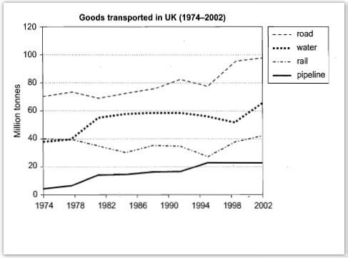
Sample Answer:
The graph illustrates the differences of transport during 1974 to 2002 in UK transport.
It can be noticed that the graph for pipeline remained steady from 1994 to 2002. However, other means of transportation on Roads, Water and Rail ways went up slowly in same year.
Goods transported in Pipeline in UK from 1974 and 2002 stayed constant at 20 million tonnes during 1994 up to 2002, which started from about one million tonnes in 1994. Unlike, Road and Water goods transported in those rose to 40 million tonnes. In the beginning 1974, Pipeline increased in 1982 almost 20 million tonnes and still maintained the same level from 1982 to 1990 and between 1990 to 1994 decreased slowly.
Three goods transport in UK (1974-2002) were Road, Water and Rail showed a rose slowly in 2002. Goods transported in Road got higher than Water and Rail. Although, water way good transportation stayed constant approximately in 60 million tonnes in 1982. Road way transported goods reduced slowly about 70 million tonnes. Pipeline was difference statistics which increased slowly but most still levelled out at nol to twenty million tonnes than others fluctuated from 1975 until 2002.
IELTS Graph #54
The graph above compares the number of visits to two new music sites on the web.
Write a report for a university lecturer describing the information shown below.
- You should write at least 150 words.
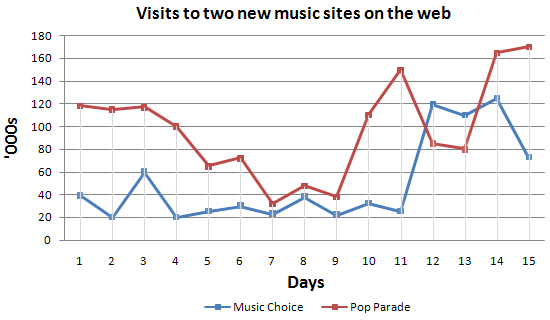
Sample Answer:
The line graph shows the amount of users of two different music sites namely, Music choice and Pop parade within two weeks. It is clear that both music sites experienced a significant increase in terms of their number of visitors towards the end of the period. It is also noticeable that more people used Music Choice than Pop parade throughout most of the period.
Turning to details, the number of listeners visited Music choice was 120 thousand on the first day and was almost thrice than the visitors by Pop parade which was only 40 thousand on the same day. From first day onwards, the number of visits started to fell noticeably from 120 thousand in Music choice, except Pop Parade which had a slight decline.
By comparison, the number of people visited Music Choice was 120000, compared to Pop Parade which was used by 60000 people on the third day shown. There was a slight fluctuation in the number of visitors to Pop Parade between 20000 and 40000 from on the day 4 till 11, in comparison, having increased from 40k to 140k, the figure for Music choice in 2 days. The visitors of Pop Parade decreased steadily from 120k till nearly 118k in two days and then recovered at that rate, whereas visits of Music Choice peaked at 14th day.
IELTS Graph #55
The graph shows Underground Station passenger numbers in London.Summarise the information by selecting and reporting the main features, and make comparisons where relevant. You should write at least 150 words. You should spend about 20 minutes on this task.
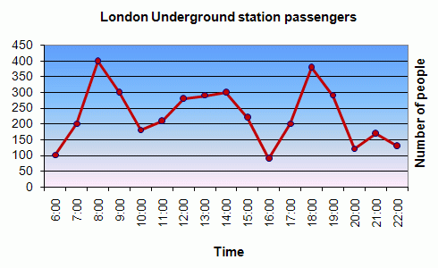
Sample Answer:
The given line graph shows data on the number of underground station passengers of London city from 6:00 am till 10:00 pm. As is observed from the graph, the highest number of people use the underground stations of London at 8:00 am and 6:00 pm.
At 6:00 am around 100 underground passengers can be found at the stations and this number increases seamlessly until 8:00 am when the passengers’ number reaches to 400. After 8:00 am the number declines steadily until 10:00 am when it reaches at around 180. The number keeps fluctuating until 4:00 pm and on an average 200 passengers can be observed during this period. After 4:00 pm the passenger number increases and reaches at 380 at around 6:00 pm. After 6:00 pm, the passenger number decreases with some fluctuations until 10:00 pm.
In summary, the highest number of passengers of London underground stations can be found in the stations during the office going and office leaving times in a day.