
| Graph 21 |
| Graph 22 |
| Graph 23 |
| Graph 24 |
| Graph 25 |
| Graph 26 |
| Graph 27 |
| Graph 28 |
| Graph 29 |
| Graph 30 |
| Graph 31 |
| Graph 32 |
| Graph 33 |
| Graph 34 |
| Graph 35 |
| Graph 36 |
| Graph 37 |
| Graph 38 |
| Graph 39 |
| Graph 40 |
IELTS Graph #21
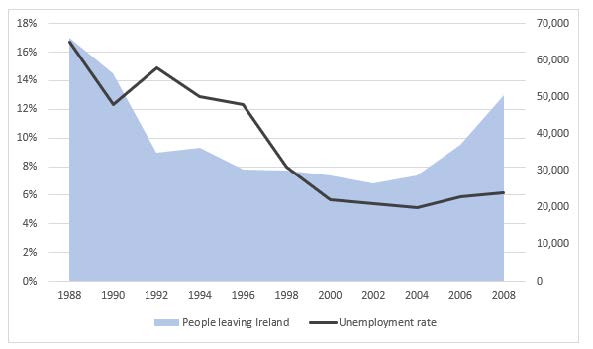
The chart below shows the unemployment rate and the number of people leaving Ireland from 1988 to 2008.
Sample Band 8
The bar chart illustrates changes in the number of emigrants from Ireland, and the percentage of unemployed people between 1988 and 2008.
In general, the unemployment rate declined significantly over the surveyed period.
Additionally, there were substantial changes in the percentage of people leaving Ireland during this time.
In 1998, the unemployment rate stood at approximately 17%. It then dropped sharply to 13% in 1990 before increasing again to 15% in 1992. From 1992 to 2000 the figure fell substantially to around 5%. Over the latter part of the surveyed period, the figure remained stable before rising slightly to 6% in 2008.
In 1988, there were just over 60,000 people leaving Ireland. This number fell by almost half over the following four years, which was then followed by a gradual decline to around 25,000 people in 2002. Over the next 6 years the figure practically doubled, reaching 50,000 people in 2008.
(154 words)
IELTS Graph #22
You should spend about 20 minutes on this task.
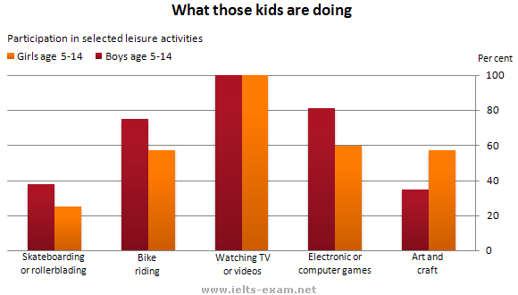
The graph below gives information about the preferred leisure activities of Australian children.
Write a report for a university lecturer describing the information shown.
You should write at least 150 words.
Model answer 1:
The graph shows the preferred leisure sctivities of Australian children aged 5-14. As might be expected, it is clear from the data that sedentary pursuits are far more popular nowadays than active ones.
Of the 10,000 children that were interviewed, all the boys and girls stated that they enjoyed watching TV or videos in their spare time. In addition, the second most popular activity, attracting 80% of boys and 60% of girls, was playing electronic or computer games. While girls rated activities such as art and craft highly – just under 60% stated that they enjoyed these in their spare time – only 35% of boys opted for creative pastimes. Bike riding, on the other hand, was almost as popular as electronic games amongst boys and, perhaps surprisingly, almost 60% of girls said that they enjoyed this too. Skateboarding was relatively less popular amongst both boys and girls, although it still attracted 35% of boys and 25% of girls.
(157 words)
Model answer 2:
The bar chart illustrates how Australian children, between 5 and 14, spend their free time. Their leisure activities are categorised into five different pursuits (Skateboarding, Bike riding, Watching TV, Computer games, and Art), and compared by the participation of boys and girls. Overall, it is noticeable that watching TV or videos is by far the most popular activity among Australian adolescents and rollerblading is the least common venture among them.
According to the diagram, all Australian boys and girls are fascinated to watch videos or TV programmes and this is the most typical leisure activity among them. The second most favoured activity among these youths is playing computer games and 80% boys are engaged in this pastime compared to 20% fewer girls. In terms of riding a bike, more than 75% of boys do it in their free time while this ratio among girls is less than 60%. ‘Art & craft’ as an activity is more favourite among Australian girls than boys. The participation of girls in arts and crafts is somewhat double than that of boy’s participation. Finally, skateboarding is the least traditional recreation activity among Australian children. Just over 20% of girls and less than 40% of boys take part in it.
Model Answer 3:
The bar graph gives information about the leisure activities of Australian children between the age of 5 – 14 years. At a first glance it is noticeable that irrespective of sex, Australian kids like to watch TV or videos.
To begin with, TV watching is the most common leisure activity among Australian children. However, about 75% to 80% of boys prefer to do bike riding and play electronic and computer games. On the contrary, nearly 60% of the girls prefer to do the same. On the other hand, more than 50% Australian young girls who are 5 – 14 years old, spend their time for art and craft. Meanwhile, just under 40% of boys spend their time for it. However, 20% to 40% of the children only spend their time for skateboarding or rollerblading and this leisure activity is also popular among boys than the girls.
In short, boys spend more time for leisure activities than girls except in art and craft while TV watching is their favourite pastime activity.
IELTS Graph #23
You should spend about 20 minutes on this task.
The diagram below shows how a central heating system in a house works.
Summarise the information by selecting and reporting the main features, and make comparisons where relevant.
You should write at least 150 words

Model answer:
This diagram provides an overview of a domestic central heating system. It shows how the tank, boiler and pipes ensure a constant flow of hot waterto both the radiators and the taps.
The cold water enters the house and is stored in a water storage tank in the roof. From there ü flows down to the boiler, located on the ground floor of the house.
The boiler, which is fuelled by gas or oil, heats up the water as it passes through it. The hot water is then pumped round the house through a system of pipes and flows into the radiators, located in different rooms. The water circulates through the radiators, which have small tubes inside them to help distribute the heat, and this warms each of the rooms. Some of the water is directed to the taps to provide hot water for the house.
Once the water has been through the pipes and radiators, it is returned to the boiler to be re-heated and circulated round the house again.
Introduction: First sentence. Overview: Second sentence.
Key features: Entry of cold water into boiler; circulation of hot waterto radiators and taps; return of waterto boiler.
Supporting information: direction of flow; types of boiler; location of radiators; radiator tubes
Paragraph breaks: The paragraph breaks mark stages in the process.
Linkers: and, from there, then, once, again Reference words: it, both, there, which, this
Topic vocabulary: enters, stored, roof, flows, ground floor, located, passes, pumped, system, circulates, heat, directed, returned, re-heated
Less common vocabulary: ensure, fuelled by, heats up, distribute the heat, warms
Structures: An appropriate mix of active and passive structures and a range of sentence types are used.
Length: 172 words
IELTS Graph #24
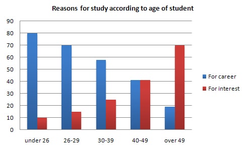
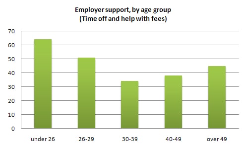
The charts below show the main reasons for study among students of different age groups and the amount of support they received from employers.
Summarise the information by selecting and reporting the main features, and make comparisons where relevant.
- You should write at least 150 words.
- You should spend about 20 minutes on this task.
1. Model Answer:
The first graph shows that there is a gradual decrease in study for career reasons with age. Nearly 80% of students under 26 years, study for their career. This percentage gradually declines by 10-20% every decade. Only 40% of 40-49yr olds and 18% of over 49yr olds studing for career reasons in late adulthood.
Conversely, the first graph also shows that study stemming from interest increases with age. There are only 10% of under 26yr olds studing out of interest. The percentage increases slowly till the beginning of the fourth decade, and increases dramatically in late adulthood. Nearly same number of 40-49yr olds study for career and interest. However 70% of over 49yr olds study for interest in comparison to 18% studing for career reasons in that age group.
The second graph shows that employer support is maximum (approximately 60%) for the under 26yr students. It drops rapidly to 32% up to the third decade of life, and then increses in late adulthood up to about 44%. It is unclear whether employer support is only for career-focused study, but the highest level is for those students who mainly study for career purposes.
This is an answer written by a candidate who achieved a Band 8 score.
2. Here is the examiner’s comment:
- This answer summarises the key features of both charts and integrates them well. Clear trends are identified and supported with appropriately-selected figures. The answer could only be improved by adding an introduction to the general topic of the charts.
- The information is well organised, with a clearly-signalled progression. Linking words are used accurately and precisely, although there is occasional omission. Paragraphing is used well initially, but lapses in the later section.
- A very good range of vocabulary is used to convey the information concisely and accurately with only occasional inappropriacy. Words are used precisely and there are no errors in spelling or word form.
- A wide range of structures is used and most sentences in this answer are accurate. Errors are rare and do not affect communication in this answer
3. Other Answer (Band 8)
Model Answer 1:
The bar chart delineates the ratio of pupils who continue their education for the benefit of their career and from passion based on their age groups. The line graph reveals the ratio of support those students get from their companies as a form of financial support and time off. Overall, young students’ main focus for education is their job while it is mostly passion when they grow older.
To illustrate, eight of ten people under 26 years old continue education for their career. Only 10% of them do it from passion. Interestingly, the higher the age, the more eager they become to study for personal interest, not for professional reasons. Seven out of ten people who are at least 50 years old study for interest. Finally, these two factors equally motivate people from 40-49 years old to further their learning.
The second diagram shows that young employees who are less than 30 years old get more backing from their employers while the least support is expected for workers between 30 to 39 years old. However, it is interesting to notice that employers are more sympathetic to workers over 40 years old than they are to employees in their thirties.
Sample Answer 2:
The diagrams outline why students from different age groups study and the support they get from their employers. Overall, having a good career is the main reason for young to study while it is personal interest for grown-ups. Moreover, young employees get more support from their employers regarding their education.
According to the first bar graph, people who are under 40 years old mostly study for the career while people over 49 years mainly study for their interest. Interestingly for the age group 40 to 49, the number of people who study for career and the number of people who study for interest is the same. 80% students under 26 years continue their education to build a career. 7 out of ten students over 49 years old do so for their interest, rather than the career.
Graph 2 shows that more than 60% students under 26 years old get support from their employers for their education and this supports includes the time off and monetary supports they get. This percentage reduces with the increase of age and at 30-39 age group, 32% get the support from the employers. After that, the employers’ support for their employees’ education increases and reaches to 45% for the over 49 year’s age group.
(Approximately 263 words) (This model answer can be followed as an example of a very good answer. However, please note that this is just one example out of many possible approaches.)
Sample Answer 3:
The graphs illustrate why people from different age groups continue their studies and the support employers offer to them in terms of financial and time off. Overall, it is obvious that there is a decreasing trend among students who study for their profession as they become older, whereas the reverse is true for those who study for passion.
It is apparent that the highest percentage of students (80%) study for their career and they are under 26 years old. Turning to the personal interest as a reason for the study, the higher the age, the ratio of pupil learning from passion increases. In addition, an equal percentage of people, aged 40 to 49, study for their career and interest in subjects.
The second bar chart reveals that the employers give more support to their young employees (those under 26 years old) and elderly workers with the least support provided to those in the age range between 30 and 39 years old.
Model Answer 4:
The charts depict why students at different ages study and also give information about the support (time off or financial aid) they receive from their employers.
Overall, it is evident that young people (under 40 years) study because of their career prospects while the majority of older people study because of their interest.
With regard to motivations, the majority of people under 40 years study in order to promote their career, although this attitude varies depending on the age of polled people. To start with, 80% students under 26 years express that they would study because of career preparation while just 10% study for interest in subjects. In older cohorts, 70% of 26-29 years old students and 58% of 30-39 years old students say that career plays an important role, while in the group of 40-49, career and interest are similarly important. People over 49 mainly study because of interest (70%).
Regarding support they receive from offices, approximately 62% of interviewees under 26 years say that they get support from their employers whereas the majority of students being older than 25 do not receive much help from their companies.
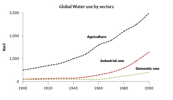
IELTS Graph #25
You should spend about 20 minutes on this task.
The graph and table below give information about water use worldwide and water consumption in two different countries.
Summarise the information by selecting and reporting the main features, and make comparisons where relevant.
Write at least 150 words.
| Country | Population | Irrigated land | Water consumption per person |
| Brazil | 176 million | 26,500 km² | 359 m³ |
| Democratic Republic of Congo | 5.2 million | 100 km² | 8 m³ |
Sample Answer 1:
The graph shows how the amount of water used worldwide changed between 1900 and 2000 and water consumptions of two countries compared to their population.
Throughout the century, the largest quantity of water was used for agricultural Purposes, and this increased dramatically from about 500 km³ to around 3,000 km³ in the year 2000. Water used in the industrial and domestic sectors also increased, but consumption was minimal until mid-century. From 1950 onwards, industrial use grew steadily to just over 1,000 km³, while domestic use rose more slowly to only 300 km³, both far below the levels of consumption by agriculture.
The table illustrates the differences in agriculture consumption in some areas of the world by contrasting the amount of irrigated land in Brazil (26,500 km³) with that in the D.R.C. (100 km²). This means that a huge amount of water is used in agriculture in Brazil, and this is reflected in the figures for water consumption per person: 359 m³ compared with only 8 m³ in the Congo. With a population of 176 million, the figures for Brazil indicate how high agriculture water consumption can be in some countries.
(Approximately 275 words)
Sample Answer 2:
The given graph shows the water consumption in different sectors and how water usage changes rapidly from 1900 to 2000. It also compares the consumption of water in the agriculture sector in two different countries according to their population.
Throughout the century, the highest water consumption could be observed in agricultural sector respectively which was initially 500 km³ and rose steadily approximately to 3000 km³ respectively. Usage of water recorded at a minimal level in 1900 and it remained same in half of the century. In 1950 and onwards, water consumption in industrial sector grew significantly to over 1000 km³ while in domestic sector slightly increment in water usages can be seen which was about only 300 km³.
The given table illustrates the water consumption in different areas of the world. Irrigated land in Brazil was 26,500 km2 with the population of 176 million and water consumption per person was 359 m³ whereas D.R.C possesses 100 km2 irrigated land with the lowest number of population (only 5.2 million) and they consumed 8 m³ water per person respectively. Moreover, Brazil consumed more water while Congo consumed less water in irrigated lands.
(Approximately 188 words)
Sample Answer 3:
The line graph and table demonstrate the trends of the global water use in three different sectors from 1900 to 2000 and compares the water usage in Congo and Brazil in 2001. There was an overall upward trend in water use in these three sectors over this period. Water consumption in Brazil was much higher than that of Congo.
Consuming water in agriculture, industrial and domestic fields all increased dramatically during this time. The figures for agriculture show the most significant changes of all. Between 1900 and 1950 its quantity rose to around 1,000 km3 and then there was a sudden rise of 2,000 km3 in 2000. The patterns of industrial and domestic water consumption were very similar to each other. Starting at almost 100 and 50 km3 respectively in 1900 and had remained nearly constant until 1950. After that, the former jumped noticeably to around 110 km3 in 2000. Likewise, the later saw a significant peak, rising by nearly 5 times (from approximately 50 to 250 km3) at the same time.
It is clearly seen from the table that the water consumption in Brazil, which had 176 million people, was significantly higher than that of Congo in spite of lower population in Congo (5.2 million), which had 265 times as less space as Brazil had.
(Approximately 213 words
Sample Answer 4:
The provided graph and table data reveals information about the usage of water in all around the world and also compares the water consumption, population and irrigated lands in Brazil and Congo.
Firstly, it can be stated that water was mainly used by three major sectors which were agriculture, industrial and domestic sectors. Secondly, Brazilian citizens consumed more water than the people of Congo did.
According to the line graph data, the irrigational need for water was dominance world widely. This consumption was around 500 Km3 in 1990; however, it increased sharply to approximately 3000 Km3 in 2000. The amount of industrial water consumption and domestic water usage were almost similar in 1990. Both of these water consumptions steadily remained sample until in 1950. After that, industrial sector consumed water more rapidly to over than 1000 Km3 in 2000. After 1970 the domestic needs for water increased but the highest consumption of water was in the agriculture sector.
The table depicts that, Brazil had far more population (176 million) than that of Congo (5.2 million). Irrigated land in Brazil was 25,500 square km while it was only 100 square km in Congo. Finally, the water consumption by Brazilian was 359 cubic meters per person compared to only 8 cubic meters by each citizen of Congo.
Sample Answer 5:
The volume of water consumed in three sectors- agriculture, industry and domestic, in the twentieth century is demonstrated in the line graph. Meanwhile, the given table illustrates the differences between agricultural and personal water consumptions in Brazil and Congo in 2000.
As the line graph represents, the highest quantity of water was consumed, throughout the given years, for the farming and it soared remarkably from 500 km3 to around 3000 km3 in 2000. An inconsiderable amount of water was used for the industrial and domestic purposes till the mid of the century. From 1950 onward, industrial water use raised steadily to above 1000 km3 while domestic utilisation of water climbed more slowly to approximately 300 km3.
By looking at the table it is clear that Brazil had 176 million population and 26500 km2 irrigation fields compare to Congo that had 5.2 million population and just 100 km2 arming lands in 2000. Consequently, the volume of water consumed by an average Brazilian was overwhelmingly greater than the water consumption of a person who lived in Congo.
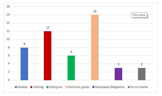
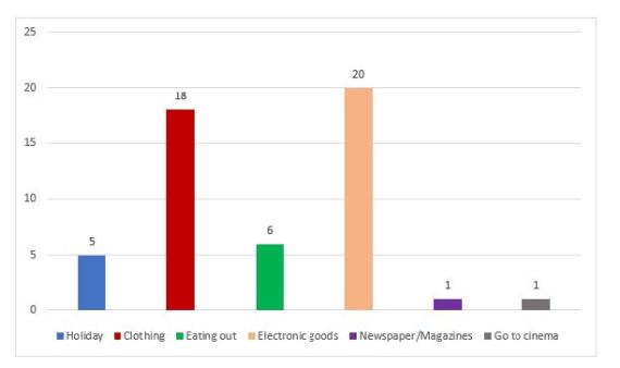
IELTS Graph #26
The charts below show the proportion of people’s total spending on different commodities and services in a particular European country in 1998 and 2008.
Sample Band 8.5
The charts give information about how people in a European country spent their money on different commodities and services in 1998 and 2008.
In general, the proportions of expenditure on electronic goods and clothing were the highest in both surveyed years. Additionally, most of the given categories saw a decrease in their figures, while the expenses for clothing and electronic goods occupied larger proportions of people’s spending.
In 1998, 16% of people’s budget was spent on electronic goods, which was 4% higher than the percentage spent on clothing. Meanwhile, the amount of money spent on holidays and eating out accounted for 8% and 6% respectively. Only 3% of people’s expenditure was used to purchase newspapers and magazines, and an additional 3% for going to the cinema.
The proportion of money spent on clothing rose by 6% in 2008, while that of electronic goods saw a 4% growth. In contrast, the percentage of expenditure used for taking holidays dropped to 5%, while that of eating out remained unchanged. Notably, people reduced their spending on newspapers and magazines, and going to the cinema, down to 1% for each.
(182 words)
Estimated Band Score: 8.5
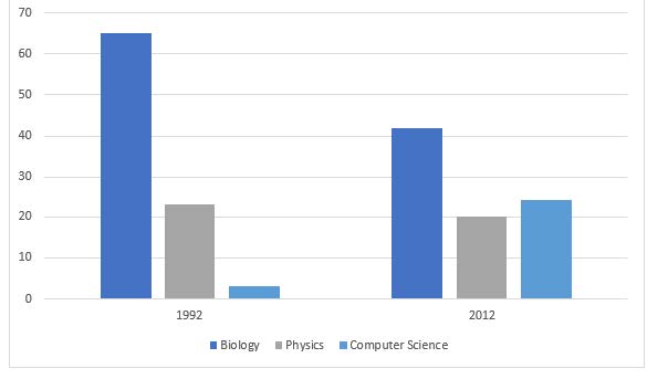
IELTS Graph #27
The chart gives information about the proportion of students choosing different science subjects in a university in 1992 and 2000
Sample Band 8.5
The bar charts show the percentage of undergraduates choosing three different science subjects in 1992 and 2012.
In general, there were more male than female students learning science subjects in the given two years. Additionally, biology was most chosen by the students, while those learning physics and computer science took up smaller proportions.
In 1992, nearly 70% of the students were males, while their counterparts only accounted for 30%. Over the following 10 years, despite a growth of 10%, the percentage of female students was still lower than that of males which declined to under 50% in 2012.
Biology was preferred by approximately 65% of the students in 1992, which was nearly triple the figure for physics, at only 20%. Computer science, on the other hand, was the least chosen subject, at under 5%. The year 2012 witnessed a significant drop in the proportion of biology learners, from 65% to over 40%, whereas the figure for physics remained unchanged at 20%. Computer science became more popular with its percentage increasing substantially to over 20%.
(174 words)
Estimated Band Score: 8.5
IELTS Graph #28
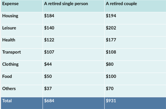
The table below illustrates how much money a single person and a couple in Australia need for a comfortable lifestyle after they retire.
Sample band 8
- The table compares the budgets needed for retired singles and couples to live a comfortable lifestyle in Australia.
- Overall, the average budget of a retired single person is much lower than that of a couple. In addition, while housing is the biggest expenditure for single retirees, retired couples need more money for leisure activities.
- The expenditure for housing of retired single people is $184, which is $10 lower than that of couples. Meanwhile, singles retirees spend $140 on leisure activities, while couples spend $60 more. Regarding healthcare, couples spend $177, which is $50 higher than the expenditure of a single retired person.
- In terms of transport, couples and singles need roughly the same amount of money, at $108 and $107 respectively. When it comes to clothing, food, and other things, the figure for an individual is almost half that of a couple. A single person spends $44, $50 and $37 respectively on these categories, while a couple spends $80, $100 and $70. In general, the total amount of money spent by an individual is $684, whereas the figure for a couple is $931.
- In contrast, the majority of people participating in the survey expected to see improvements in the communication between people, at 64%, while only 36% of them thought the opposite. Meanwhile, opinions on food quality were divided almost equally with just over half the survey participants believing that things would improve, and 49% thinking the opposite.
- (183 word)
IELTS Graph #29
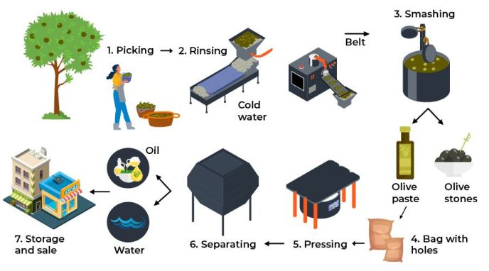
The diagram below shows the production of olive oil.
Sample Band 8
The diagram illustrates the process by which olive oil is produced.
Overall, this is a step-by-step process that is comprised of seven stages, from the harvesting of the mature fruit from olive trees, to the packaging and sale of the finished product.
Initially, ripe olives are harvested from trees by farmers and then taken to a rinsing machine where they are washed in cold water. After being rinsed, the olives are transferred via conveyor belt to another machine which grinds the olives to separate the fruit from the seeds. During this stage, the olives are ground into a paste, and the olive stones are removed.
The olive paste is then placed in a type of perforated bag before being put through a pressing machine, followed by another process where any excess water is separated from the oil. And finally, the olive oil is packaged and delivered to shops where it can be sold.
(153 word)
IELTS Graph #30
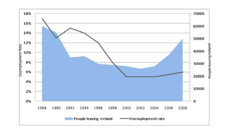
The chart below shows the unemployment rate and the number of people leaving Ireland from 1988 to 2008.
Report Plan:
- Paraphrase paragraph: shows>illustrates; the unemployment rate>the % of people unemployed; leaving Ireland>who left Ireland
- Overview/summary paragraph: (1) the unemployment rate fell (2) the number of people leaving Ireland fluctuated
- Paragraph 3: the unemployment rate – report trends and select relevant figures (e.g. the highest and lowest points)
- Paragraph 4: the numbers of people leaving Ireland – report on the fluctuations, contrasting the trends during this period
Report:
The line graph illustrates the percentage of people unemployed and the number of people who left Ireland in the period 1988 to 2008.
Overall, it is clear that the unemployment rate fell over the period, despite some fluctuations, while the number of people leaving Ireland fluctuated significantly.
In 1988, the proportion of unemployed people in Ireland stood at its highest figure of 17%. After a steep decline to 13% in 1990, the unemployment rate rose to 15% in 1992. The following years saw a dramatic decline to around 5% by 2000. The percentage of unemployed then remained relatively stable, with a rate of 6% in 2008.
Similarly, the number of people leaving Ireland was also at its peak in 1988 at 6,000. There was then a dramatic decrease to 3,500 in1992. The number then declined slowly, reaching the lowest figure in 2002 of 2,800. By contrast, the figure for emigrants from Ireland increased sharply to around 5,000 at the end of the period.
163 words.
IELTS Graph #31
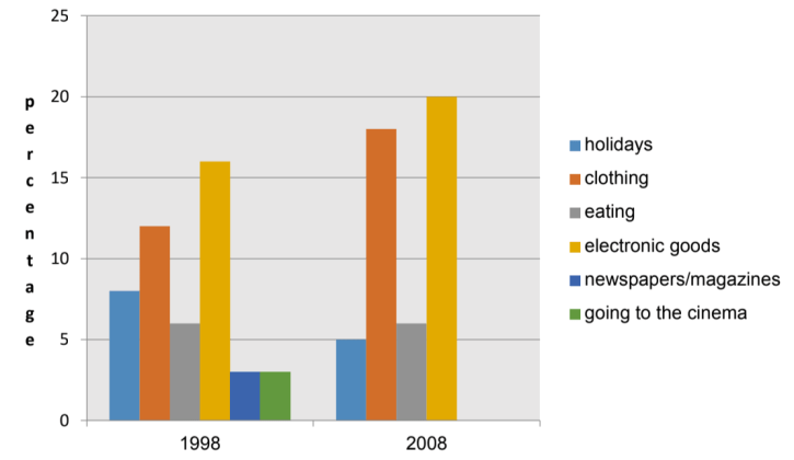
The charts compare the spending of an average American household on six different types of products or activities in 1998 and 2008.
Report Plan:
- Paraphrase paragraph: show>compare; US>American; various>different; categories>types
- Overview/summary paragraph: (1) the highest % of income was spent on electronic goods (2) expenditure on electronic goods and clothing increased significantly
- Paragraph 3: report on the 3 categories in which the proportion of spending increased – electronic goods, clothing and holidays
- Paragraph 4: contrast spending on newspapers/magazines and the cinema, which declined. % of spending on eating remained stable.
Report:
Overall, it is clear that the highest proportion of household income was spent on electronic goods, while spending both on electronic goods and clothing increased significantly in 2008 compared with ten years earlier.
In 1998, electronic goods accounted for 16% of household expenditure, and this proportion rose to 20% in 2008. A similar increase was seen in spending on clothing, from 12% of the household budget in 1998 to 18% ten years later. There
was also a small rise in holiday expenditure, which was 3% of household spending in 1998 compared with 5% in 2008.
By contrast, while the amount spent on newspapers and magazines and going to the cinema accounted for 3% of household expenditure in 1998, by 2008 households spent nothing on these things.
Finally, there was no change in the proportion of income spent on eating, which remained at 6% for the average US household.
170 words
IELTS Graph #32
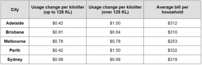
The table shows the cost of water in 5 cities in Australia.
Summarize the information by selecting and reporting the main features and make comparison where relevant.
Sample
The table illustrates the price of water, and the average household water bill, in five Australian cities.
Overall, it can be seen that Melbourne residents have the lowest water bill per household on average, while Perth households have the largest water bills. Additionally, there is little to no difference in the cost of water for residents exceeding 125 kilolitres in Brisbane, Sydney and Melbourne, whereas Perth and Adelaide residents pay significantly higher rates.
The cost of water in Adelaide and Perth is $0.42 per kilolitre for use of up to 125 kilolitres. However, this cost increases to $1.00 in Adelaide and $1.50 in Perth for water use exceeding 125 kilolitres. Residents in Melbourne and Sydney, on the other hand, pay a set rate of $0.78 and $0.98 respectively per kilolitre of water, regardless of the total amount used, while those in Brisbane pay $0.81 per kilolitre and $0.84 for water use surpassing 125 kilolitres.
Regarding household water bills, Perth residents have the highest on average, at $332, while the average in Melbourne is $253. Residents in other cities pay an average of between $310 to $320 per household.
IELTS Graph #33
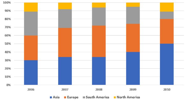
The chart shows the percentage of car manufacturer’s total sales in North America, South America, Europe and Asia.
Sample:
The bar chart illustrates the percentages of vehicles sold in four different regions by a car manufacturer, over five consecutive years, starting from 2006.
It is clear that while the proportion of cars sold in Asia increased significantly, the opposite was true in South America. Additionally, the figures for the remaining regions remained relatively stable over the period shown.
In 2006, 30% of cars were sold in Asia and Europe each, just 1% higher than in South America. By contrast, the car sales in North America made up by far the lowest percentage of total sales, at only 11%. Two years later, the proportion of car sales in Asia and Europe both rose moderately, with Europe’s sales peaking at 38% in 2008, whereas there were considerable decreases in the figures for the other regions.
By 2010, the percentage of cars sold in Asia had soared to reach 50%, while those in Europe and South America had declined significantly to 30% and 9% respectively. Meanwhile, the sales in North America, which had dropped to 5% in 2009, had recovered to 11%.
180 words
IELTS Graph #34
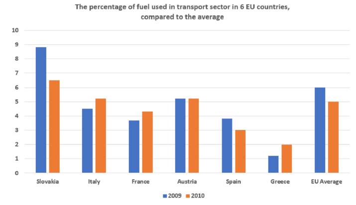
The chart below shows information about fuel used in the transport sector in different countries in Europe, compared to the EU average, in 2009 and 2010.
Sample:
The bar chart illustrates fuel usage for transportation in six different European nations, and compares these figures to the European average, in 2009 and 2010.
Overall, while the percentage of fuel used in Slovakia and Spain decreased, fuel consumption in Italy, France and Greece saw opposite trends during the research period. Additionally, the European average was higher than the figures for all countries, except for Slovakia.
In 2009, the transportation sector in Slovakia consumed nearly 7% of the total fuel, about 2% higher than in Austria. Italy used about 4.5% of fuel in transportation, compared to approximately 1% in Greece, which was the lowest figure shown on the chart. Meanwhile, fuel consumed for transportation in the other countries accounted for just under 4% of total fuel usage in each.
In 2010, the figure for Austria remained unchanged, at just over 5%, and slightly less fuel was used for transportation in Slovakia and Greece as illustrated by decreases to just over 6% and 2% respectively. In contrast, Italy, France, and Greece all experienced increases of roughly 1% in fuel consumption.
179 words
IELTS Graph #35
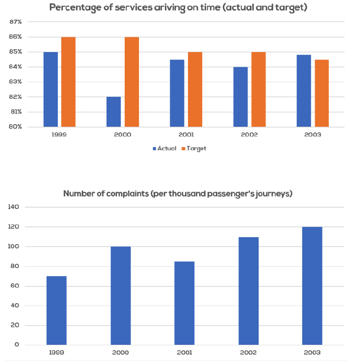
The charts below show the performance of a bus company in terms of punctuality, both actual and target (what actually happened compared to what the company was trying to achieve), and the number of complaints and passengers.
Sample :
The first chart shows the actual and target percentage of buses, from a particular bus company, that arrived at the destination on time, between 1999 and 2003. Meanwhile, the second chart shows how many complaints were made during the same period.
It is clear that while the expected target of buses arriving on time decreased over the years, there was no clear pattern in the percentage of buses that actually arrived on time. Additionally, the number of complaints from their passengers increased throughout the period.
In 1999, the company’s target of buses arriving on time stood at 86%, which was 1% higher than what was actually achieved. Although the target remained unchanged one year later, the percentage of on-time arrivals dropped by nearly 3%. By 2003, this company had reduced its target of on-time arrivals to just over 84%, while the actual figure had witnessed considerable growth to about 85%.
Starting at approximately 7% of total passengers in 1999, the number of complaints made by passengers rose significantly before experiencing a slight decline to just over 8% in 2001. This figure then grew considerably two years later, with about 12% of passengers complaining in the last year.
198 words.
IELTS Graph #36
The chart gives information about the percentage of overweight men and women in Australia from 1980 to 2010.
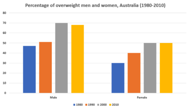
Sample:
The bar chart illustrates the rate of overweight adults in Australia, at the start of each decade, beginning in 1980.
Overall, it is clear that the percentage of overweight males was significantly higher than females in each year. Additionally, the rate of both men and women who were overweight rose over the research period.
In 1980, just under 50% of Australian men were overweight, compared to only about one-third of females, which were the lowest figures for each gender during the research period. Over the next 20 years, the rates of overweight male and female citizens in Australia both saw significant increases, with the figure for men reaching a peak of almost 70% in 2000.
From 2000 to 2010, slightly fewer men were overweight, as illustrated by a decline of roughly 3% in 2010, whereas the figure for women remained unchanged, with exactly half of Australian women being overweight in the final year.
153 words
IELTS Graph #37
The chart below shows waste collection by a recycling centre from 2011 to 2015.
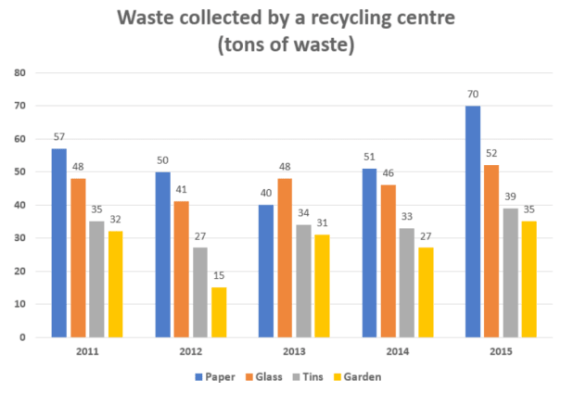
Sample
The bar chart illustrates how much waste was collected by a recycling centre over five consecutive years, starting in 2011.
It is clear that the total amount of waste collected each year followed similar trends and only fluctuated slightly. Additionally, while waste paper was the most collected type of recyclable waste, the opposite was true for garden waste during the period.
In 2011, paper was the most collected type of waste, at just under 60 tons, while about 50 tons of glass was collected. Meanwhile, there was approximately 35 tons of discarded tin collected, and 32 tons of plastic waste.
The amount of collected waste paper hit the lowest point of approximately 40 tons in 2013 before rising to over 70 tons in 2015, which was the highest figure for all observed years. Meanwhile, the figures for the other types of waste all witnessed fluctuations throughout the period, with 52 tons of glass, 39 tons of tin and 35 tons of garden waste being collected in the last year.
169 words
IELTS Graph #38
The bar chart shows the average size class in primary schools and lower secondary schools in 6 countries compared to the world average in 2006.
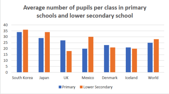
Sample:
The bar chart illustrates the average class size in primary and secondary schools in six different countries, and compares these figures with the world average.
In general, the world average number of pupils in a lower secondary school class was higher than the figure for primary schools. In addition, Asian countries (South Korea and Japan) had a higher number of students on average in classrooms compared with other countries.
In 2006, South Korea, Japan, and the UK all had larger primary school classes when compared with the world average. South Korea had the largest primary school classes, at around 34 students per class. On the other hand, Mexico, Denmark, and Iceland all had smaller than world average primary school classes, at 20, 23, and 21 students per class respectively.
With regards to lower secondary school classes, South Korea, Japan, and Mexico, all had higher than world average class sizes, with South Korea again having the largest classes, at an average of 36 students per class. The UK, Denmark, and Iceland, all had smaller than world average classes, with 18, 21, and 20 students per class respectively.
185 words
IELTS Graph #39
The illustration shows information about how igloo is built from snow.
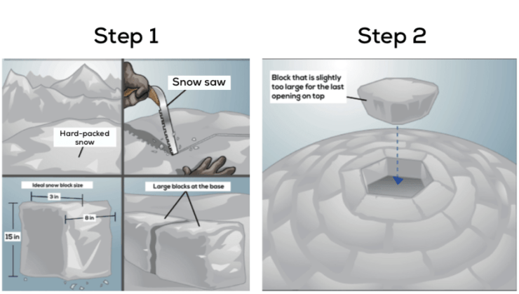


The diagram illustrates the process that is used to build an igloo from snow.
There are five main stages in this process, starting with finding an area covered by hard-packed snow and culminating in covering the entrance hole with snow blocks.
As can be seen from the process, after a surface of hard-packed snow is found, a snow saw is used to cut large blocks to the appropriate size to build the base. The edges of the blocks are then smoothed with the saw and are placed in a circle, and a hole is dug under the wall to make an entrance. Next, a slightly over-sized block is precisely shaped and placed on the top of the igloo.
Out of the remaining steps, snow is shoveled onto the outside of the igloo and is packed into all crevices while the internal surface of the igloo is smoothed by hand. Any excess snow is also removed from the inside of the igloo. And finally, a hole is dug in the shape of the entrance, and is then covered with snow blocks to complete the igloo.
(184 word)
IELTS Graph #40
The diagrams show total global population between 1900 and 2000, and its proportions according to region.
Global population from 1900 to 2000
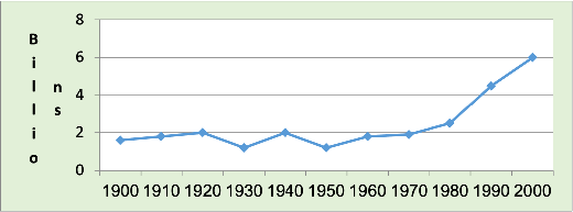
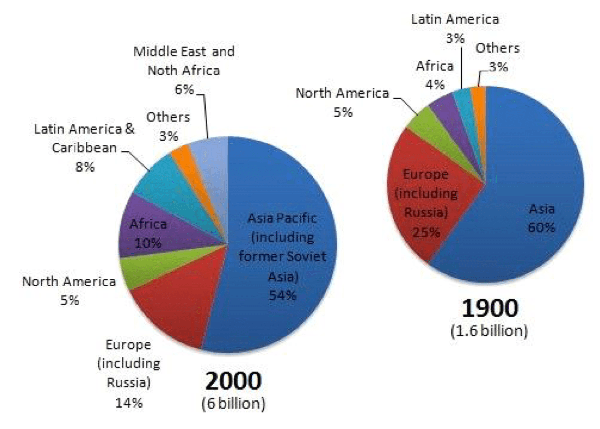
Report Plan:
- Paraphrase paragraph: (make one sentence for each type of show>give information about/illustrate; global>world; proportion>percentage
- diagram):
- Overview/summary: (1) line graph – world population increased rapidly after 1970 (2) pie charts – the region with the highest proportion was Asia
- Paragraph 3: report figures and trends for world population (line graph)
- Paragraph 4: report figures and changes for the two largest regions (Asia and Europe)
- Paragraph 5: contrast figures and trends for the other regions.
Report:
The line graph gives information about total world population from 1900 to 2000. The pie charts illustrate the percentage of the world population in this period in terms of regions.
Overall, it is clear that global population rose dramatically after 1970. The region with the highest proportion of people in the world was Asia.
From 1.6 billion in 1900, the world population fluctuated until 1950. It then increased significantly, reaching 3 billion in 1980 and doubling to 6 billion by 2000.
According to the pie charts, 60% of global population lived in Asia in 1900, although this fell to 54% at the end of the period. The proportion of global population also fell in Europe (including Russia) from 25% in 1900 to 14% in 2000.
By contrast, in Africa the proportion of world population over the period more than doubled to reach 10%. There was a similar increase in Latin America, from 3% in 1900 to 8% in 2000. The proportion of global population in North America and ‘Others’ remained constant at 5% and 3%, respectively. Finally, a new region is shown in the chart for 2000, the Middle East with 6% of world population.
195 words