
| Graph 01 |
| Graph 02 |
| Graph 03 |
| Graph 04 |
| Graph 05 |
| Graph 06 |
| Graph 07 |
| Graph 08 |
| Graph 09 |
| Graph 10 |
| Graph 11 |
| Graph 12 |
| Graph 13 |
| Graph 14 |
| Graph 15 |
| Graph 16 |
| Graph 17 |
| Graph 18 |
| Graph 19 |
| Graph 20 |
IELTS Graph # 1
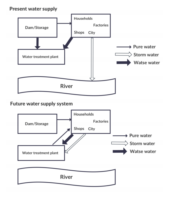
The diagrams below show the water supply system in Australia present and in future.
SAMPLE ANSWER BAND 8
The diagrams illustrate how the water supply system in Australia currently works and the plan for future changes.
Overall, the most noticeable change in the future water supply system is the recycling process of water for use in the city.
Looking at the present water supply system plan, pure water is stored in a dam before being transferred to a city to be used by households, shops and factories. From the city, storm water goes straight into the river whereas waste water is sent to the water treatment plant. After being processed, it is safe to be released into the river.
Regarding the future water supply system, it can be seen that the storage of pure water in the dam and its usage in the city are planned to remain unchanged. However, both storm water and waste water from the city will be directly pumped to the water treatment plant for processing. After that, they will both be recycled back for use in the city. Also, there will be no water released into the river.
176 words
IELTS Graph # 2
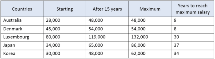
The table below shows the salaries of secondary/high school teachers in 2009.
Sample Band 8.5
The table compares secondary and high school teachers’ salaries in five countries in 2009.
Overall, while teachers in Luxembourg were the most well-paid, teachers from Australia were the lowest-paid. In addition, the amount of time it took for a teacher in Denmark to earn the maximum salary was much faster than most other countries.
Secondary and high school teachers in Luxembourg were paid a starting salary of $80,000 a year, while the figure for teachers in Denmark was significantly lower, at $45,000. Additionally, the starting salary for an inexperienced teacher in other countries stood at around $30,000.
However, teachers with at least 15 years of experience in Luxembourg earned up to $119,000 a year, while teachers in Denmark and Japan with the same level of experience only made salaries of $54,000 and $65,000 respectively. Meanwhile, Australian and Korean teachers with at least 15 years’ experience were paid the lowest salaries, at $48,000 a year. Also worth noting is that it only took teachers in Australia and Denmark less than 10 years to receive their maximum salary, while teachers in the other countries had to wait for at least 30 years.
(191 words)
IELTS Graph # 3
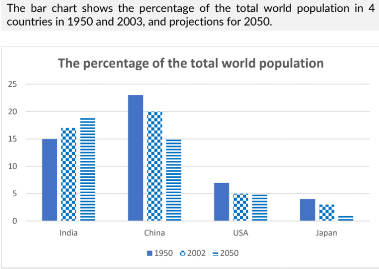
The bar chart shows the percentage of the total world population in 4 countries in 1950 and 2003, and projections for 2050.
Sample Band 8+
The bar chart illustrates the proportion of the total world population in four countries (India, China, USA and Japan) in 1950, 2002, and predicted figures for 2050. Overall, the figures for the proportion of world population decreased for all countries except India. Additionally, India is the only country where the proportion of world population is expected to have increased by 2050.
In 1950 and 2002, China made up the greatest proportion of world population, despite a slight decrease in its figures from approximately 23% to 20%. Similarly, the USA and Japan also experienced a decline of around 2% over the same period, with figures at around 5% and 2.5% respectively in 2002. In contrast, the opposite could be seen in India where the figure increased from approximately 15% to 17% in 2002.
In 2050, the figures for China and Japan are predicted to continue to drop to around 15% and 2% respectively, while the figure for the USA is likely to remain unchanged, at 5%. Meanwhile, India’s percentage of world population is projected to continue rising to 19%.
(179 words)
IELTS Graph # 4
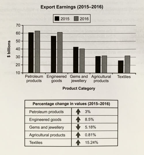
The chart below shows the value of one country’s exports in various categories during 2015 and 2016. The table shows the percentage change in each category or exports in 2016 compared with 2015.
Band 9 sample answer:
The bar chart and table give information about a country’s export earnings from five groups of products in 2015 and 2016.
It is noticeable that export revenues in all but one of the five product categories increased over the period shown. While petroleum products were the highest earning exports in both years, the textile industry saw the most significant growth in earnings.
Export earnings from petroleum products rose from around $61 billion in 2015 to $63 billion in 2016, which was an increase of 3%. Income from engineered goods reached a similar level. The country’s export earnings from these goods went up by 8.5% to approximately $62 billion in 2016.
From 2015 to 2016, there was a 15.24% increase in export revenue from textiles, with earnings rising from roughly $25 billion to over $30 billion. By contrast, there was almost no change in the amount of money earned from agricultural products, which remained at just over $30 billion. Finally, the only decline in income occurred in the gems and jewellery product group, where export earnings fell by around 5% to approximately $40 billion in 2016.
IELTS Graph # 5
The bar chart shows the distribution of employment among agriculture, services, industries in three countries in 1980 and projected distribution in 2020.
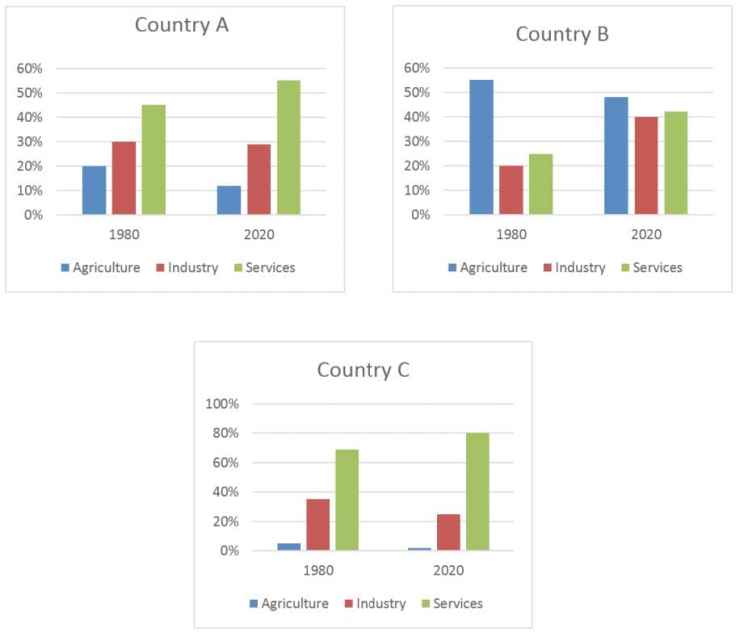
Sample Band 8+
The given bar charts compare the proportions of people working in three sectors (Agriculture, Industry, and Services) in three countries in 1980, along with predicted changes in 2020.
Overall, it can be seen that services were the main source of employment for people in countries A and C, while agriculture was the main area of employment in country B. Additionally, despite some slight variations, there are no predicted changes in the overall trends of these countries’ employment distribution.
In 1980, the main source of jobs in countries A and C was services, at approximately 45% and 65%, followed by industry, at 30% and 35% respectively. Jobs in agriculture accounted for the smallest percentage of the workforce in both countries, at around 20% and 5% respectively. Both countries are expected to see a decrease in industry related jobs and a rise in service jobs by 2020.
Country B, on the other hand, saw the largest percentage of jobs in agriculture, at approximately 70%, followed by services and industry, at approximately 35% and 20% respectively. It is predicted that trends will also remain the same in country B, with an approximate 15% decrease in agriculture jobs.
194 words
IELTS Graph # 6
The chart shows the employment status of adults in the US in 2003 and 2013
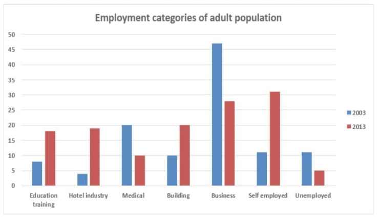
Sample Band 8+
The given bar chart illustrates the percentage of American adults in different fields of employment from 2003 to 2013.
In general, it can be seen that there were increases in the percentages of people working in education training, the hotel industry, the building industry, and the self-employment sector, while the medical, and business sectors saw decreases over this ten-year period. The unemployment rate also significantly dropped during this time.
In 2003, approximately 8%, 3%, and 10% of American adults were employed in education training, the hotel industry, and building respectively. The figures for these fields all rose to around 20% over the following ten years. Additionally, the percentage of self-employed people almost tripled, from around 10% to just over 30% during the period.
In 2013, around a quarter of the American working population chose to run their own businesses, which had seen a two-fold decrease from 2003. Similarly, percentages of those in the medical industry also dropped by half, from 20% to 10%, over the period.
IELTS Graph # 7
The bar chart shows the number of cars per 1000 people in 5 European countries in 3 years and compares with the European average.
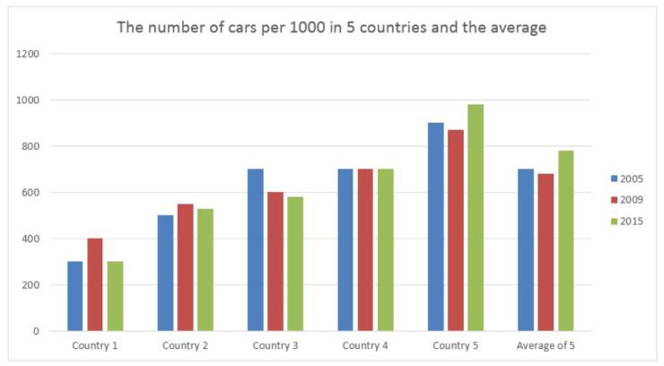
Sample Band 8+
The chart gives information about the number of cars per 1000 people in five European countries in 2005, 2009 and 2015, in comparison to the European average.
Overall, it can be seen that on average, there was a rise in the number of cars per 1000 people in Europe from 2005 to 2015. In addition, country 4 was the only country where there was no change in the number of cars during the surveyed years.
Country 5 had the highest figure among the five nations, with about 900 per 1000 people in 2005, higher than the average figure for Europe by roughly 200. The figures dropped in 2009 but rose up to almost one car per person by 2015. In contrast, country 1 had the lowest number of cars, with only around 300 cars per 1000 people in 2005. It increased to 400 in 2009 and then returned to its original point six years later.
Country 3 and 4 shared similar figures of approximately 700 per 1000 people in 2005, similar to the European average. However, while the number remained unchanged in country 4, the figures for country 3 dropped below 600 per 1000 in 2015. Finally, the number of cars per 1000 in country 2 went from 500 in 2005, to approximately 560 in 2015.
216 words
IELTS Graph # 8
The chart below shows information about fuel used in the transport sector in different countries in Europe, compared to the EU average, in 2009 and 2010.
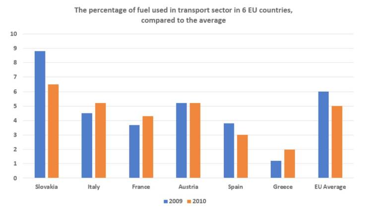
Sample Band 8+
The bar chart illustrates fuel usage for transportation in six different European nations, and compares these figures to the European average, in 2009 and 2010.
Overall, while the percentage of fuel used in Slovakia and Spain decreased, fuel consumption in Italy, France and Greece saw opposite trends during the research period. Additionally, the European average was higher than the figures for all countries, except for Slovakia.
In 2009, the transportation sector in Slovakia consumed nearly 7% of the total fuel, about 2% higher than in Austria. Italy used about 4.5% of fuel in transportation, compared to approximately 1% in Greece, which was the lowest figure shown on the chart. Meanwhile, fuel consumed for transportation in the other countries accounted for just under 4% of total fuel usage in each.
In 2010, the figure for Austria remained unchanged, at just over 5%, and slightly less fuel was used for transportation in Slovakia and Greece as illustrated by decreases to just over 6% and 2% respectively. In contrast, Italy, France, and Greece all experienced increases of roughly 1% in fuel consumption.
179 words
IELTS Graph # 9
The chart shows the percentage of car manufacturer’s total sales in North America, South America, Europe and Asia
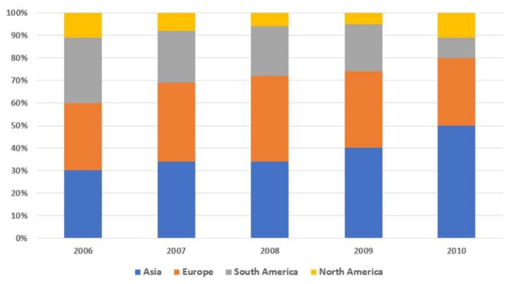
Sample Band 8+
The bar chart illustrates the percentages of vehicles sold in four different regions by a car manufacturer, over five consecutive years, starting from 2006.
It is clear that while the proportion of cars sold in Asia increased significantly, the opposite was true in South America. Additionally, the figures for the remaining regions remained relatively stable over the period shown.
In 2006, 30% of cars were sold in Asia and Europe each, just 1% higher than in South America. By contrast, the car sales in North America made up by far the lowest percentage of total sales, at only 11%. Two years later, the proportion of car sales in Asia and Europe both rose moderately, with Europe’s sales peaking at 38% in 2008, whereas there were considerable decreases in the figures for the other regions.
By 2010, the percentage of cars sold in Asia had soared to reach 50%, while those in Europe and South America had declined significantly to 30% and 9% respectively. Meanwhile, the sales in North America, which had dropped to 5% in 2009, had recovered to 11%.
180 words
IELTS Graph # 10
The chart gives information about the percentage of overweight men and women in Australia from 1980 to 2010.
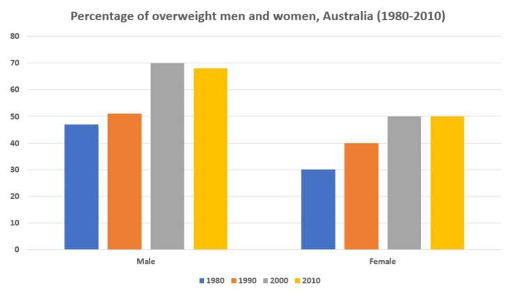
Sample Band 8+
The bar chart illustrates the rate of overweight adults in Australia, at the start of each decade, beginning in 1980.
Overall, it is clear that the percentage of overweight males was significantly higher than females in each year. Additionally, the rate of both men and women who were overweight rose over the research period.
In 1980, just under 50% of Australian men were overweight, compared to only about one-third of females, which were the lowest figures for each gender during the research period. Over the next 20 years, the rates of overweight male and female citizens in Australia both saw significant increases, with the figure for men reaching a peak of almost 70% in 2000.
From 2000 to 2010, slightly fewer men were overweight, as illustrated by a decline of roughly 3% in 2010, whereas the figure for women remained unchanged, with exactly half of Australian women being overweight in the final year.
153 words
IELTS Graph # 11
The bar chart shows the average size class in primary schools and lower secondary schools in 6 countries compared to the world average in 2006.
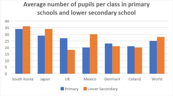
Sample Band 8+
The bar chart illustrates the average class size in primary and secondary schools in six different countries, and compares these figures with the world average.
In general, the world average number of pupils in a lower secondary school class was higher than the figure for primary schools. In addition, Asian countries (South Korea and Japan) had a higher number of students on average in classrooms compared with other countries.
In 2006, South Korea, Japan, and the UK all had larger primary school classes when compared with the world average. South Korea had the largest primary school classes, at around 34 students per class. On the other hand, Mexico, Denmark, and Iceland all had smaller than world average primary school classes, at 20, 23, and 21 students per class respectively.
With regards to lower secondary school classes, South Korea, Japan, and Mexico, all had higher than world average class sizes, with South Korea again having the largest classes, at an average of 36 students per class. The UK, Denmark, and Iceland, all had smaller than world average classes, with 18, 21, and 20 students per class respectively.
185 words
IELTS Graph # 12
The chart below shows waste collection by a recycling centre from 2011 to 2015
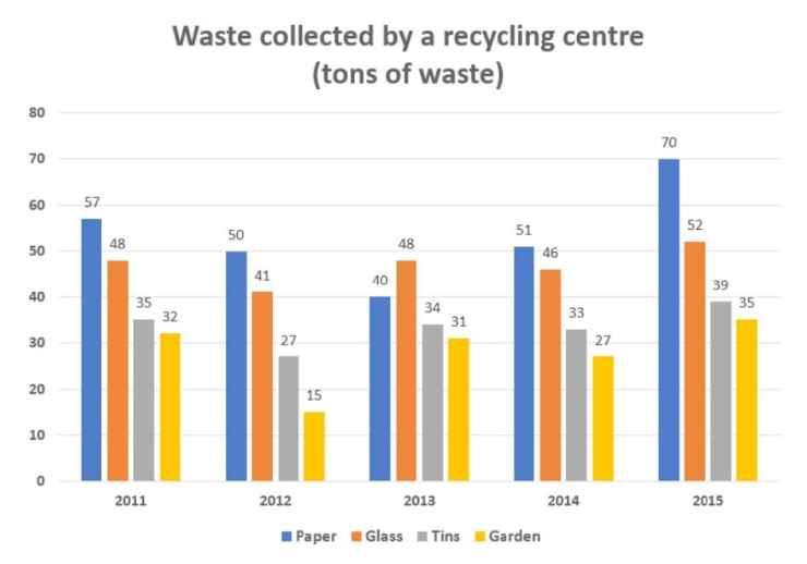
Sample Band 8+
The bar chart illustrates how much waste was collected by a recycling centre over five consecutive years, starting in 2011.
It is clear that the total amount of waste collected each year followed similar trends and only fluctuated slightly. Additionally, while waste paper was the most collected type of recyclable waste, the opposite was true for garden waste during the period.
In 2011, paper was the most collected type of waste, at just under 60 tons, while about 50 tons of glass was collected. Meanwhile, there was approximately 35 tons of discarded tin collected, and 32 tons of plastic waste.
The amount of collected waste paper hit the lowest point of approximately 40 tons in 2013 before rising to over 70 tons in 2015, which was the highest figure for all observed years. Meanwhile, the figures for the other types of waste all witnessed fluctuations throughout the period, with 52 tons of glass, 39 tons of tin and 35 tons of garden waste being collected in the last year.
169 words
IELTS Graph # 13
The graph below shows the amount of UK investments in clean energy from 2008 to 2015.
Summarise the information by selecting and reporting the main features, and make comparisons where relevant.
You should write at least 150 words.
Sample Answer:
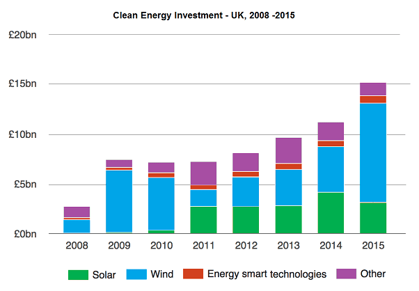
The bar graph presents data on the United Kingdom’s annual investment on clean energy between 2008 and 2015. As is obvious, the UK budget on eco-friendly energy increased over the period and wind power got a considerable attention in terms of the grant it received.
As the data suggests, the UK authorities financed nearly two and half billion pound in 2008 to generate eco-friendly power and half of it went on the wind power sector. Next year budget for wind power almost trebled while a small portion was spent on energy smart technologies and solar power. More than 7 billion was invested in 2009 in the UK to generate clean energy which went as high as 15 billion in 2015. The investment in next two years, 2010 and 2011, remained alike but more than one-third was disbursed for the solar power. From 2012 to 2015, the UK spent roughly 3-5 billion yearly to produce solar energy. The UK government mainly invested on wind and solar power in later years and energy smart technologies attracted a steady portion of UK clean energy investment throughout the period.
IELTS Graph # 14
The graphs below show how people in a European city reached their office and got back home in 1959 and 2009.
Summarise the information by selecting and reporting the main features, and make comparisons where relevant.
You should write at least 150 words.
Journeys to and from work
Sample Answer:
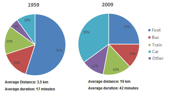
The pie charts delineate how citizens in a European city commuted to and from their offices in 1959 and 2009. Overall, more than half of the office-goers walked in 1959 while car use in 2009 significantly increased. Besides, people travelled more distance in 2009 at a faster speed.
According to the illustration, more than half of the job holders walked to reach their office and get back home in 1959 while only a quarter of them did so in 2009. Bus commuters in this city accounted for 15% in 1959 while it was 2% less after 5 decades. The ratio of office executives (15%) who used trains in both years remained the same. One in ten office commuters drove cars in 1959 but after five decades their percentage increased significantly, 35% to be exact. The use of different other transportations in 2009 increased than that of 50 years earlier.
It is worth noticing that the speed and average distance travelled by these commuters considerably increased in 2009 when a commuter travelled 19 kilometres on an average in 42 minutes compared to their average 3.5-kilometre journey in 17 minutes in 1959.
IELTS Graph # 15
The graph gives information about drinking habits of the US population by age.
Summarise the information by selecting and reporting the main features, and make comparisons where relevant.
You should write at least 150 words.
Drinking habits by age (US)
Sample Answer:
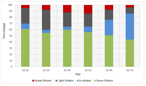
The bar graph outlines the drinking habits of Americans based on their age groups. As can be seen, US citizens’ drinking pattern greatly varies based on their age and elder population over 65 years mostly abstain from drinking.
According to the diagram, 60% US citizens between 16 to 24 years old have never been on alcohol while roughly 10% of them used to drink but now are abstainers. Around one-quarter of these young Americans are light-drinkers while remaining 5% drinks heavily. A similar pattern could be observed among the 25-34 years age group but with an increasing ratio of irregular drinkers and almost 8% hard drinker.
It is interesting to note that chronic alcoholics in the US are highest between 35-54 years population and this ratio is lower among the younger and senior citizens. The rate of people who never have had alcohol declines with the increase of age and a reverse trend could be observed for the ex-drinkers whose proportion hikes as people get older.
The highest ratio of hard drinkers falls between 45-54 years age group and the light drinkers is highest among the 25-34 years old Americans. Finally, an overwhelming number of US population, almost 40%, quit drinking when they are over 64 years old.
IELTS Graph # 16
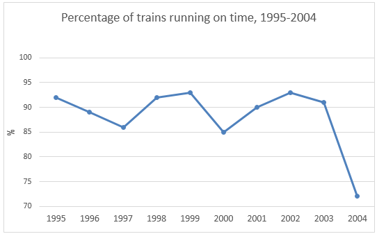
The first graph gives the number of passengers travelling by train in Sydney. The second graph provides information on the percentage of trains running on time.
Summarise the information by selecting and reporting the main features, and make comparisons where relevant.
You should write at least 150 words.
Sample Answer:
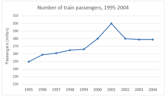
The line graphs give data on the number of train commuters in Sydney from 1995 to 2004 and outline the ratio of trains that ran on time during the same period. As an overall trend, the number of rail passengers in Sydney gradually increased between 1995 to 2002 and in 2004 a higher percentage of locomotives failed to run on time.
As the data suggests, 250 million passengers used the train transportations in 1995 in Sydney and this number slowly increased in the next 4 years. In 1999, train commuters’ number in Sydney was around 265 million and it abruptly hiked in the next two years before dropping again in 2002. In 2000, 280 million passengers used locomotives and this number further increased and reached to the highest, 300 million, in 2001. From 2002 to 2004 the train commuters’ number remained constant at 280 million.
Besides, more than 92% trains in 1995 arrived and reached their destination on time but this record deteriorated and dropped to just over 85% in 1997. In 2000, almost 15% rails failed to maintain the schedule and this scenario was worst in 2004 when more than 25% trains in Sydney could not run on time.
IELTS Graph # 17
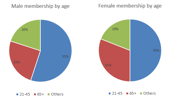
The graph below shows the average monthly use of health club in Miami and Florida by all full-time members in 2017. The pie charts show the age profile of male and female members of this health club.
Summarise the information by selecting and reporting the main features, and make comparisons where relevant.
You should write at least 150 words.
Health club use in Miami and Florida in 2017
IELTS Graph
Sample Answer:
The illustrations give the number of full-time male and female health-centre members in Miami and Florida throughout the year 2017 and outline the ratio of these members based on their gender and age. Overall, more male were active health centre members than that of females and just over half of them were between 21 to 45 years old.
As the bar chart implies, 500 females were active members of different fitness clubs in Florida and Miami in January 2017 while their male counterparts were slightly higher in number. The membership count to these gyms and health centres remained almost the same till April but afterwards increased rapidly between June and September. During this period, fitness centres in these two areas had more than 800 active male participants and slightly over 700 female members. The number of male health club members had always been higher than that of females. From October until the end of the year, these clubs retained a fewer number of members and this number varied from 500 to 700.
According to the pie charts, more than half of the male members of these fitness clubs were between 21 to 45 years old while this was exactly 50% for women. Over 65 years old men accounted for one-quarter participants while it was 6% higher in the case of females. Remaining one-fifth fitness club members were from different other age groups.
IELTS Graph # 18
The chart below shows the percentage of total US population aged 65 and over between 1900 and 2000.
Summarise the information by selecting and reporting the main features, and make comparisons where relevant.
You should write at least 150 words.
Percent of total Population age 65 and over between 1900 to 2000 in the USA.
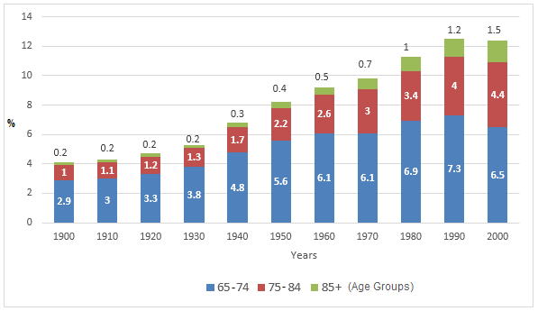
Source: U.S. Census Bureau, decennial census of population, 1900 to 2000.
Sample Answer:
The column graph summarises the percentages of elderly citizens in the USA who were above 64 years old between 1900 and 2000 based on the U.S. Census Bureau’s decennial census of population data.
Generally speaking, the ratio of senior citizens in the USA increased significantly over the period, and 65 to 74 years old citizens were highest in percentage in terms of their ratio among the elderly Americans.
According to the graph, four out of hundred Americans were above 64 years old in 1900 and the majority of them were between 65 to 74 years old at that time. Moreover, the ratio of people over 85 years old in this decade was very insignificant. After three decades, however, the elderly people’s ratio in the US reached over 5% and it kept on increasing until the end of the 20th century. Thus, almost one in ten US citizens was elderly in 1970 and 0.7% of them were 85 years old. The growth of senior citizens further accelerated after 1980 in the USA. As a consequence, during the last two decades of the 20th century, the USA had been the home to 12% senior citizens and almost 4.5% of them were between 75 to 84 years old and 1.5% above 85 years old.
IELTS Graph # 19
Write a report for a university lecturer describing the information shown below.
You should write at least 150 words.
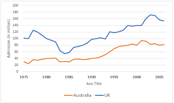
Chart A: Films screened in the UK and Australia, 2001.

Chart B: UK and Australian cinema admission, 1976 to 2006.
Sample Answer:
The bar chart presents data on the origin of films which were screened in Australia and the UK in 2001 while the line graph compares the number of cinema attendants in these two countries between 1976 and 2006.
Overall, Australian and Britsh theatres were dominated by American movies during the period, and more British went to movie theatres than their Australian counterparts between 1976 and 2005.
As the data suggests, more than 75% movies that were released in the UK theatres in 2001 were produced in the USA while 20% were locally made. Besised, almost one in ten movies screened in the UK was produced in Australia. A similar movie screening trend could be observed in Australia in this year where American movies commanded the theatres with a 65% ratio. Australians could watch fewer UK-made movies as only one in twenty British films made it to Australian halls. Interestingly, locally produced films in Australia were ignorable in percentage – as their screening ratio suggests.
It is obvious that more Brits enjoyed cinemas in a theatre than Australians did between 1976 and 2005. In 1975, over 100 million British watched movies in halls while this was just around 30 million in Australia. With some fluctuations, Australian movie-goers’ number reached over 80 million after 3 decades. On the contrary, British cinema attendees dropped from 1977 to 1984, but afterwards steadily went up with some minor vacillations. After 30 years, almost 160 million British went to cinema halls- almost double than that of Australians.
IELTS Graph # 20
The pictures show the changes of a park from 1980 to the present day.

Sample
The maps show changes in the layout of a park between 1980 and the present.
In general, the park is now more accessible and has several new facilities to serve different recreational demands of the public.
In 1980, there was one pathway running through the park from the west gate to the south gate. A number of trees were located in the north east, and flowers were planted along the south wall. There was also a pond with several benches around it situated on the eastern side of the park.
Between 1980 and now, the path was removed and replaced with a new path which leads to all four sides of the park, and essentially divides it into four different areas. In the south western corner, the pond and benches are still intact, but the flowers in that area have been replaced with bushes. A new picnic area with tables and a barbecue grill has been set up in the north eastern corner, while the southeastern corner is now a dedicated playing field.
(173 words)