IELTS Graph #51
The diagrams below give information about the Eiffel Tower in Paris and an outline project to extend it underground.
Write a report for a university lecturer describing the information shown.
model answer:
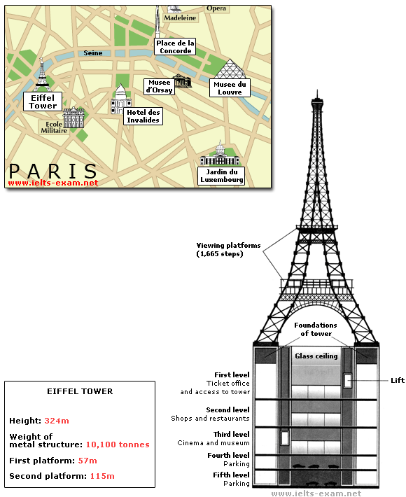
The Eiffel Tower is situated close to the Seine River in Paris. It is a metal structure that is 1,063 feet high and weighs 7,417 tonnes. The tower has been a tourist attraction since 1889, when it was built, and there are 1,665 steps that can be climbed in order to reach the two viewing platforms.
There are now plans to build below the foundations of the tower. These plans include the development of five underground levels that will incorporate the tower’s ticket office, shopping facilities, a cinema and museum and two floors of underground parking.
Although details have yet to be finalised, the principle is that the five floors will be connected by two vertical passenger lifts on either side of the tower. In addition, the floor immediately below the tower, which is planned to house the ticket office, will also consist of a large atrium with a glass ceiling so that visitors can look directly up at the tower itself.
(162 words)
IELTS Graph #52
The table below provide information on rental charges and salaries in three areas of London.
Write a report for a university lecturer describing the information shown below.
You should write at least 150 words.

model answer:
The table shows two sets of related information: the relative cost, in pounds, of renting a property with one, two or three bedrooms in three different suburbs of London and an indication of the kind of annual salary you would need to be earning to rent in these areas.
Of the three areas mentioned, Notting Hill is the most expensive with weekly rents starting at £375 (salary approximately f 100,000) and rising to £738 per week for a 3-bedroom property. To afford this, you would require a salary in the region of £200,000 per annum. Alternatively, Fulham is the cheapest area shown with rents ranging from £215 per week for a one bedroom property to £600 per week for a 3-bedroom property. To rent in this area, salaries need to be somewhere between £85,000 and £170,000 depending on the number of bedrooms required. For those able to pay in the middle price range for accommodation, Regent’s Park might be a more suitable district.
(163 words)
IELTS Graph #53
The graph below gives information about the preferred leisure activities of Australian children.
Write a report for a university lecturer describing the information shown.
model answer:
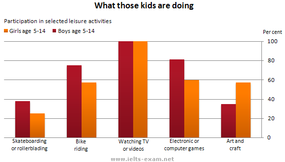
The graph shows the preferred leisure sctivities of Australian children aged 5-14. As might be expected, it is clear from the data that sedentary pursuits are far more popular nowadays than active ones.
Of the 10,000 children that were interviewed, all the boys and girls stated that they enjoyed watching TV or videos in their spare time. In addition, the second most popular activity, attracting 80% of boys and 60% of girls, was playing electronic or computer games. While girls rated activities such as art and craft highly – just under 60% stated that they enjoyed these in their spare time – only 35% of boys opted for creative pastimes. Bike riding, on the other hand, was almost as popular as electronic games amongst boys and, perhaps surprisingly, almost 60% of girls said that they enjoyed this too. Skateboarding was relatively less popular amongst both boys and girls, although it still attracted 35% of boys and 25% of girls.
(157 words)
IELTS Graph #54
The diagram below shows how a central heating system in a house works.
Summarise the information by selecting and reporting the main features, and make comparisons where relevant.
model answer:
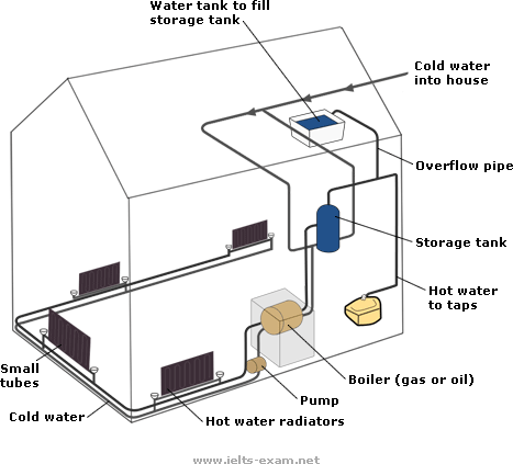
This diagram provides an overview of a domestic central heating system. It shows how the tank, boiler and pipes ensure a constant flow of hot waterto both the radiators and the taps.
The cold water enters the house and is stored in a water storage tank in the roof. From there ü flows down to the boiler, located on the ground floor of the house.
The boiler, which is fuelled by gas or oil, heats up the water as it passes through it. The hot water is then pumped round the house through a system of pipes and flows into the radiators, located in different rooms. The water circulates through the radiators, which have small tubes inside them to help distribute the heat, and this warms each of the rooms. Some of the water is directed to the taps to provide hot water for the house.
Once the water has been through the pipes and radiators, it is returned to the boiler to be re-heated and circulated round the house again.
Introduction: First sentence. Overview: Second sentence.
Key features: Entry of cold water into boiler; circulation of hot waterto radiators and taps; return of waterto boiler.
Supporting information: direction of flow; types of boiler; location of radiators; radiator tubes
Paragraph breaks: The paragraph breaks mark stages in the process.
Linkers: and, from there, then, once, again Reference words: it, both, there, which, this
Topic vocabulary: enters, stored, roof, flows, ground floor, located, passes, pumped, system, circulates, heat, directed, returned, re-heated
Less common vocabulary: ensure, fuelled by, heats up, distribute the heat, warms
Structures: An appropriate mix of active and passive structures and a range of sentence types are used.
Length: 172 words
IELTS Graph #55
The graph and table below give information about water use worldwide and water consumption in two different countries.
Summarise the information by selecting and reporting the main features, and make comparisons where relevant.

| Country | Population | Irrigated land | Water consumption per person |
| Brazil | 176 million | 26,500 km² | 359 m³ |
| Democratic Republic of Congo | 5.2 million | 100 km² | 8 m³ |
model answer:
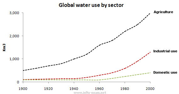
The graph shows how the amount of water used worldwide changed between 1900 and 2000.
Throughout the century, the largest quantity of water was used for agricultural Purposes, and this increased dramatically from about 500 km³ to around 3,000 km³ in the year 2000. Water used in the industrial and domestic sectors also increased, but consumption was minimal until mid-century. From 1950 onwards, industrial use grew steadily to just over 1,000 km³, while domestic use rose more slowly to only 300 km³, both far below the levels of consumption by agriculture.
The table illustrates the differences in agriculture consumption in some areas of the world by contrasting the amount of irrigated land in Brazil (26,500 km³) with that in the D.R.C. (100 km²). This means that a huge amount of water is used in agriculture in Brazil, and this is reflected in the figures for water consumption per person: 359 m³ compared with only 8 m³ in the Congo. With a population of 176 million, the figures for Brazil indicate how high agriculture water consumption can be in some countries.
(180 words)
IELTS Graph #56
Write a report for a university lecturer describing the information shown below.
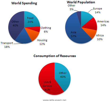
In this analysis we will examine three pie charts. The first one is headed ‘World Spending.’ The second is ‘World Population’ and the third is ‘Consumption of Resources.’
In the first chart we can see that people spend most of their income (24%) on food. In some countries this percentage would obviously be much higher. Transport and then housing are the next major expenses at 18% and 12% respectively. Only 6% of income is spent on clothing.
In the second chart entitled ‘World Population’, it is not surprising to find that 57% of people live in Asia. In fact China and India are two of the most populated countries in the world and they are both situated on this continent. Europe and the Americans account for nearly 30% of the total, whilst 10% of people live in Africa.
Finally, the third chart reveals that the USA and Europe consume a huge 60% of the world’s resource.
To sum up, the major expenditure is on food, the population figures are the highest for Asia and the major consumers are the USA and Europe.
IELTS Graph #57
The table below give information about Favorite Pastimes in different countries.
Summarise the information by selecting and reporting the main features, and make comparisons where relevant.
Write at least 150 words.
| TV | Sport | Reading | Hobbies | Music | Beach | Sleep | |
| Canada | 60 | 22 | 15 | 40 | 3 | 0 | 2 |
| France | / | / | 30 | 20 | 4 | / | / |
| England | / | / | 30 | 21 | 4 | / | 20 |
| Australia | 65 | 30 | 15 | 45 | 5 | 30 | 4 |
| Korea | 22 | 21 | 60 | 45 | 2 | 2 | 4 |
| China | 15 | 25 | 60 | 50 | 0 | 5 | 5 |
| USA | 60 | 23 | 15 | 42 | 23 | 30 | 2 |
| Japan | / | / | 62 | / | / | / | / |
model answer:
This table clearly presents and compares favorable pastimes in eight different countries. The pastimes, across the top of the table, are analyzed in relation to each country.
As can be seen, about 60% of Canadians, Australians and Americans like watching television. On the other hand, this figure is quite low for China where only 15% of people watch television. Predictably, Americans like music at 23%, whereas only 2 to 5% of people in the other countries feel the same way. 20% of people in England enjoy sleeping as a pastime whereas in Canada and the USA, for example, the figure is only 2%. Interestingly, the Chinese like hobbies the most at 50%, as opposed to only 20% in France. It isn’t surprising that the highest percentage of beach-lovers is in Australia and the USA at 30%.
It seems that pastimes of people of different nationalities may be influenced by a number of factors such as the socio-economic situation or the climate. These factors influence cultural differences between different nationalities and make cross-cultural experiences more interesting.
(175 words)
IELTS Graph #58
The flowchart illustrates the production of coloured plastic paper clips in a small factory.
Write a report for a university tutor describing the production process.

model answer: There are four main stages in the production of plastic paper clips from this small factory. Two of these stages involve actual preparation of the clips, while the other two consist of quality control before the clips are sent out from the factory to the retailers to be sold to the public.
To begin with, molten plastic is poured into three different moulds depending on the colour required; the colours are red, blue and yellow. Once these clips emerge from the moulds a quality control machine checks them for strength. Unsatisfactory clips are rejected. In the third stage in the process the clips are stored by hand into two groups, mixed and single colours. When this stage is complete the groups are checked a second time to ensure that the colour mixtures are divided correctly into single colours and mixed colour batches. Finally, the clips are packed and dispatched to the markets.
(152 words)
IELTS Graph #59
The graph below shows the differences in wheat exports over three different areas.
Write a report for a university lecturer describing the information shown below.

model answer:
The three graphs of wheat exports each show a quite different pattern between 1985 and 1990. Exports from Australia declined over the five-year period, while the Canadian market fluctuated considerably, and the European Community showed an increase.
In 1985, Australia exported about 15 millions of tonnes of wheat and the following year the number increased by one million tonnes to 16 million. After that, however, there was a gradual decline until 1989 and 1990 when it stabilised at about 11 million tonnes. Over the same period, the amount of Canadian exports varied greatly. It started at 19 million tonnes in 1985, reached a peak in 1988 of 24 million, dropped dramatically in 1989 to 14 million tonnes and then climbed back to 19 million in 1990. Seventeen million tonnes were exported from the European Community in 1985, but this decreased to 14 million tonnes in 1986 and then rose to 15 million in 1987 and 1988 before increasing once more to 20 million in 1990.
(165 words)
IELTS Graph #60
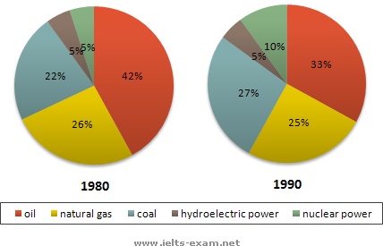
The two graphs show the main sources of energy in the USA in the 1980s and the 1990s.
Write a report for a university lecturer describing the changes which occurred.
model answer:
The two graphs show that oil was the major energy source in the USA in both 1980 and 1990 and that coal, natural gas and hydroelectric power remained in much the same proportions. On the other hand, there was a dramatic rise in nuclear power, which doubled its percentage over the ten years.
Oil supplied the largest percentage of energy, although the percentage decreased from 42% in 1980 to 33% in 1990. Coal in 1990 was the second largest source of energy, increasing its proportion to 27% from 22% in the previous decade. Natural gas, the second largest source in 1980 at 26%, decreased its share very slightly to provide 25% of America’s energy ten years later. There was no change in the percentage supplied by hydroelectric power which remained at 5% of the total energy used. Nuclear power the greatest change: in 1990 it was 10%, twice that of the 1980s.
(152 words)