The graphs below show the numbers of male and female workers in 1975 and 1995 in several employment sectors of the republic of Freedonia.Write a report for a university teacher describing the information shown. model answer: The two decades between 1975 and 1995 brought significant changes in the representation of women in Freedonia’s work force, […]
Category: IELTS Graphs
Find here a huge collection of IELTS graphs , diagrams, process charts, graph tables, maps and design layout for IELTS writing task 1 academics. Also learn how to write in IELTS writing task 1, learn various tips and tricks to score higher in IELTS exam.
The whole collection is categorized into books with Volume 1, 2, 3….. Choose a book and start practicing.
Graphs Volume 8 (Most Important & Comprehensive, 167 essays)
Graphs Book Volume 3 Part 1
IELTS Graphs Volume 7
IELTS Graphs Volume 6
Random Graphs (Downloadable)
IELTS Graphs Volume 4
(Downloadable)
IELTS Graphs Volume 5
(Downloadable)
Vocabulary for IELTS Writing Task 1
(Downloadable)
The graphs below show the types of music albums purchased by people in Britain according to sex and age.Write a report for a university lecturer describing the information shown below. You should write at least 150 words. You should spend about 20 minutes on this task. model answer: The three graphs provide an overview of […]
The chart below gives information about global sales of games software, CDs and DVD or video.Write a report for a university lecturer describing the information.• You should write at least 150 words.• You should spend about 20 minutes on this task. model answer: The chart shows the changes in the sales of video material / […]
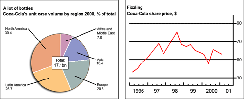
The chart and graph below give information about sales and share prices for Coca-Cola.Write a report for a university lecturer describing the information shown below. You should write at least 150 words. You should spend about 20 minutes on this task. model answer: The pie chart shows the worldwide distribution of sales of Coca-Cola in […]
Being able to use appropriate vocabularies, presenting the main trend, comparing & contrasting data and presenting the logical flow of the graph ensure a high band score in your Academic IELTS writing task 1
Line Graph 49 The graph below shows the weekday volume of passenger activity on the Toronto Metro system for July 2007. Summarize the information by selecting and reporting the main features, and make comparisons where relevant. The line graph demonstrates the passenger activities on the Toronto Metro System for a week in July 2007. The […]
Bar Graph 47 The graph below shows the percentage of urban/suburban and rural households in a European country that had Internet access between 1999 and 2004. Summarize the information by selecting and reporting the main features, and make comparisons where relevant. The bar graph shows the percentages of city and rural households with the internet […]
Line Graph 46 The chart below shows the total volume of telephone calls (in million minutes) in Denmark, divided into three categories, from 1995- 2004.Summarize the information by selecting and reporting the main features, and make comparisons where relevant. The line graph compares the duration of national landline, international landline and cell phone calls made […]
Bar Graph 45 The chart below shows how frequently people in the USA ate at fast food restaurants between 2003 and 2013.Summarize the information by selecting and reporting the main features, and make comparisons where relevant. The diagram outlines the frequency of having fast food meals by Americans at restaurants from 2003 to 2013. Generally […]
Bar Graph 44 The graph below shows the daily water consumption for Americans in their homes. Summarize the information by selecting and reporting the main features, and make comparisons where relevant. The illustration presents data on the daily water usage by an American for different purposes. The water consumption is measured in gallon per day […]